Overview
A watch brand lets customers build their own watch — choosing size, case colour, dial, hour markers, hands, and strap. Behind that builder sits this CMS, where the team manages every option, its price, and how it appears to customers.
The goal was to make a complex product catalogue feel simple to run: see everything at a glance, edit any option in a few clicks, and never publish a combination that can't be made.
TRY THE LIVE CMS ↗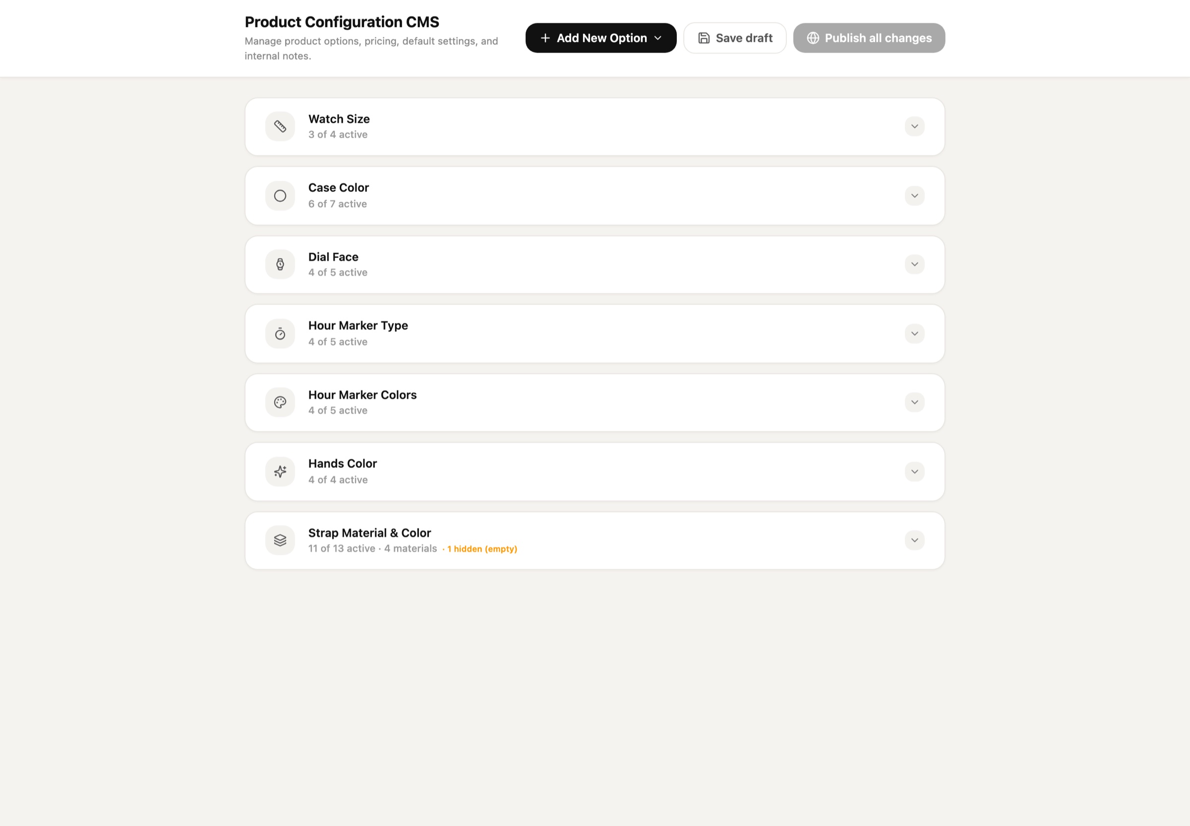
Problem
A configurable product multiplies quickly. Seven categories and dozens of options create hundreds of combinations — and every change affects price, stock, and what customers see.
- Options were spread across spreadsheets, so prices and defaults drifted out of sync.
- Some combinations can't be manufactured, but nothing stopped them from being offered.
- Staff couldn't see how a colour or size would actually look before going live.
- Edits went straight to customers, with no safe way to prepare changes first.
Scan fast. Edit in place. Publish with confidence.
Overview first
Each category is a collapsible card showing how many options are active, so staff can spot gaps without opening anything.
Show, don't describe
Colours appear as swatches, markers as mini dials, and every edit updates a live watch preview.
Safe by default
Changes are saved as drafts and published together. Only one default per category, and incompatible options are blocked.
Structure
The CMS mirrors the order customers build a watch, so the team thinks in the same steps as the buyer.
- 01Watch Size
40, 44, 49 mm — table with SKU, status, and price.
- 02Case Color
Swatches such as Matte Black, Navy Blue, Rose Gold.
- 03Dial Face
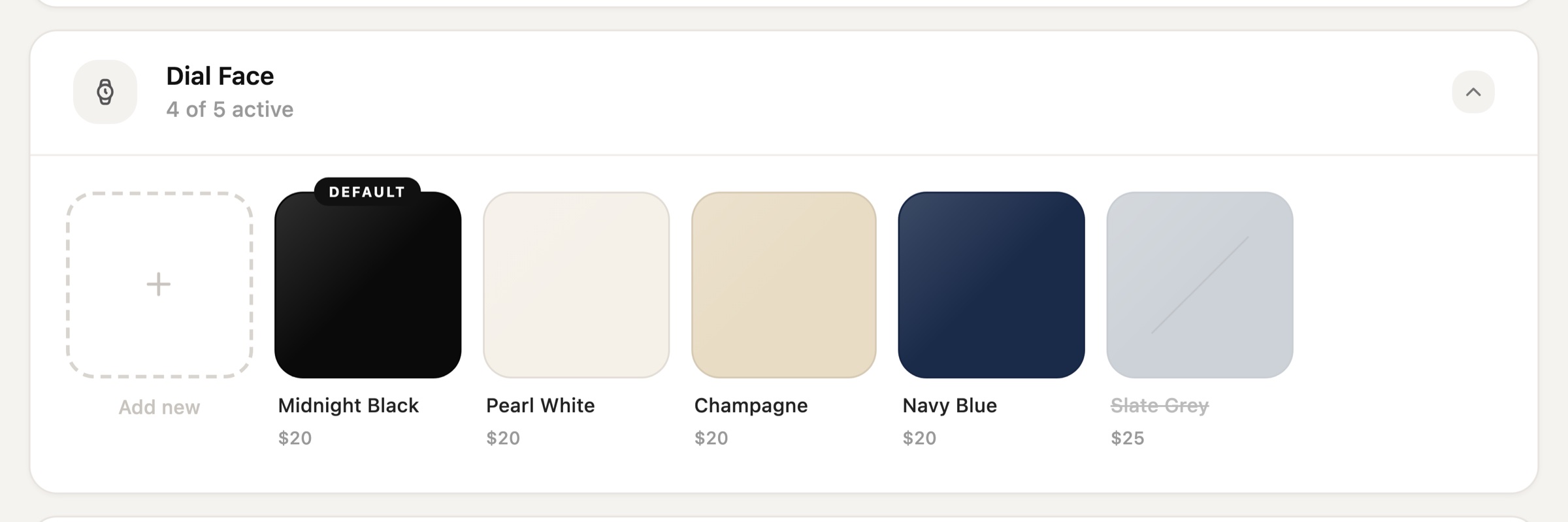
Midnight Black, Pearl White, Champagne, and more.
- 04Hour Marker Type
Arabic, Roman, Dots, Lines — shown as dial previews.
- 05Hour Marker Colors
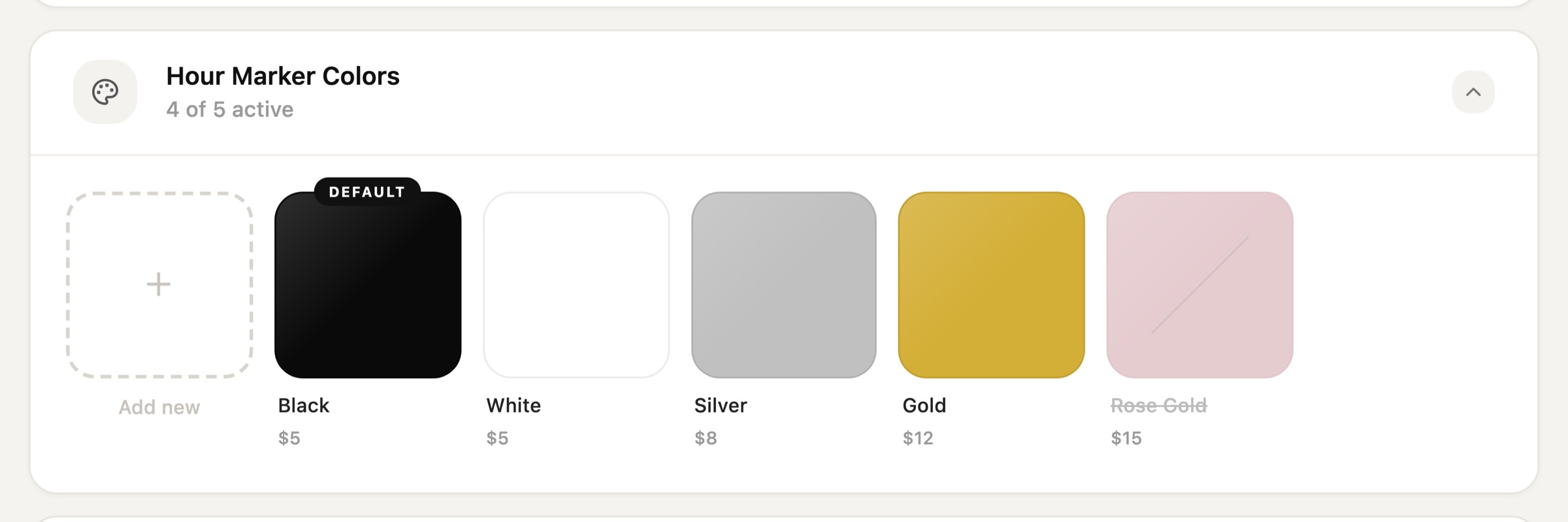
Black, White, Silver, Gold.
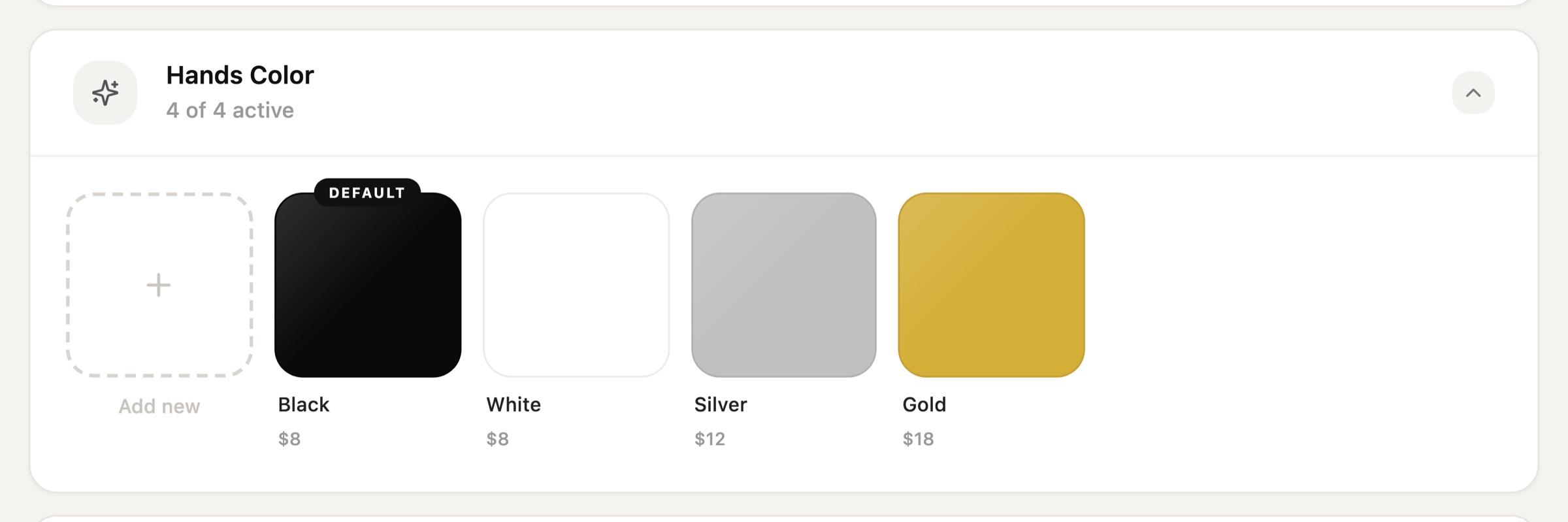
- 06Hands Color
Colour options for the watch hands.
- 07Strap Material & Color
Tabs for Rubber, Leather, Nylon, Metal, each with its own colours.
Option Categories
Each category uses the layout that fits its data best.
Watch Size — a table
Sizes carry more data than colours, so they sit in a table: a proportional preview dot, description, SKU, status pill, and price. The default size is marked with a badge, and inactive sizes are struck through instead of hidden.
Watch Size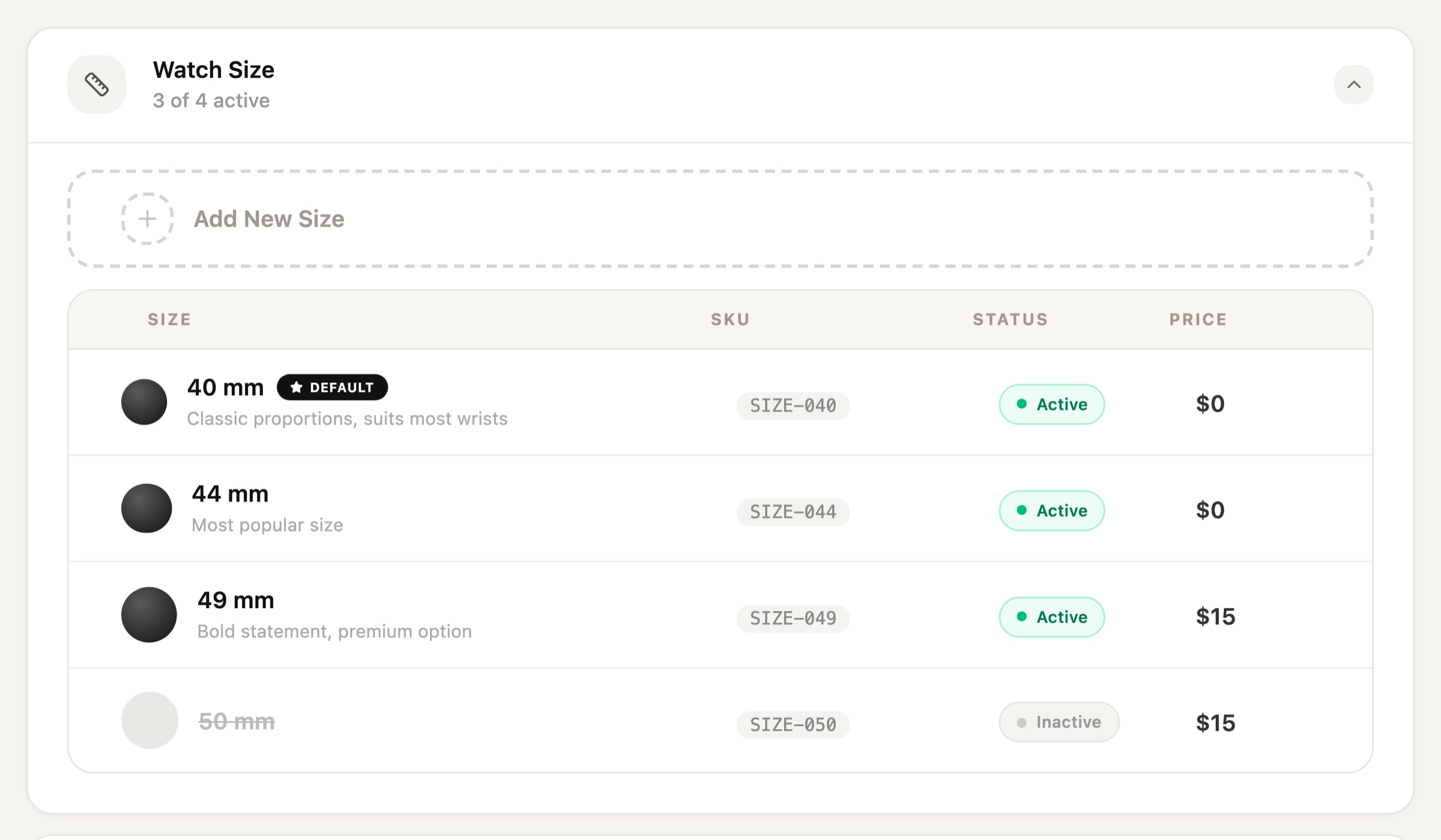
Colours — a swatch grid
Case, dial, marker, and hands colours are shown as large swatches with name and price. An "Add new" tile always leads the row, and inactive colours fade with a strike-through so they're clearly off without being lost.
Case Color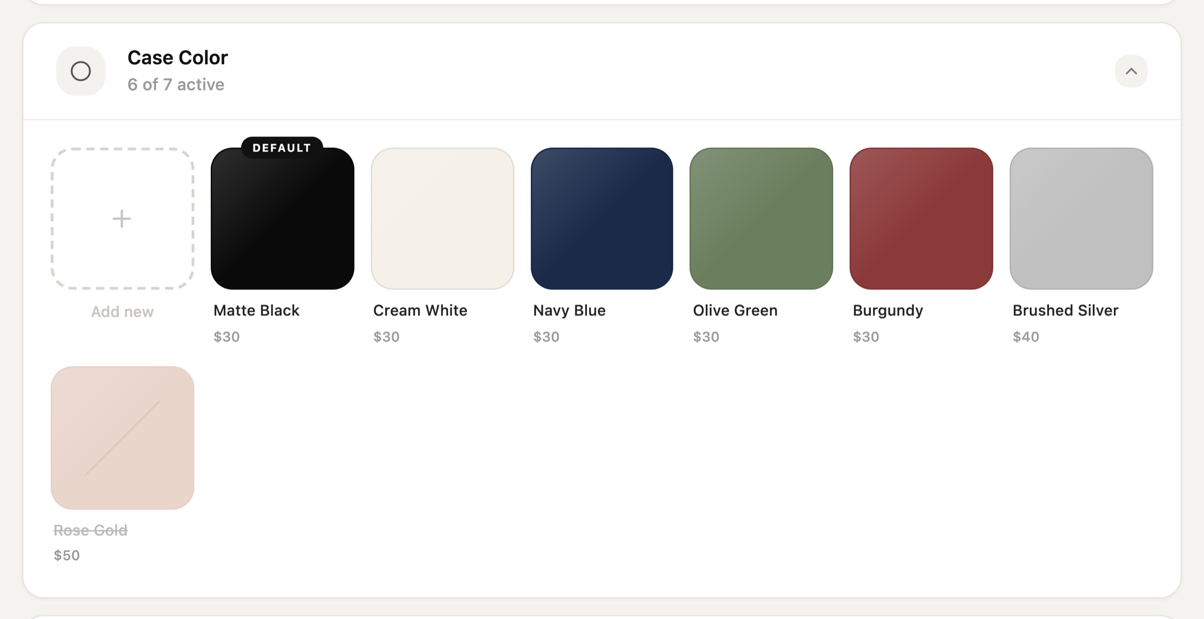
Hour markers — visual dials
Marker styles are hard to describe in words, so each one is shown as a small dial — Arabic, Roman, Dots, Lines, or None — with its SKU underneath.
Hour Marker Type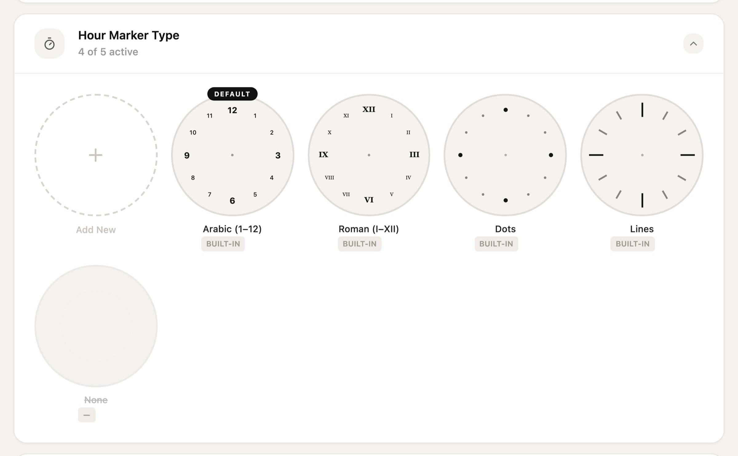
Straps — material tabs
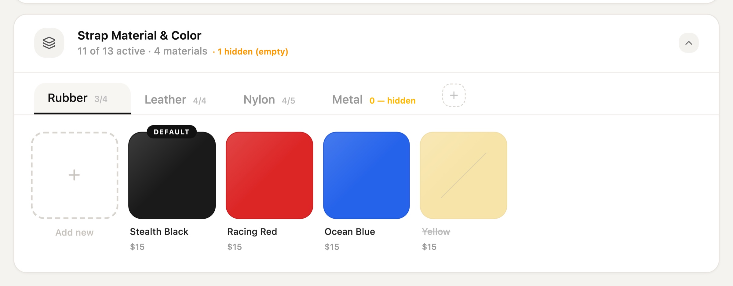
Straps have two levels: material, then colour. Tabs for Rubber, Leather, Nylon, and Metal show a count for each, and an empty material is flagged as hidden so it never appears half-finished to customers.
Strap Material & Color — Rubber and Leather tabs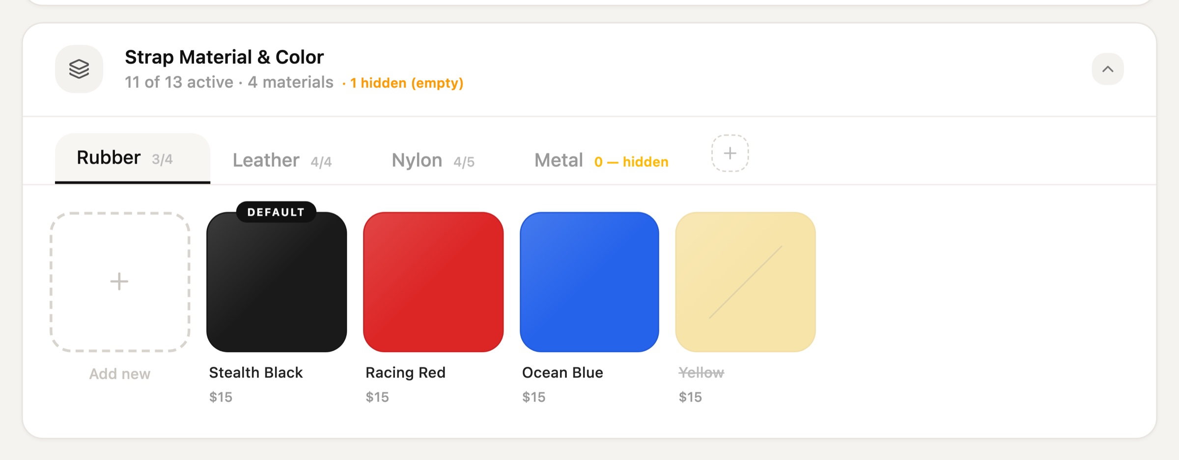
Editing an Option
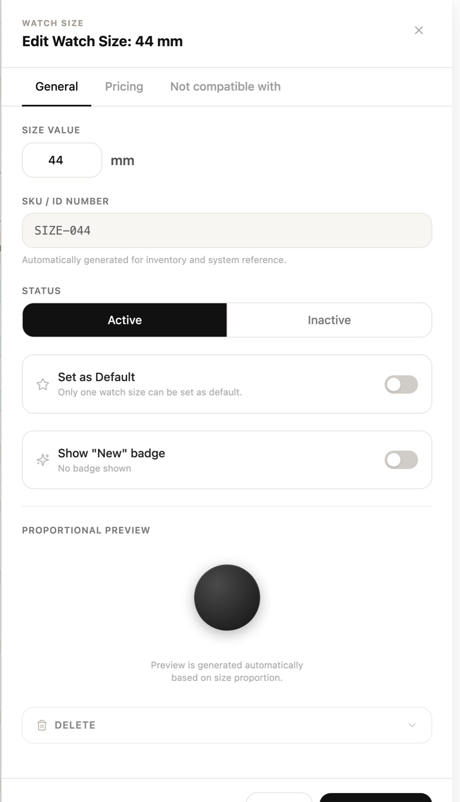
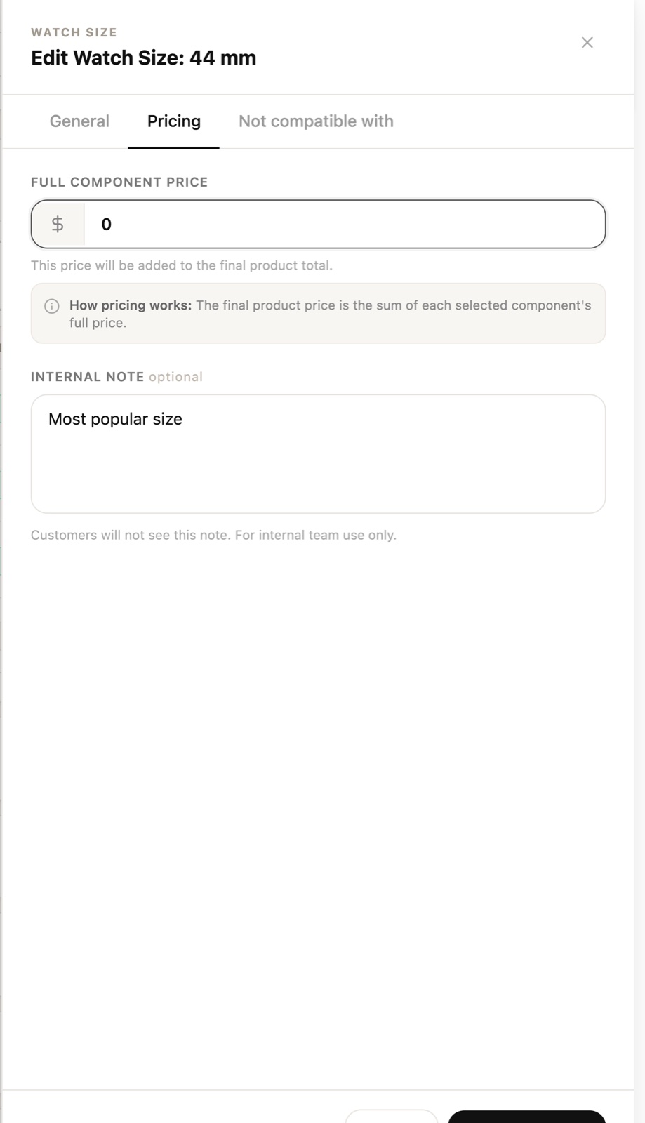
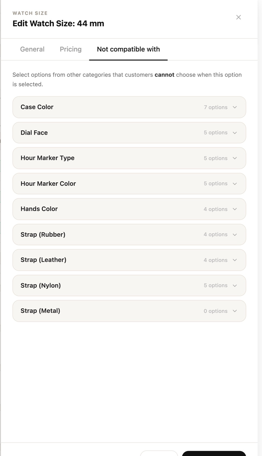
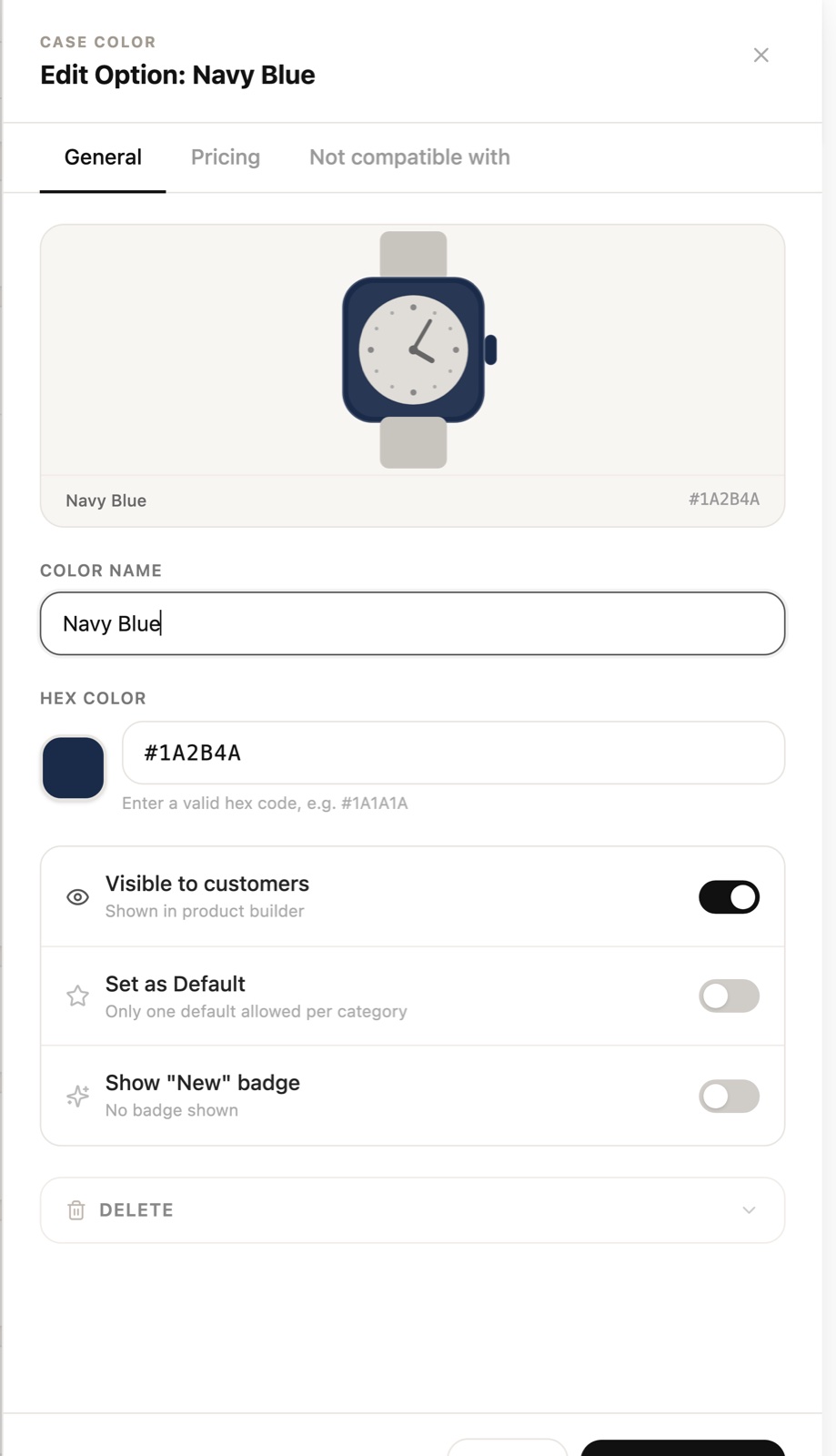
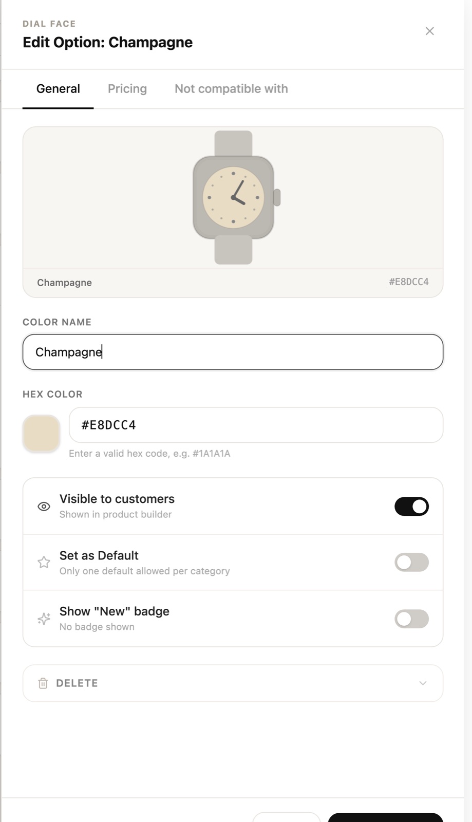
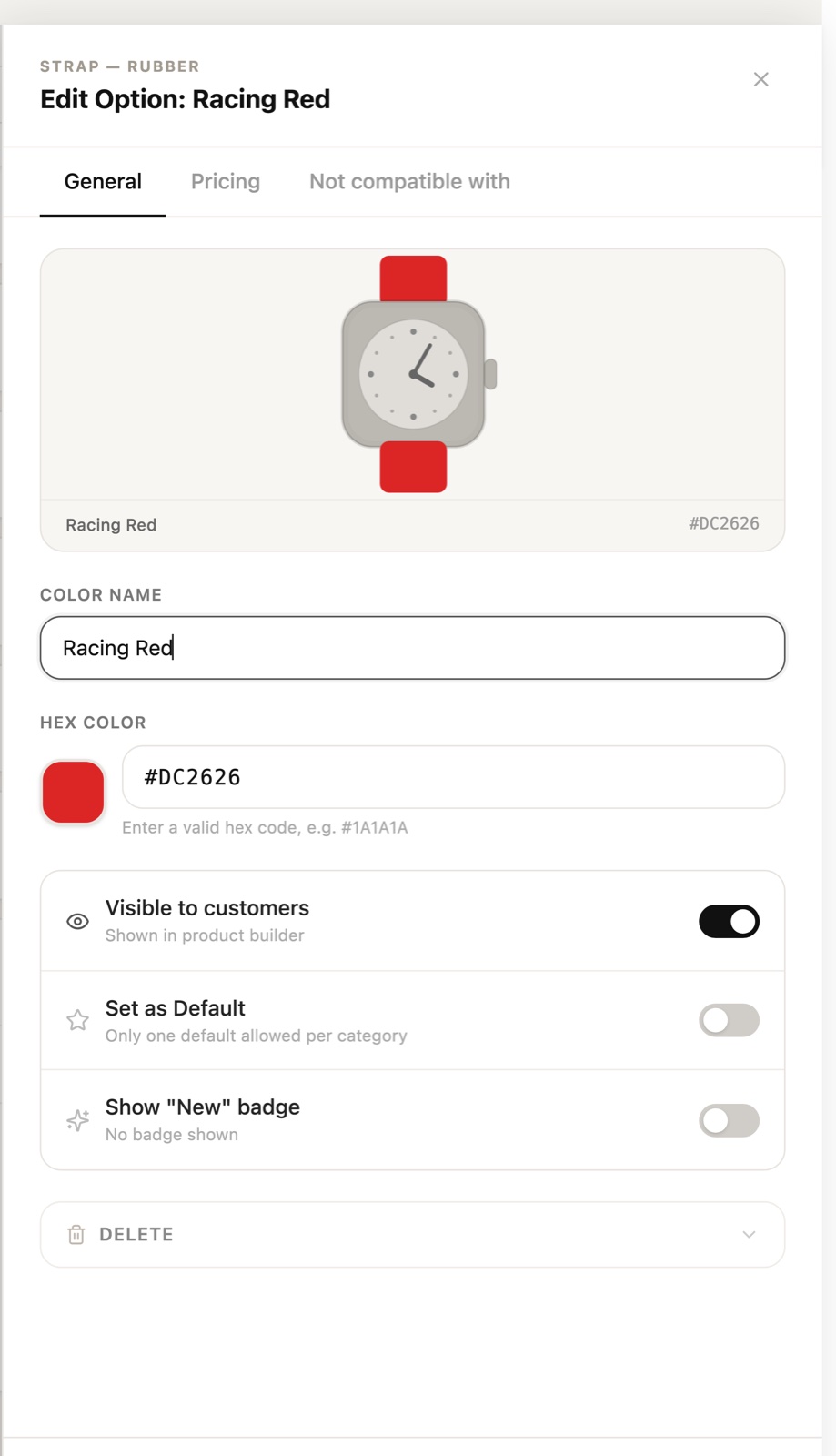
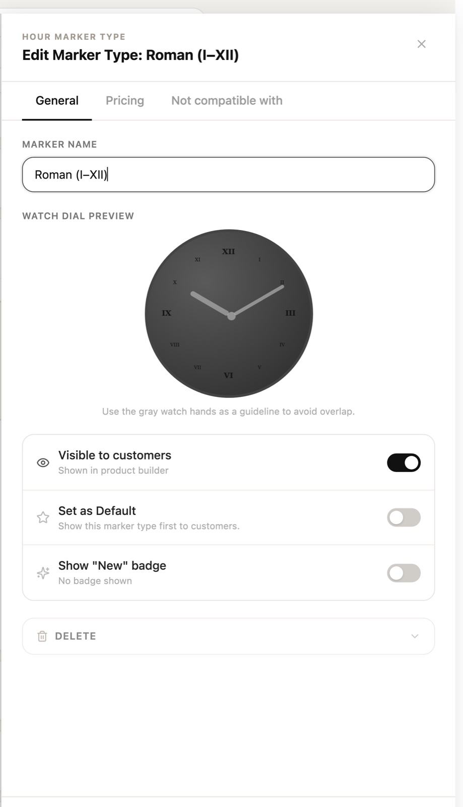
Clicking any option opens a side drawer, so the list stays in view behind it. Every drawer shares the same three tabs.
Live Preview
Every colour and style edit updates a watch illustration in real time, so staff see exactly what customers will see.
Colour drawers pair a name with a hex code and swatch; marker drawers render the full dial, with grey hands as a guide to avoid overlap. Toggles for Visible to customers, Set as default, and Show "New" badge sit together, and Delete is tucked away in a collapsed section to prevent accidents.
Draft & Publish
Nothing reaches customers by accident.
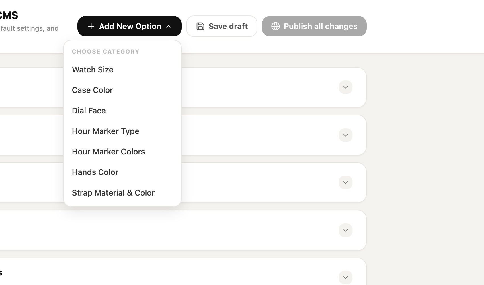
All edits are collected as a draft. Save draft keeps work in progress; Publish all changes becomes active only when there is something to publish, and releases everything at once. Add New Option opens a category picker, so new items always land in the right place.
Outcome
One place to run the whole product catalogue — visual, rule-aware, and safe to change.
- Seven option groups managed from a single page, with active counts at a glance.
- Pricing, defaults, badges, and visibility controlled per option.
- Compatibility rules prevent combinations that can't be built.
- A live preview and a draft-then-publish flow reduce mistakes before customers see them.
INTERACTIVE PROTOTYPE
Try it yourself.
Open the working CMS — expand categories, open an option, change a colour and watch the preview update.
OPEN POSAWEE-SO.COM/IDDESIGN/ ↗Best viewed on desktop. Changes are for demo only.