Overview
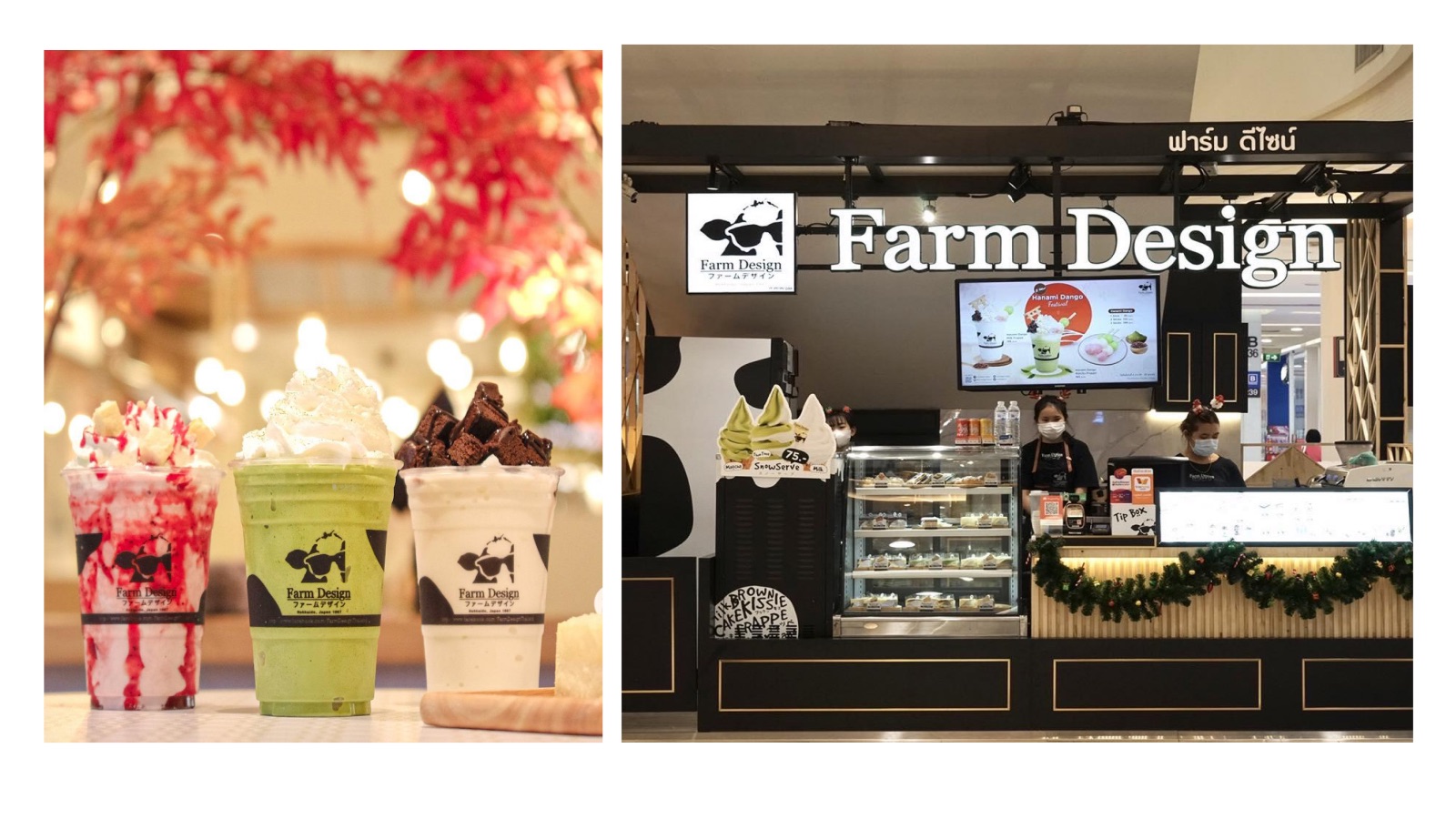
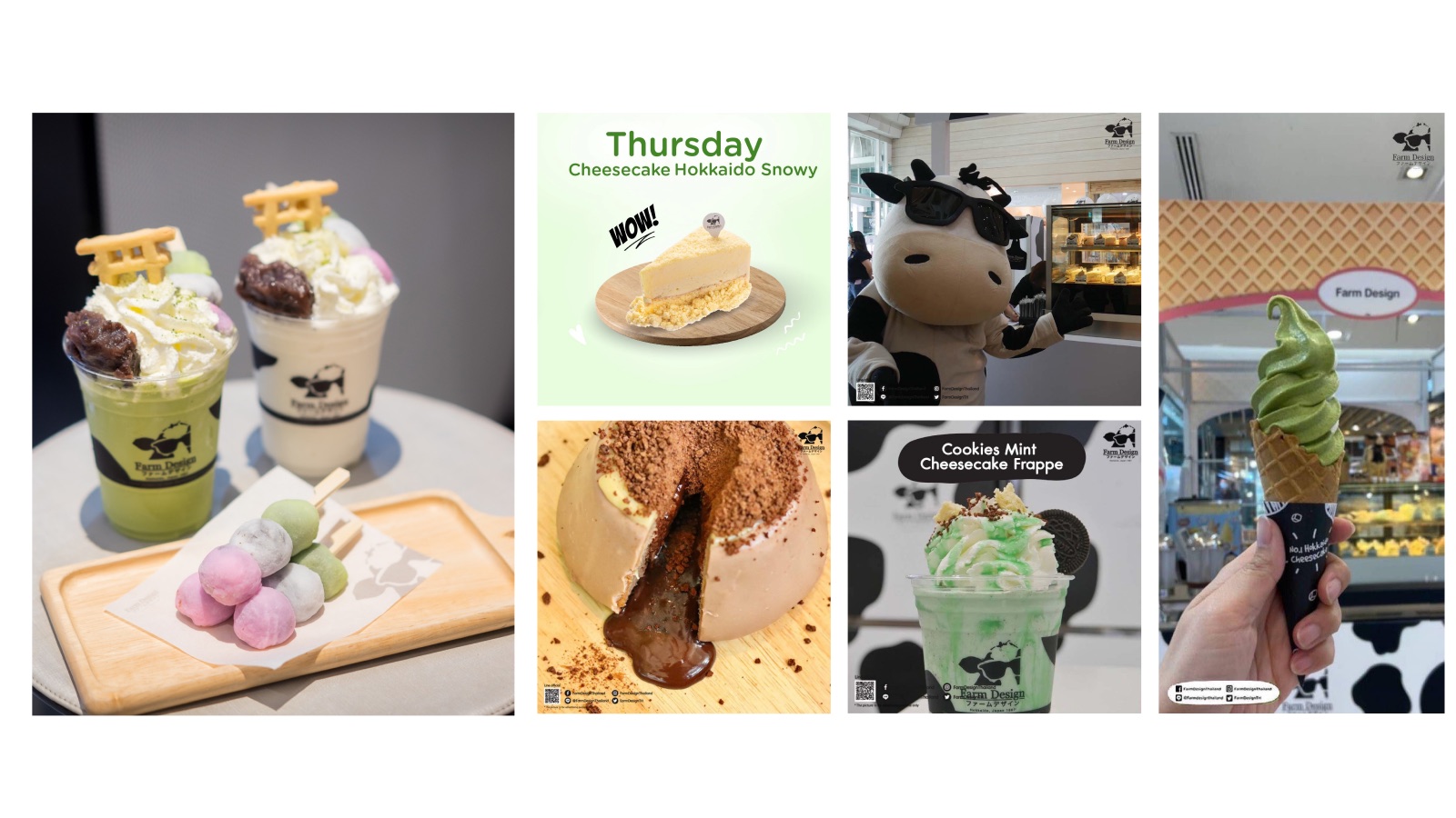
Farm Design is a Hokkaido café brand known for dairy desserts made with premium Hokkaido milk — cheesecake, soft serve, pudding, and yogurt drinks. It came to Thailand in 2011 and became "Thailand's No.1 Hokkaido Cheesecake."
Why Rebrand?
The product was never the problem. The brand lost its premium feel, never became an everyday habit, and its look didn't grow up with its audience.
What didn't work
- Too many Buy-1-Get-1 deals made it feel cheap
- Cheesecake is a treat, not a daily habit
- Cartoonish visuals from 2011 felt dated
- 100% reliant on mall traffic
- The Hokkaido story was never told
- Invisible on TikTok and Reels
What worked
- Mr. Mooooo — a mascot people love
- A real origin: Akkeshi, Hokkaido, 1987
- A signature cheesecake people still remember
- Premium quality at an accessible price
New Direction
Stop competing on price. Compete on emotion.
Grow beyond cheesecake into daily coffee and milk.
The dessert is the start — the feeling is the product.
Tell the Hokkaido story at every touchpoint.
"We didn't change who we are. We simply gave it a face and a heart."
Farm Design
A name about origin — a dairy farm in Hokkaido where fresh milk became dessert.
MR.MOO
A name about who — the friend you want to see every day. Warmth, small moments of joy, and a smile waiting for you.
Purpose & Values
"Crafting experiences with warmth and care for everyone who walks away feeling something right."
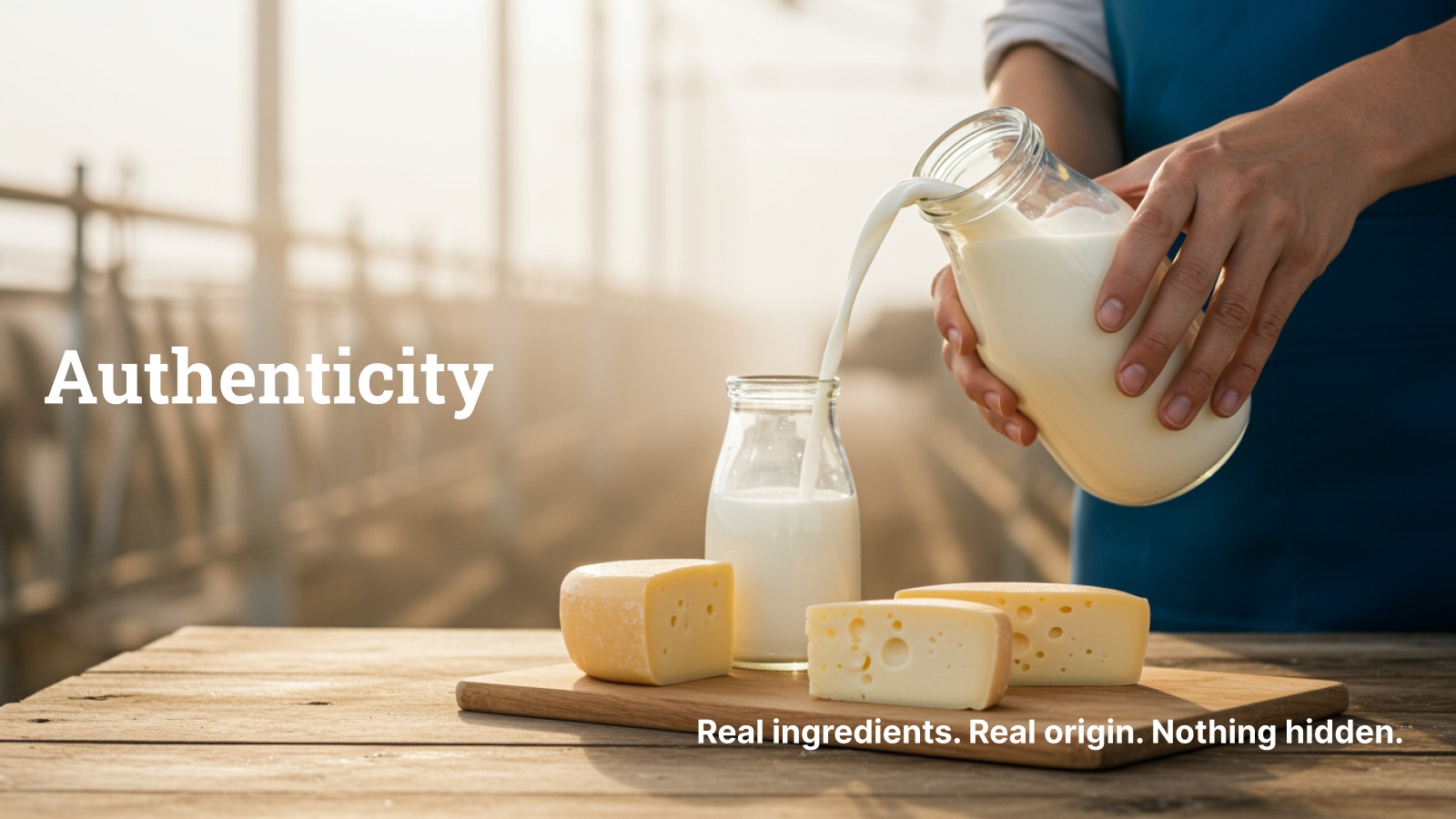
Authenticity
Real ingredients. Real origin.Every product starts with real Hokkaido milk. Nothing hidden.
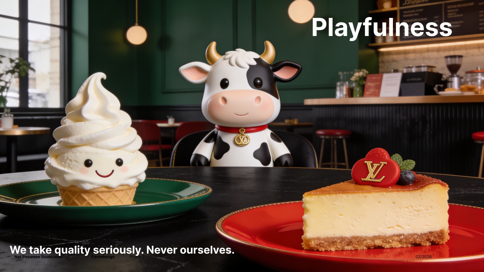
Playfulness
Serious about quality, never ourselvesFrom Mr. Mooooo to spotted cheesecakes, joy lives in the details.
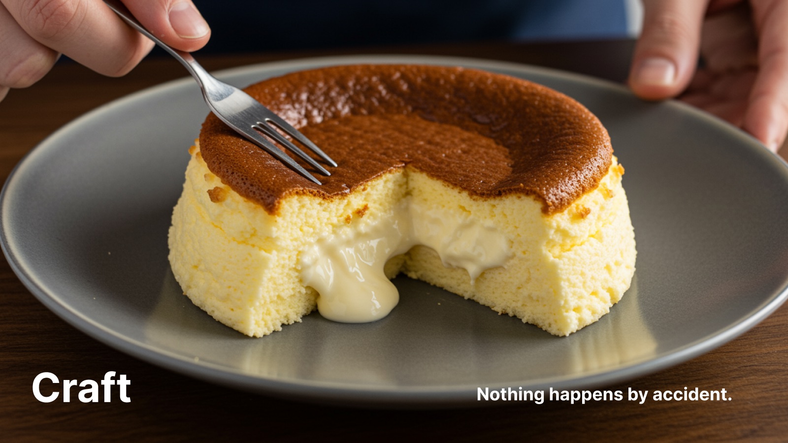
Craft
Nothing happens by accidentEvery recipe, texture, and experience is made with intention.
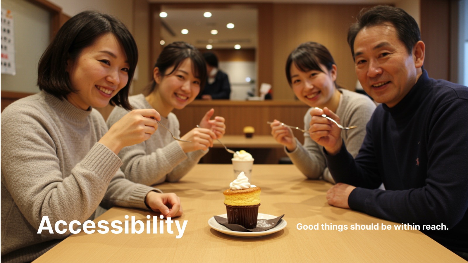
Accessibility
Premium for everyone, every dayWelcoming to every age, background, and budget.
Creative Platform
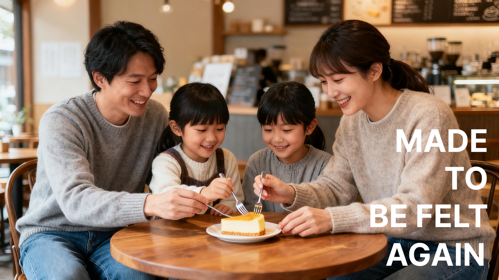
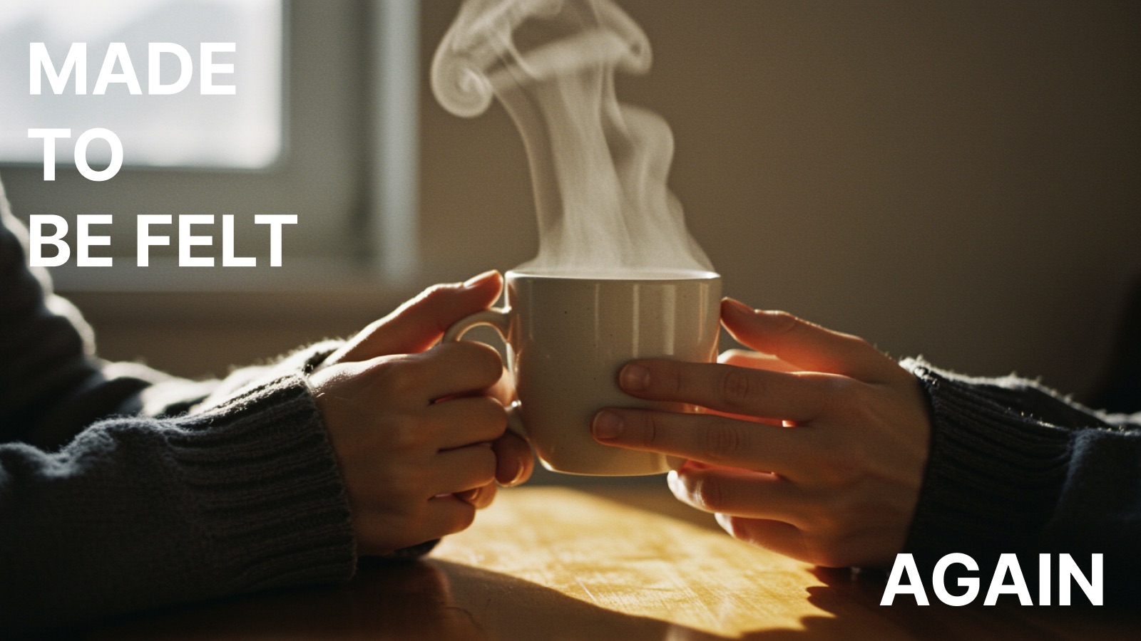
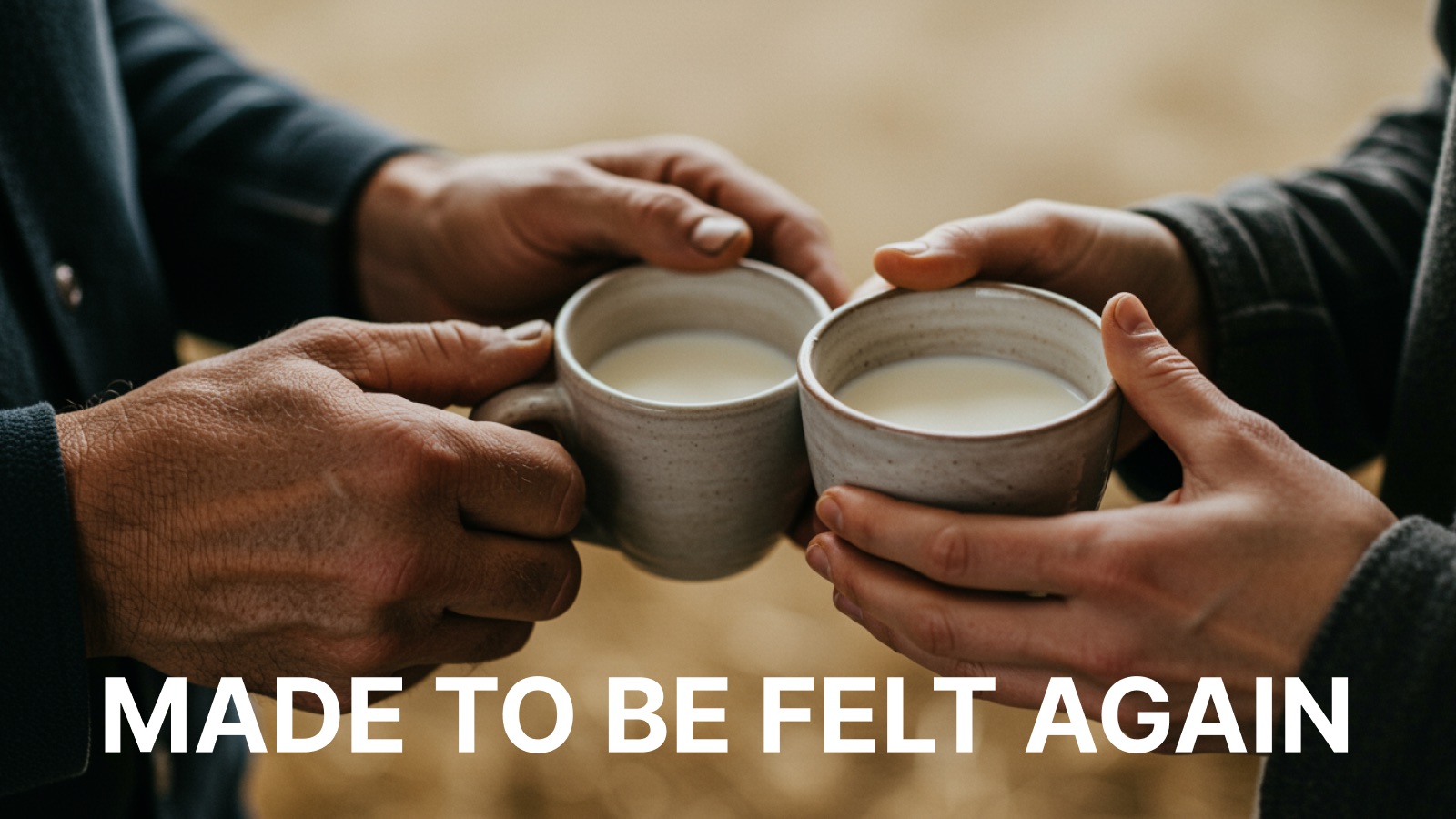
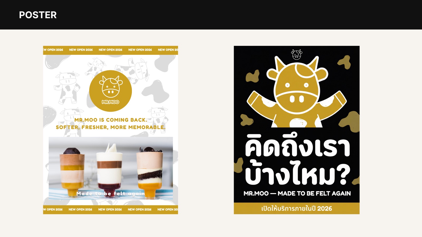
The brand line is "Made to be felt." For the relaunch, one word is added — again — speaking directly to past customers: the warmth you remember never left. It was waiting.
Objectives
Add everyday products — milk coffee, dairy snacks, grab-and-go.
New revenue from subscription, e-commerce, and frozen delivery.
Win Gen Z with consistent TikTok and Reels content.
Reach new audiences through lifestyle and fashion collaborations.
Talk about Hokkaido heritage and craft, not price.
Modernise the identity while keeping Mr. Mooooo as the anchor.
Logo
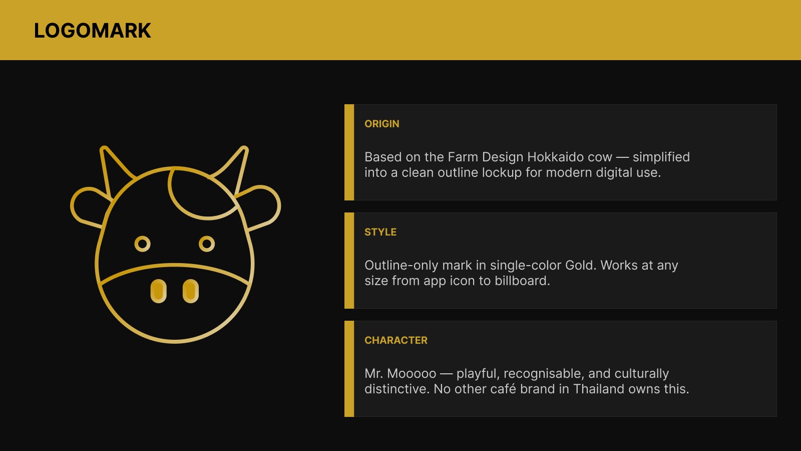
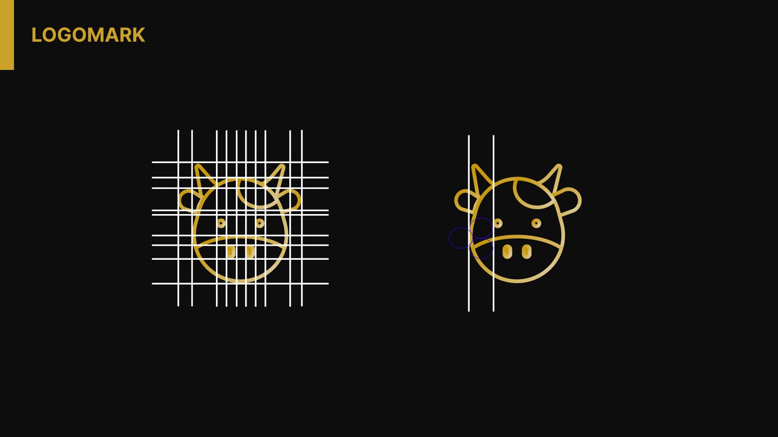
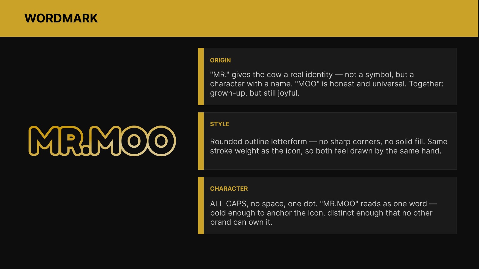
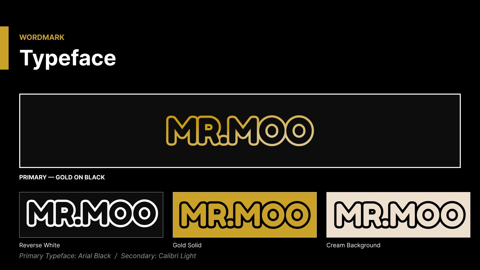
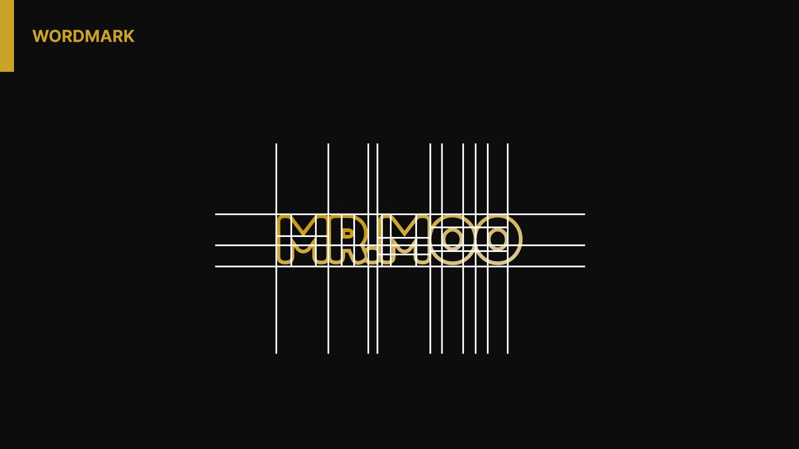
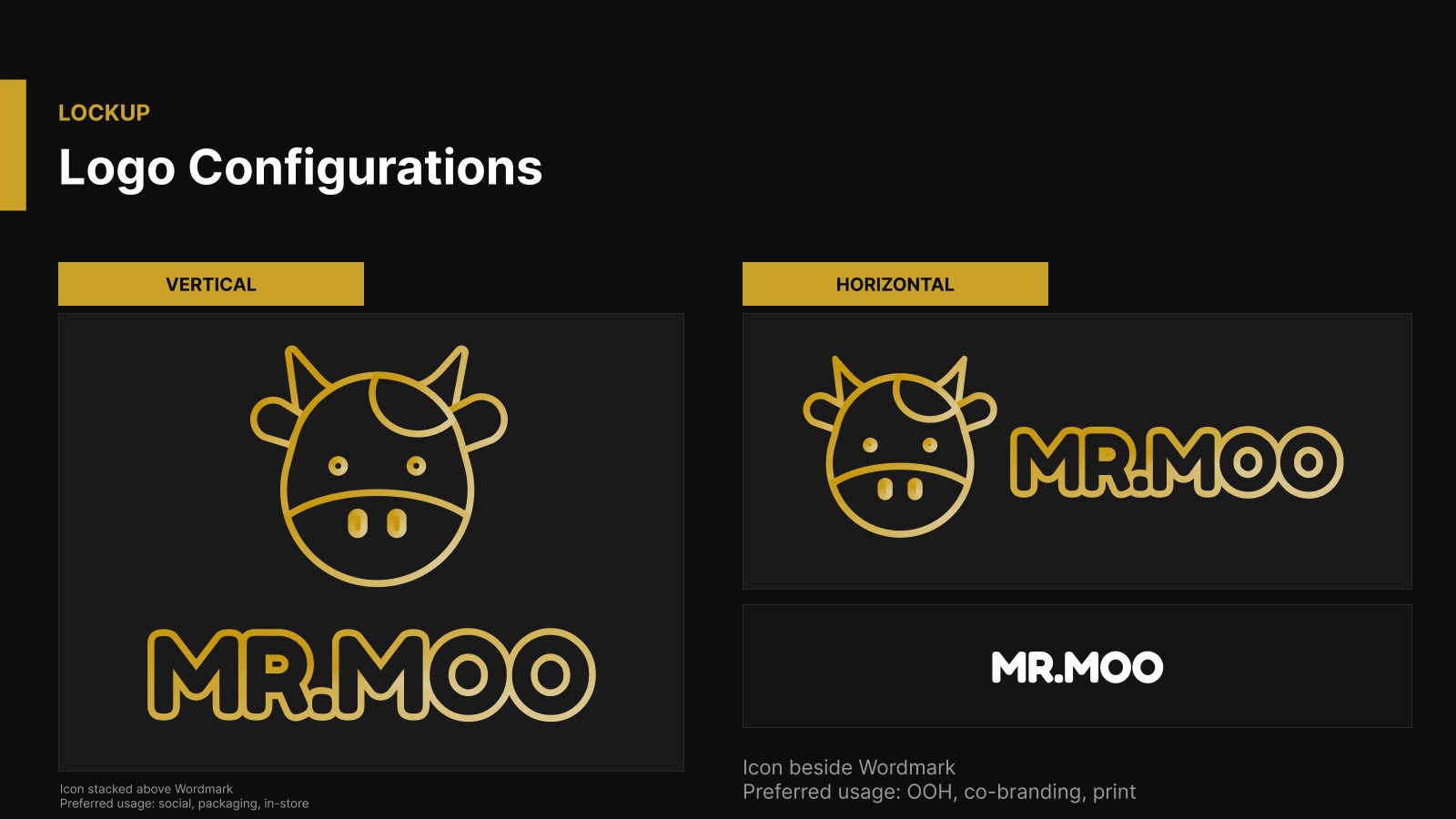
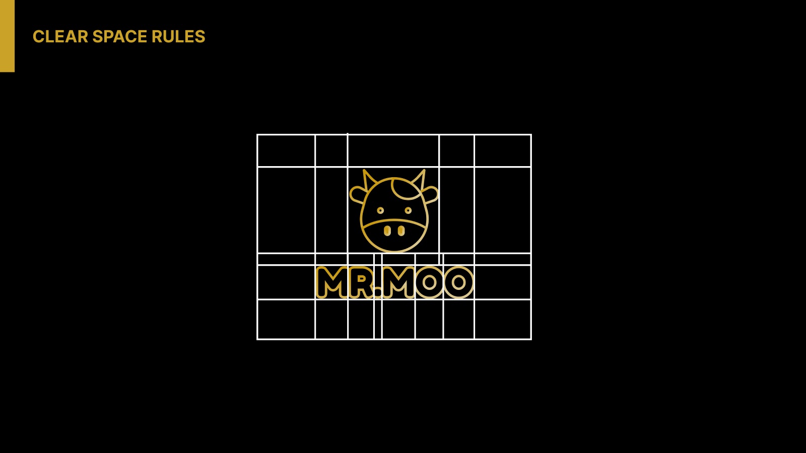
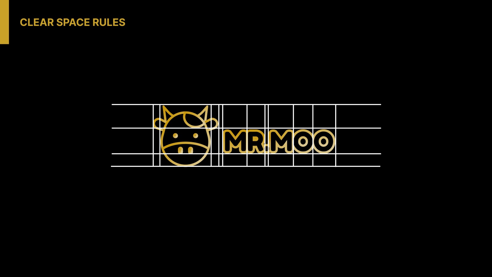
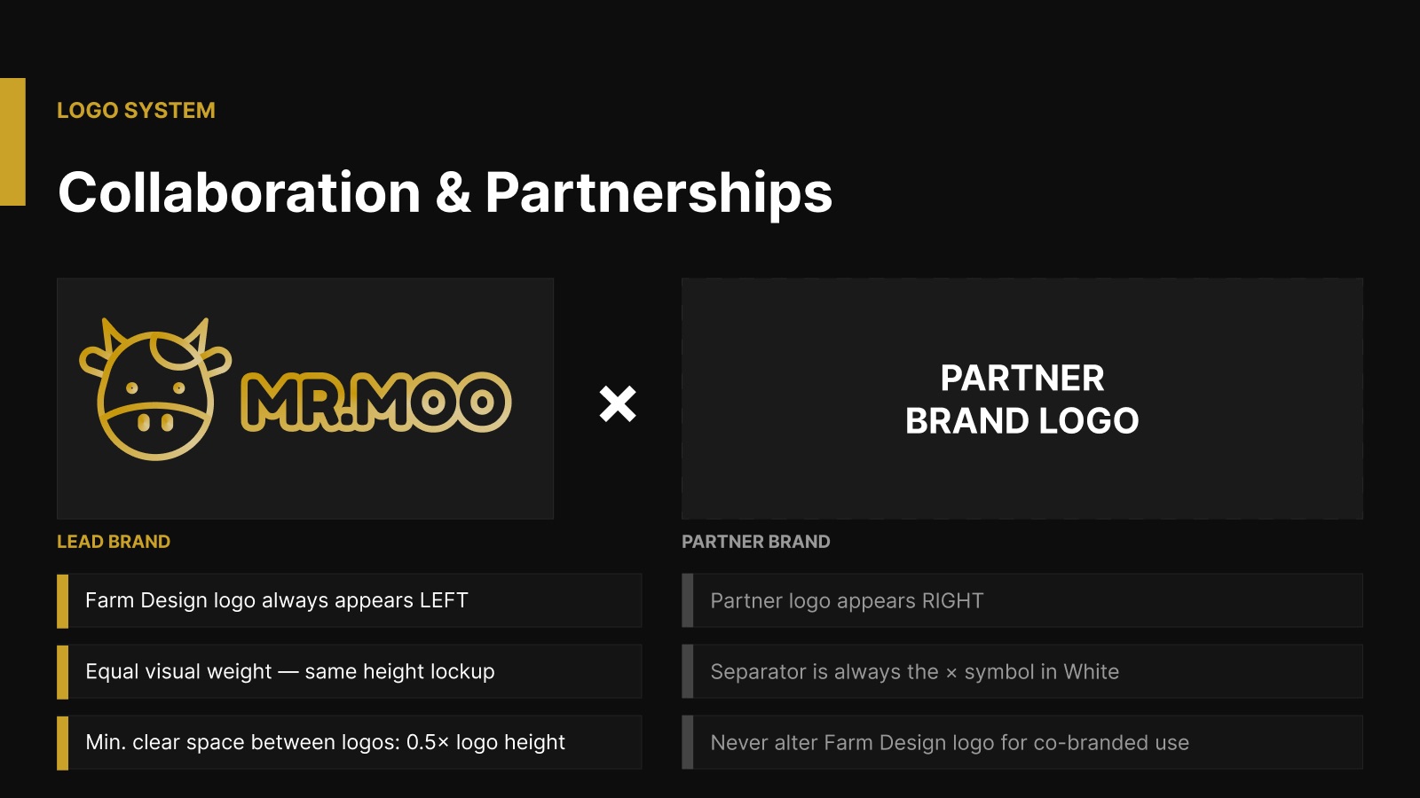
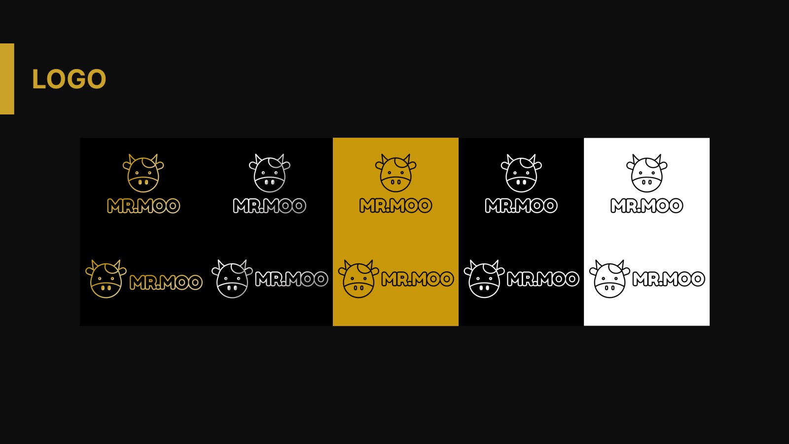
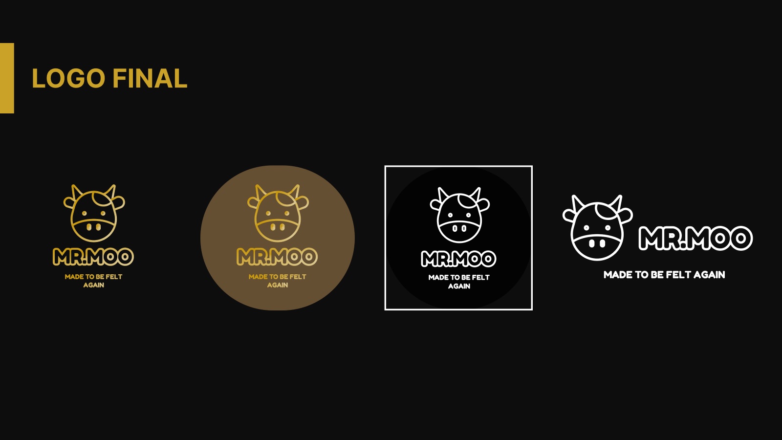
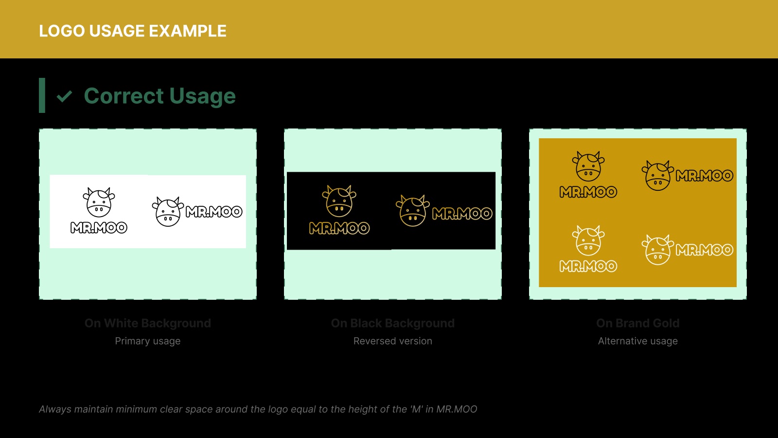
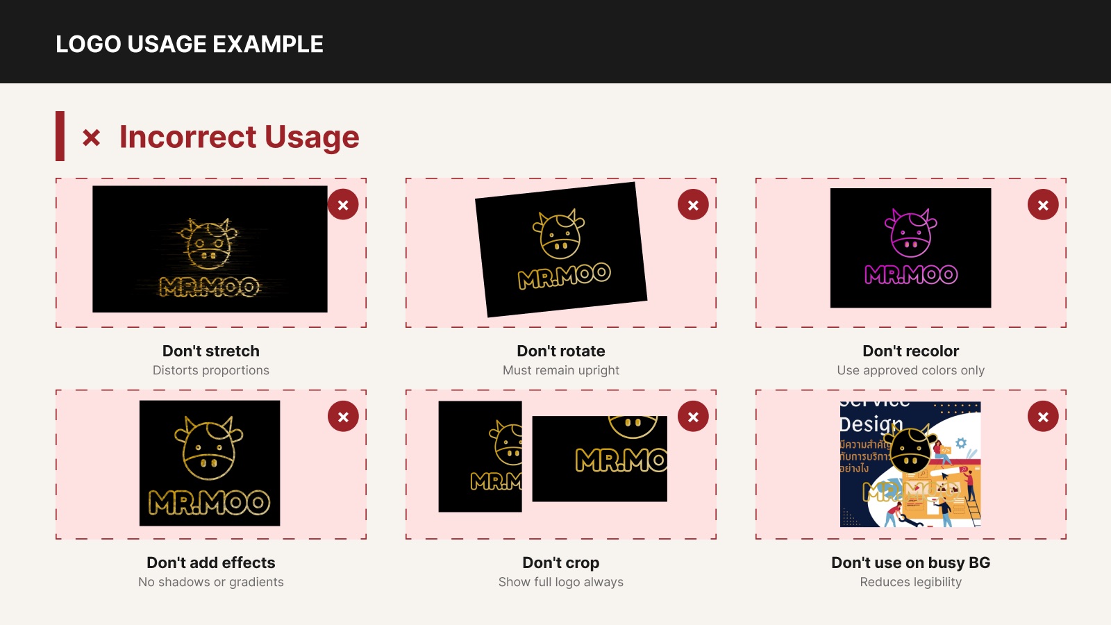
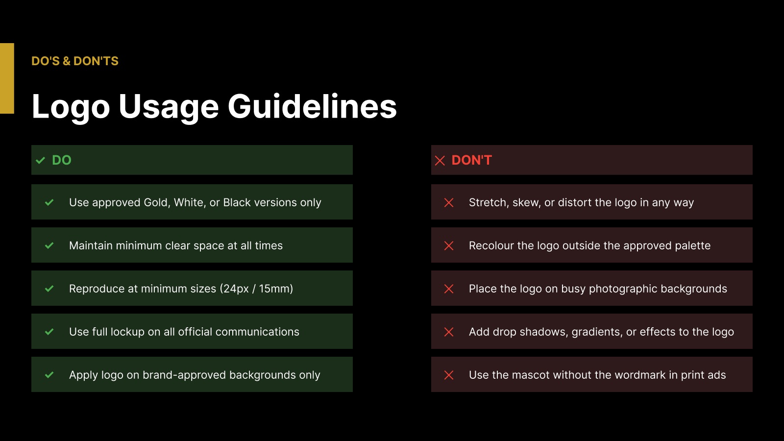
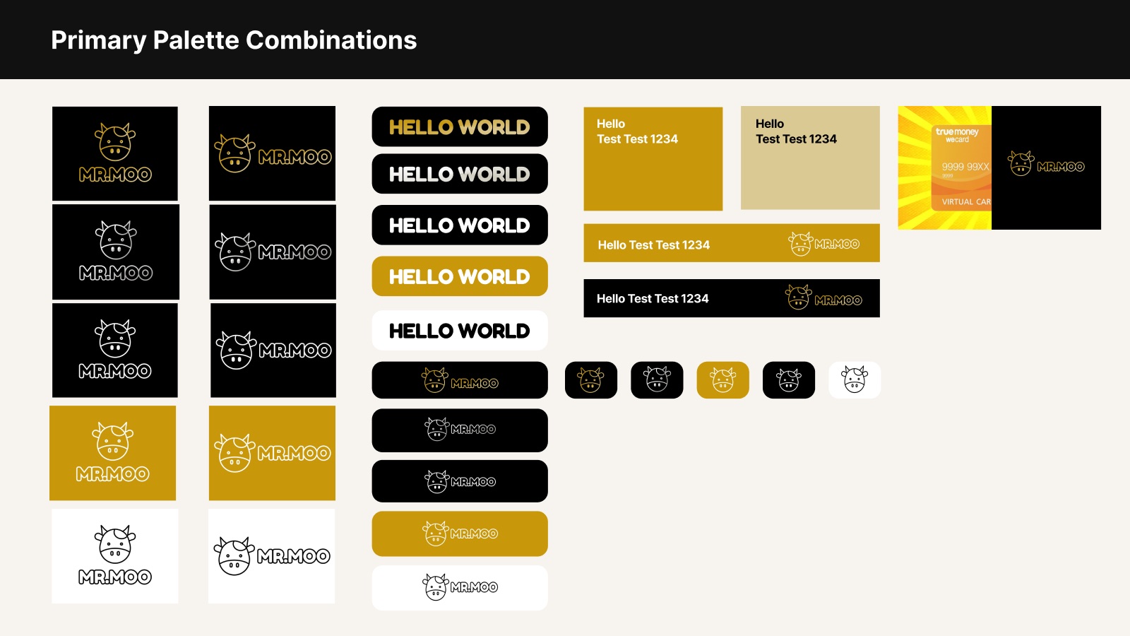
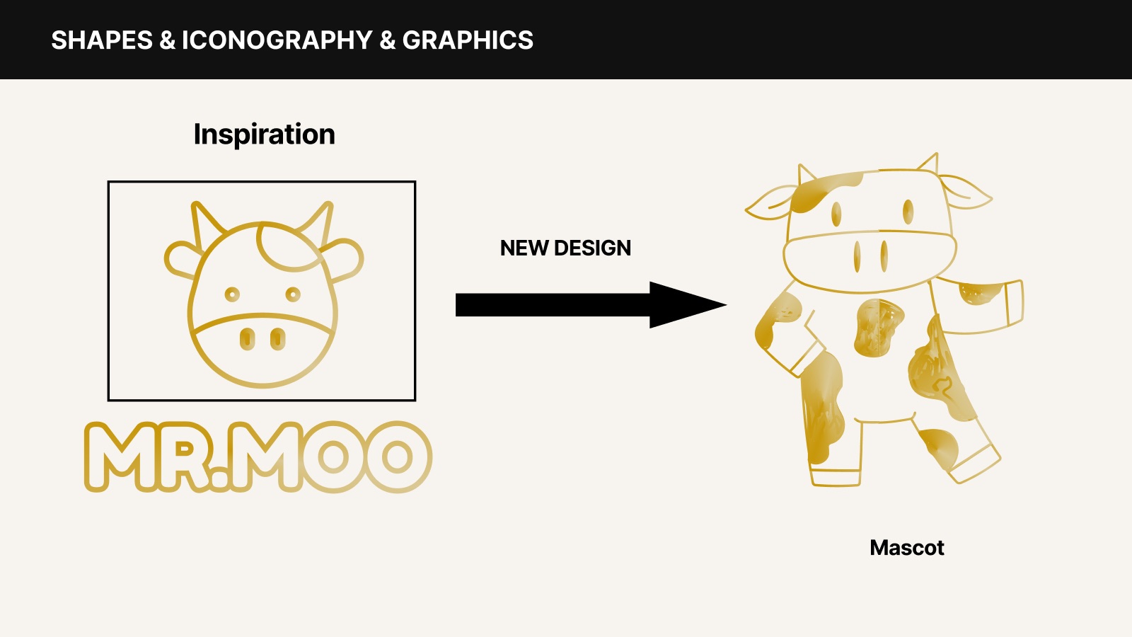
The Farm Design cow is simplified into a gold outline mark, paired with a rounded "MR.MOO" wordmark drawn with the same stroke — grown-up, but still joyful.
Colour
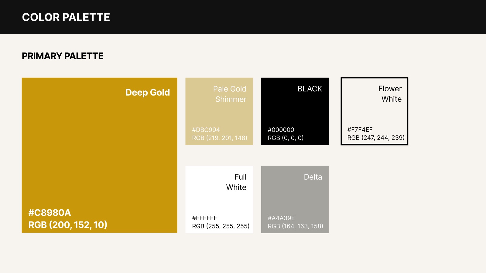
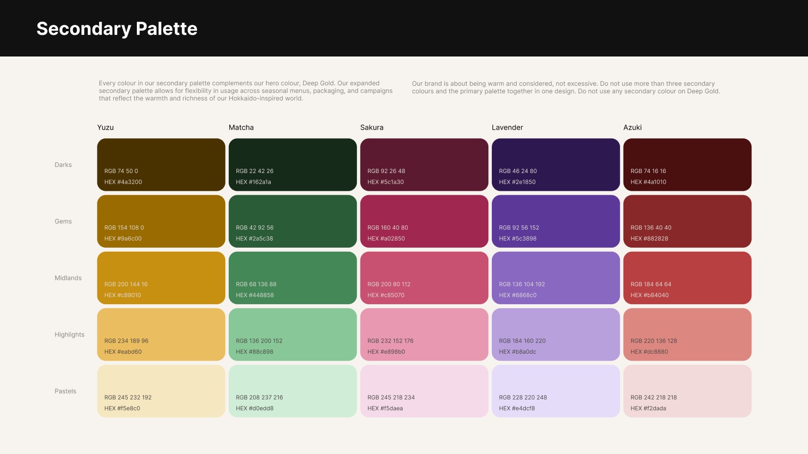
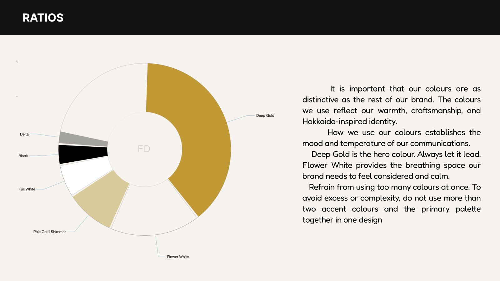
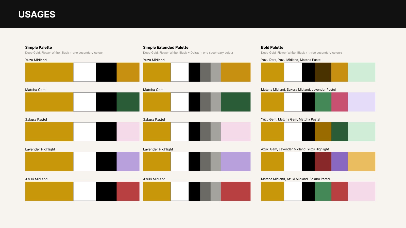
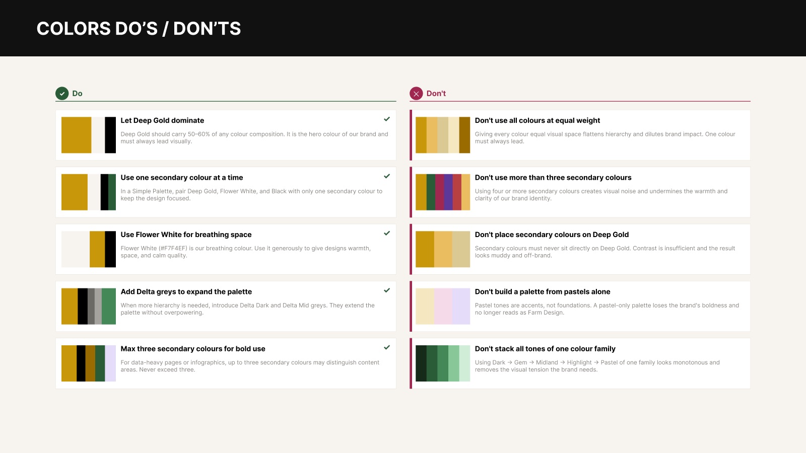
Deep Gold leads (50–60% of any design), with Flower White for breathing space. Five Japanese-inspired secondary families — Yuzu, Matcha, Sakura, Lavender, Azuki — add seasonal flexibility, max three at a time.
Typography
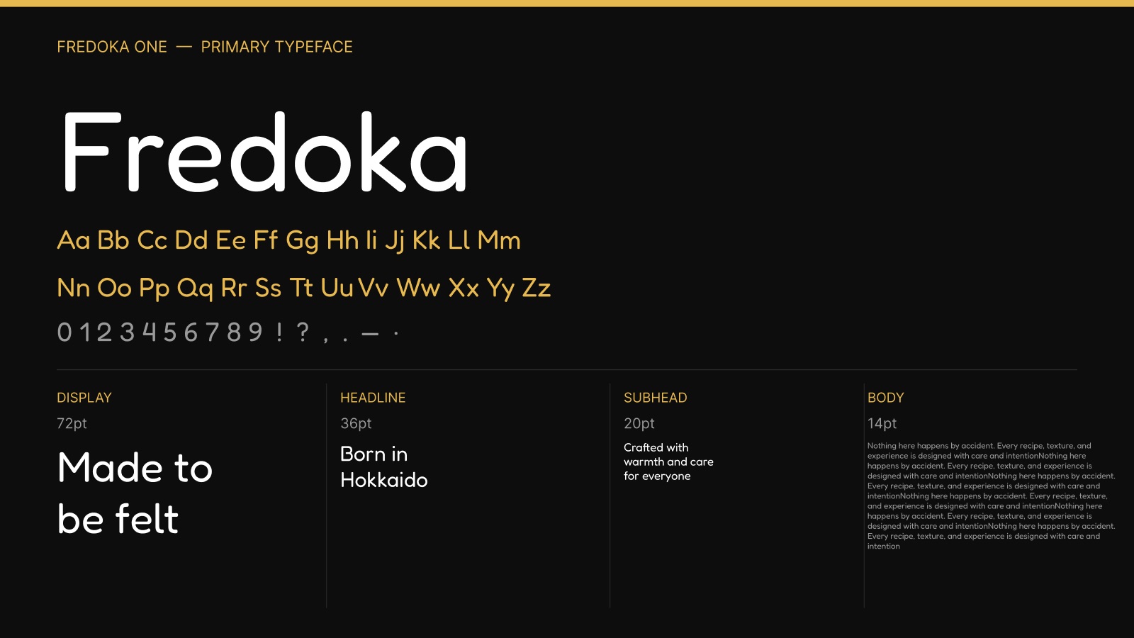
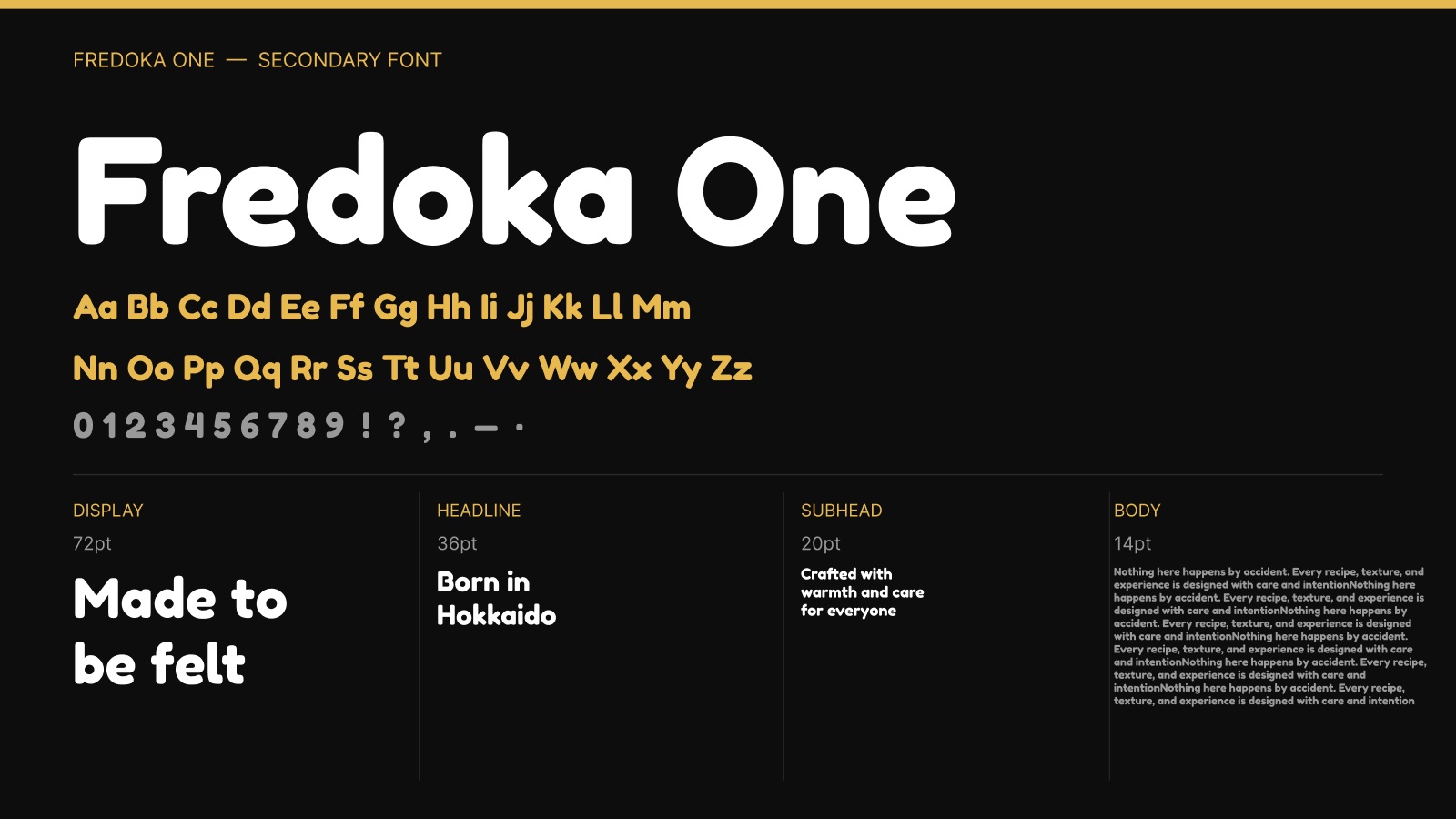
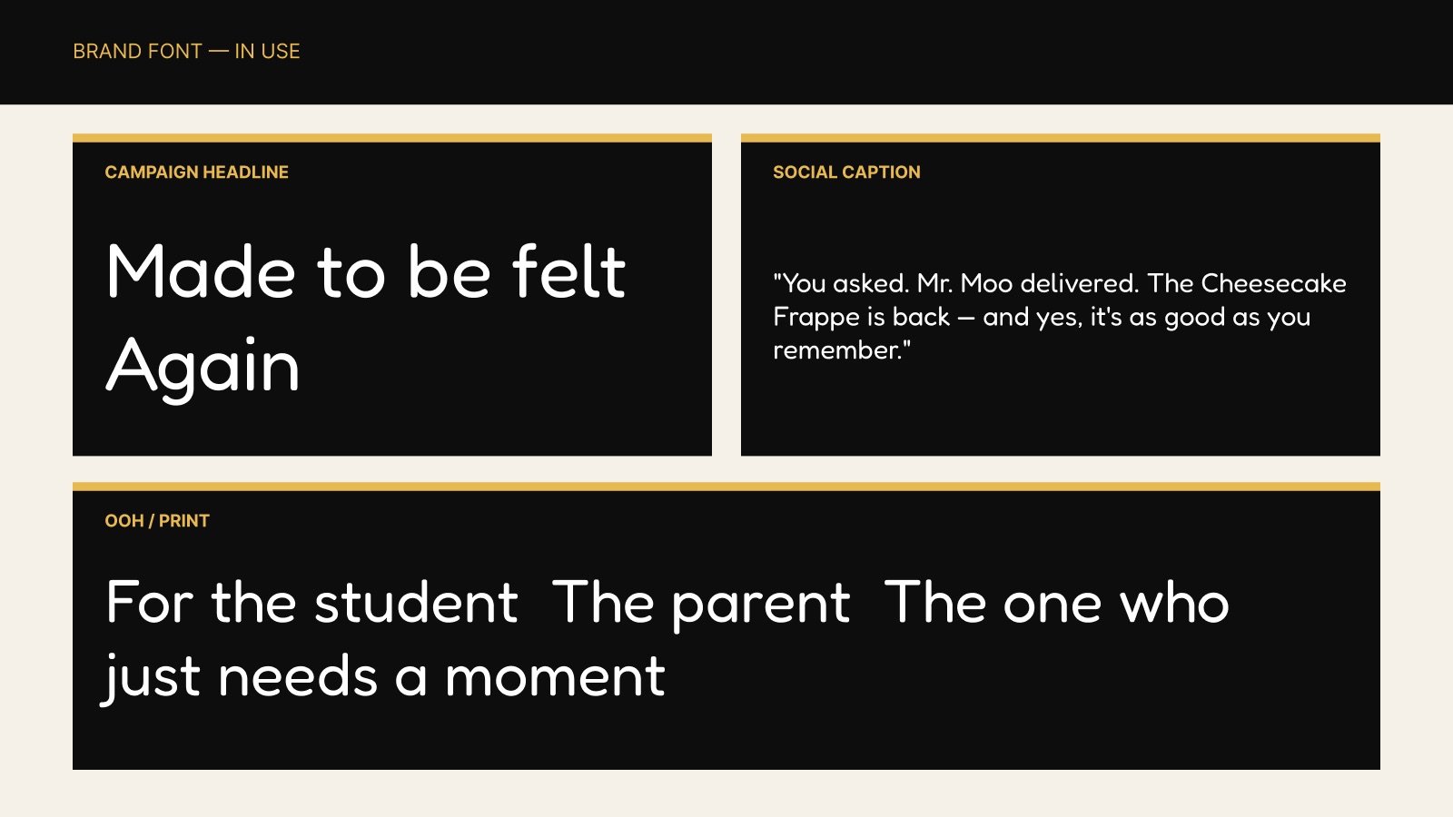
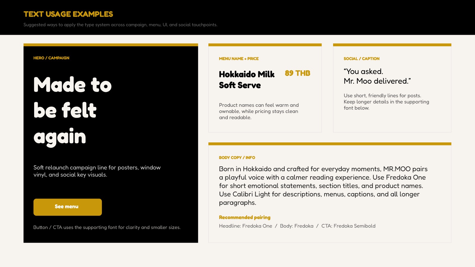
Fredoka and Fredoka One — soft, rounded letterforms that match the logo's friendly curves, from 72pt campaign headlines to 14pt body copy.
Graphic Elements
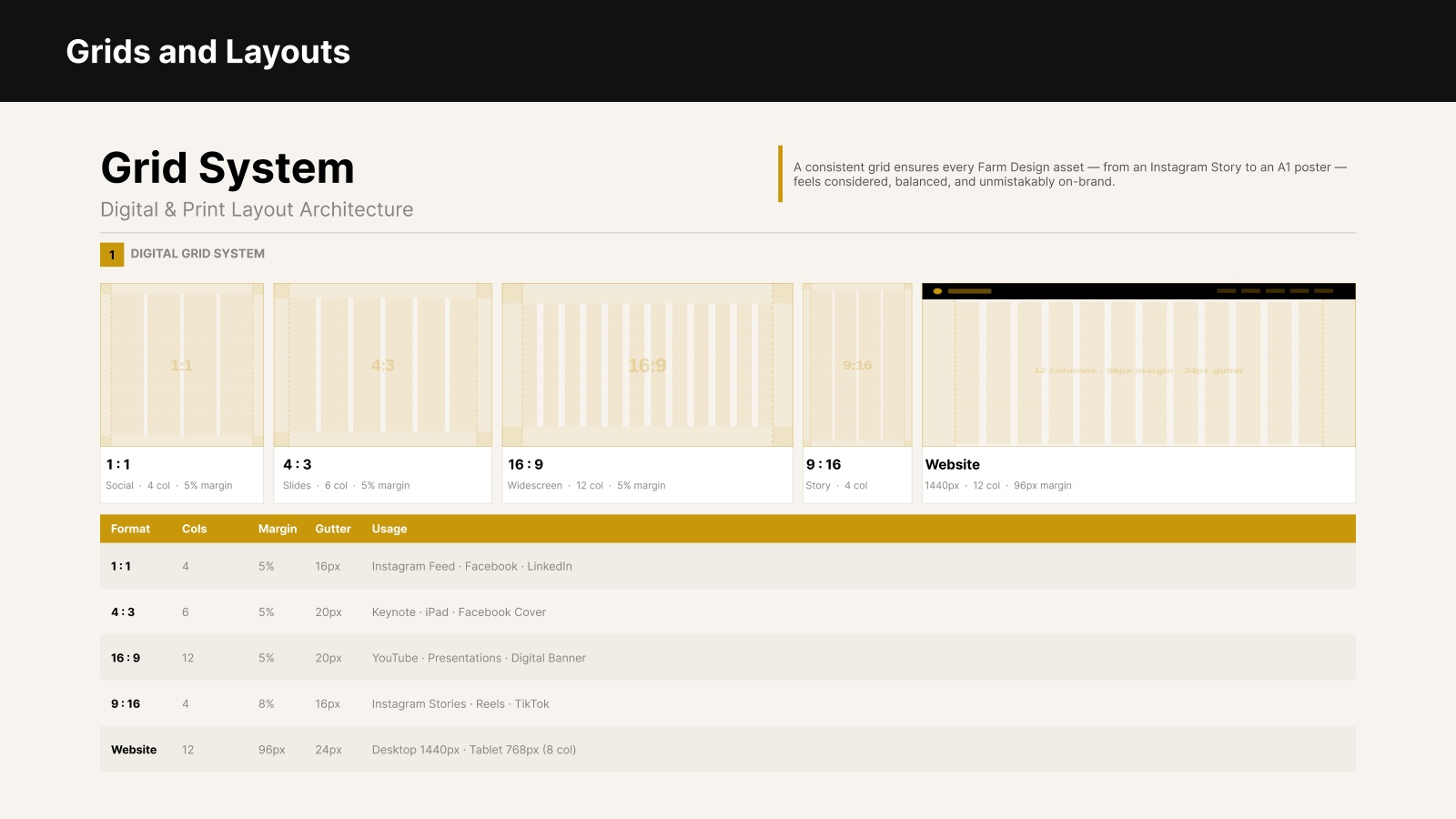
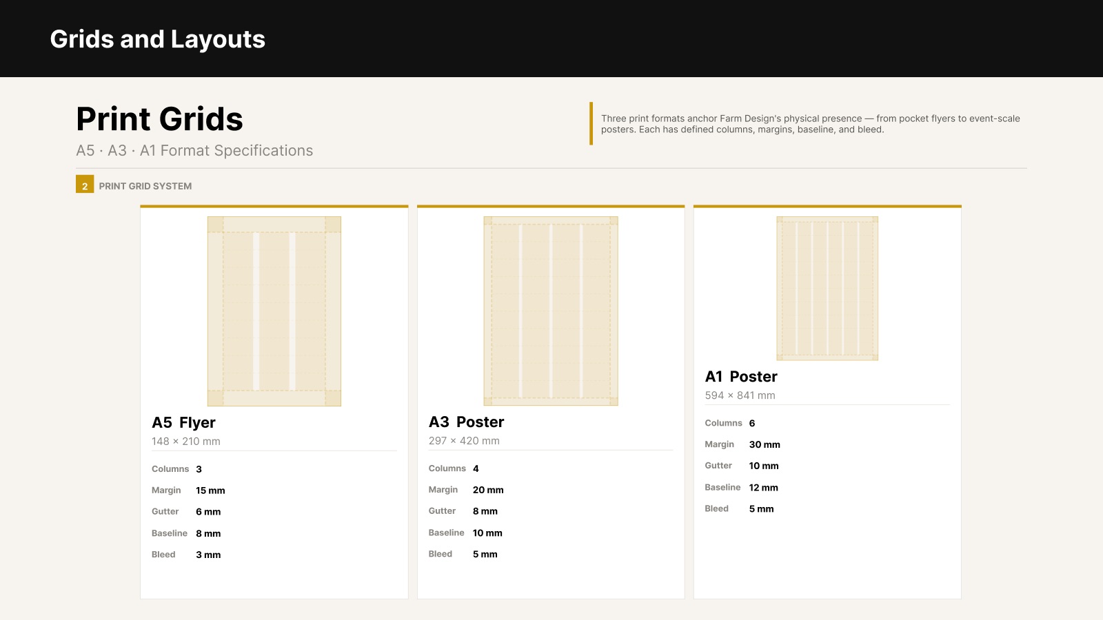
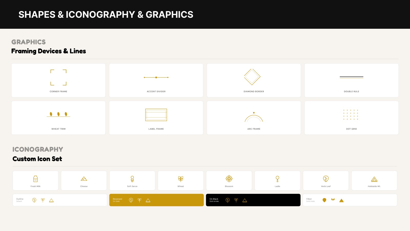
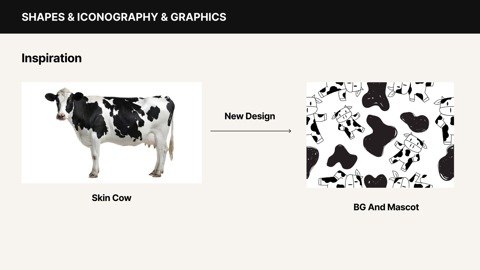
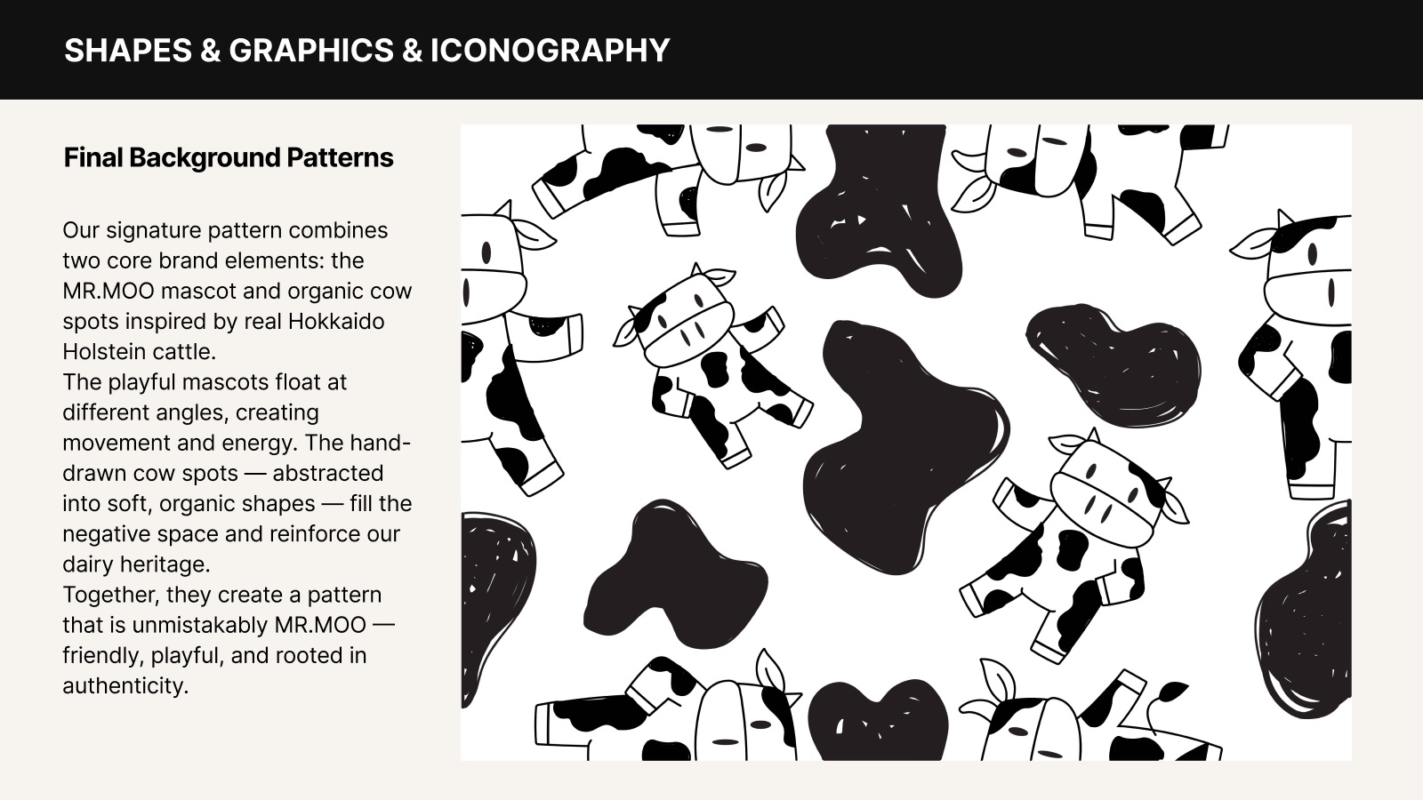
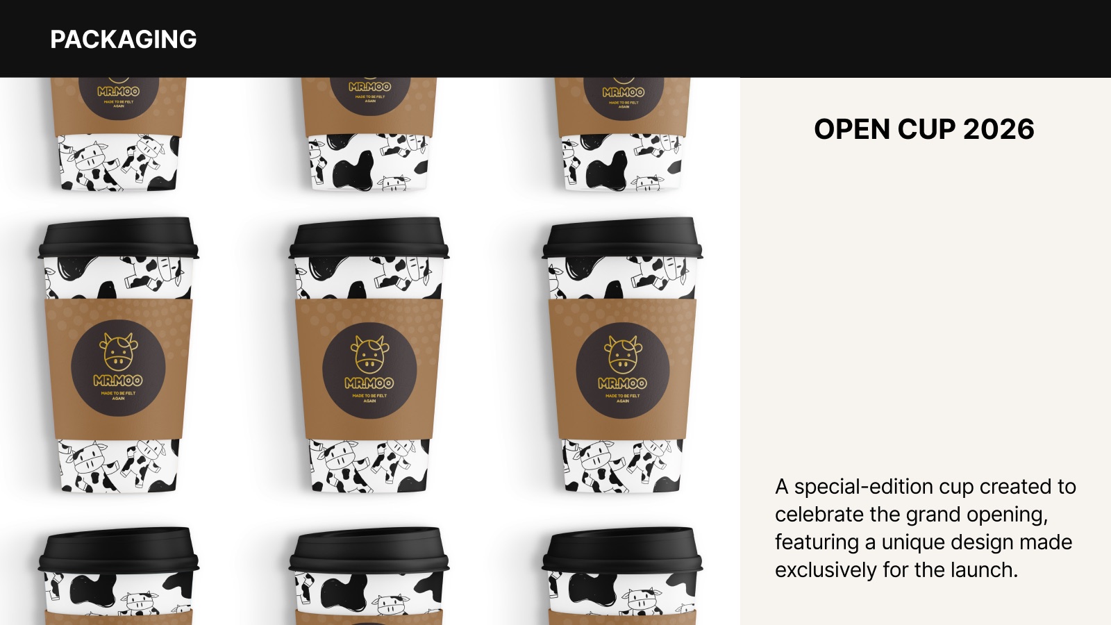
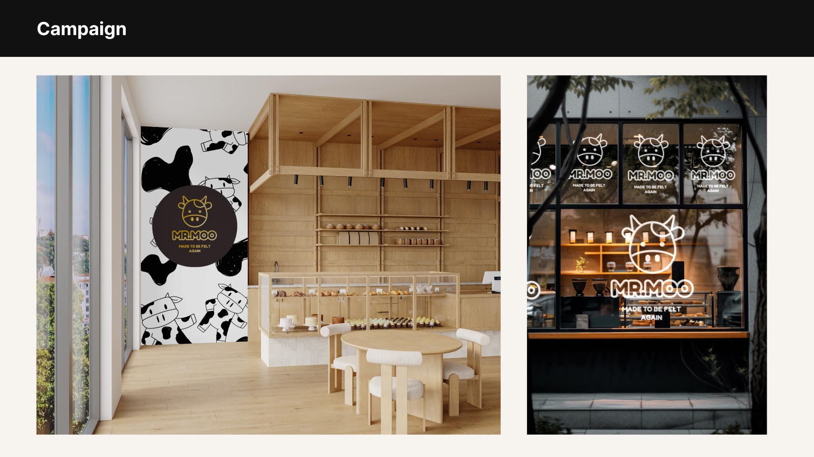
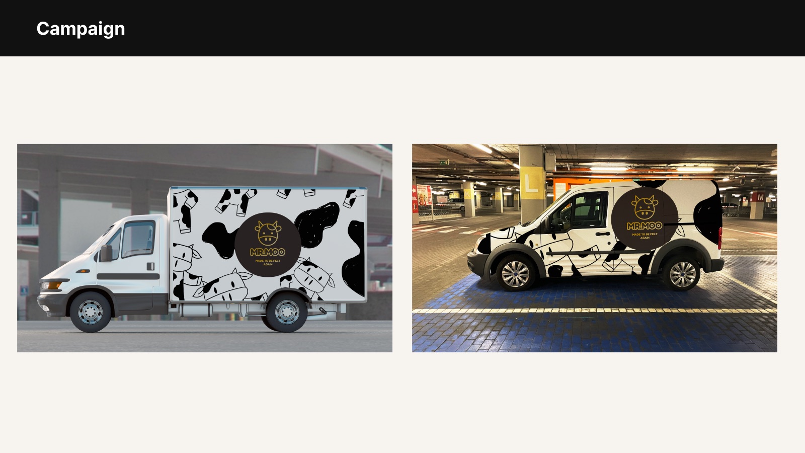
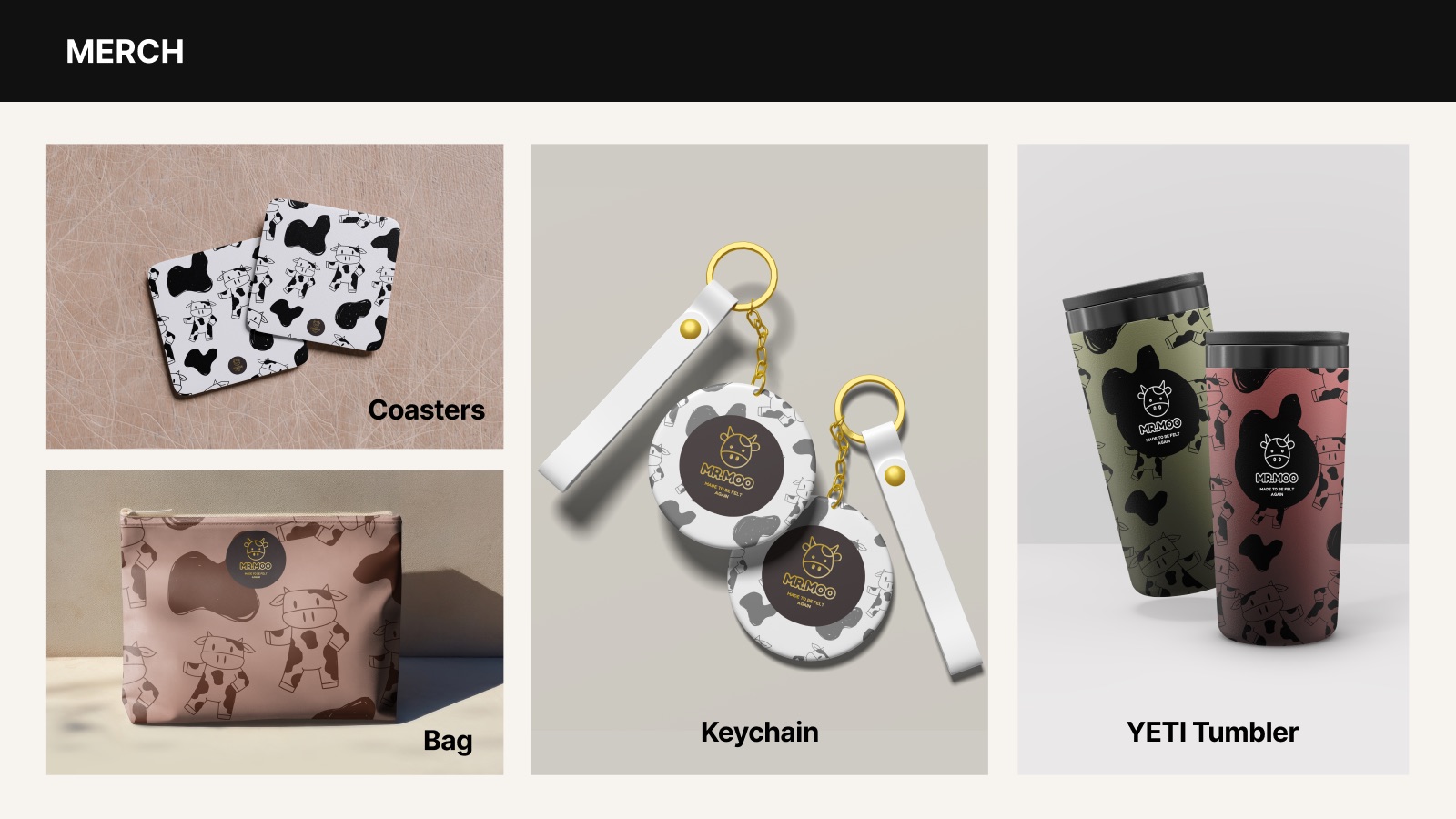
Grids for every format, a custom icon set, framing devices, and a signature pattern: MR.MOO mascots floating among hand-drawn Holstein cow spots.
Art Direction
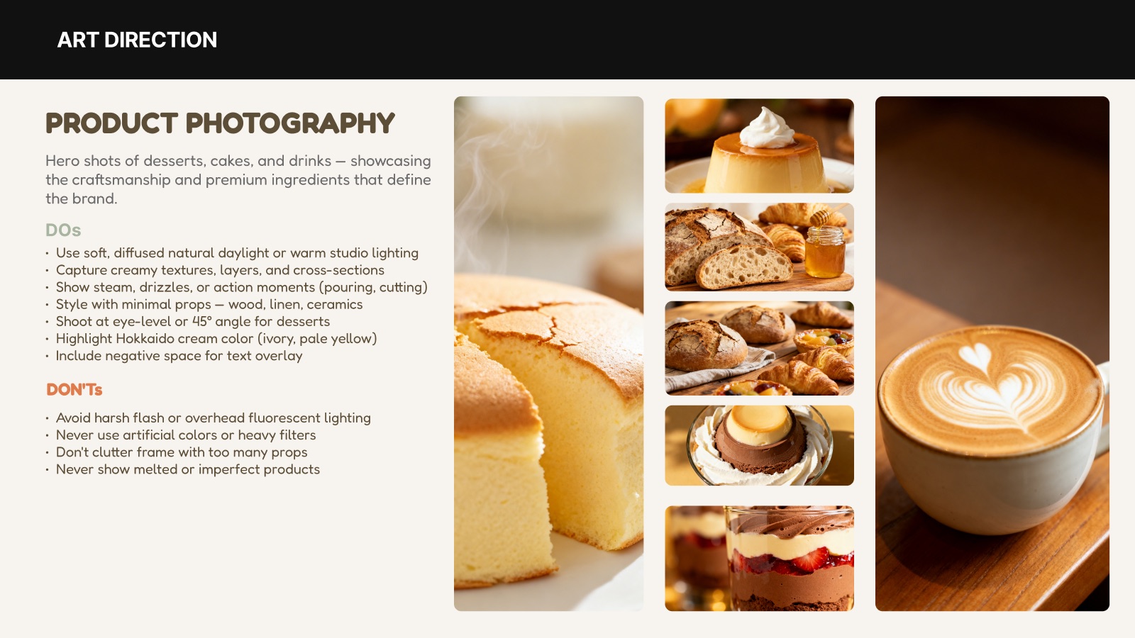
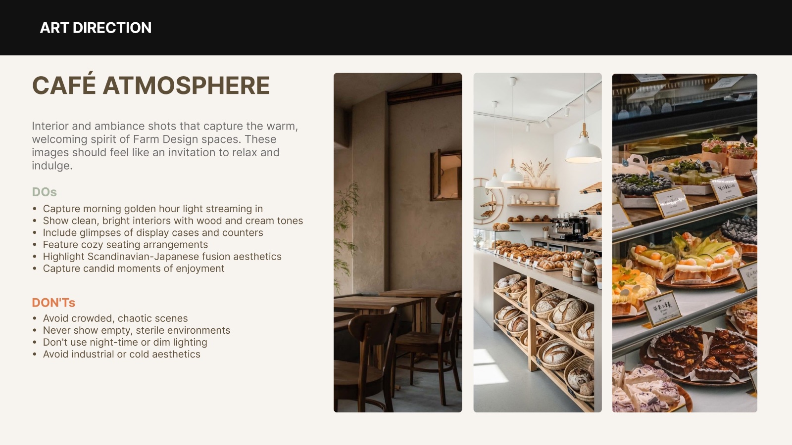
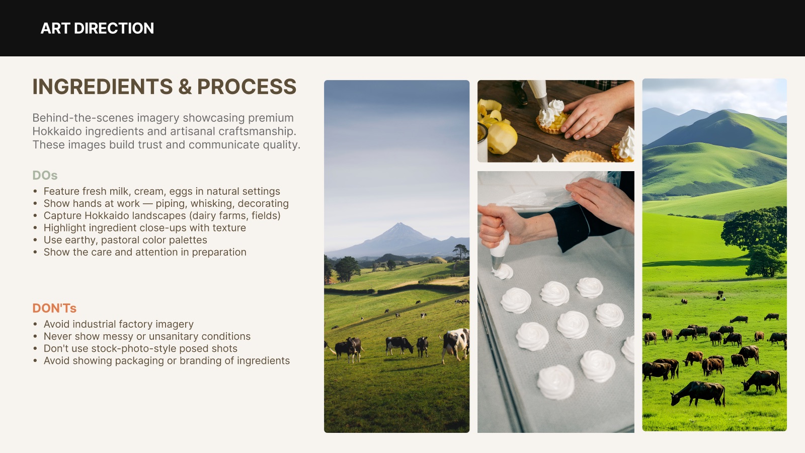
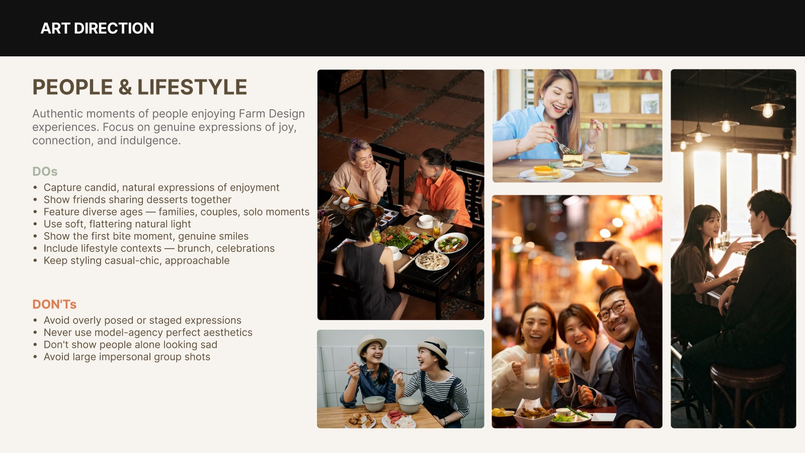
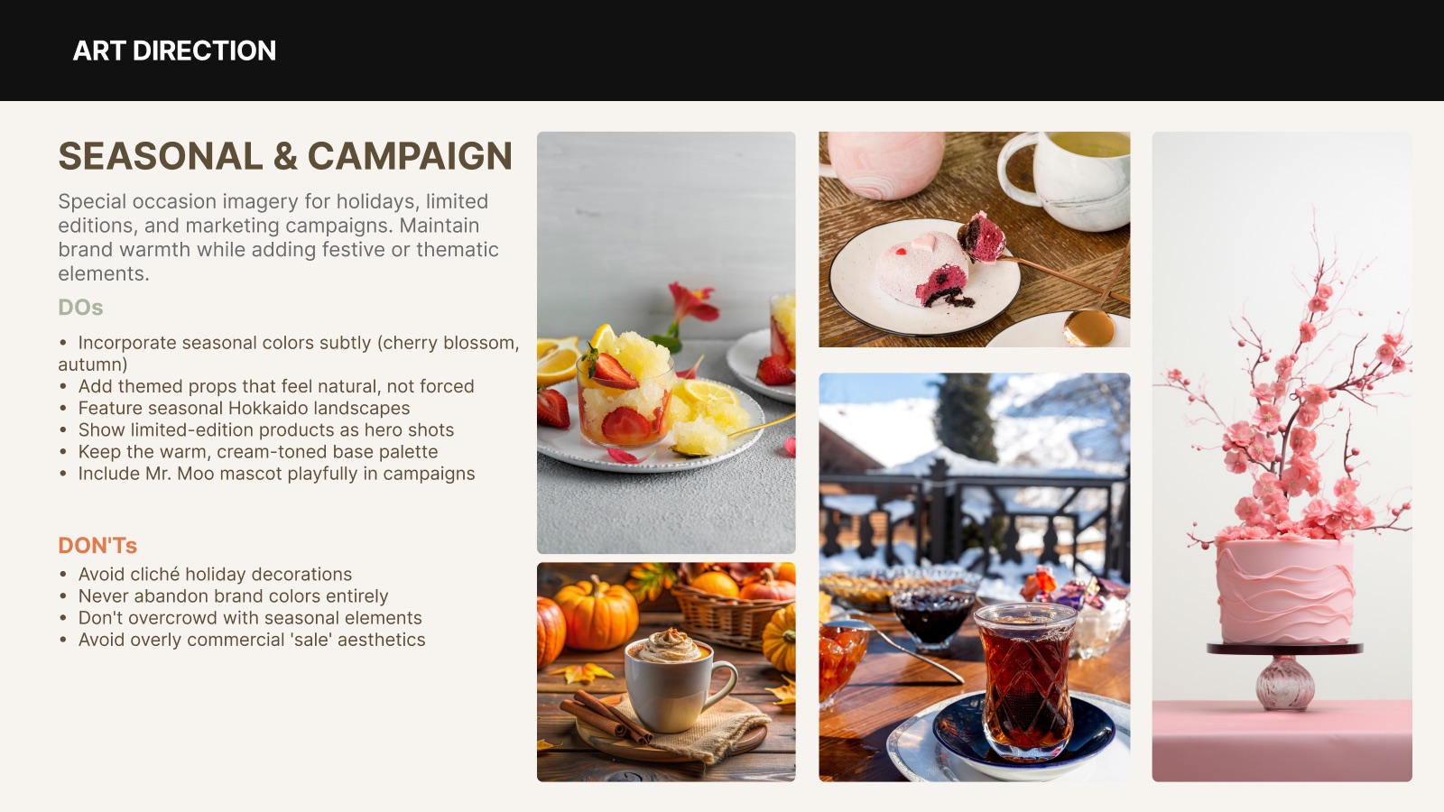
Warm, natural light and honest moments across five photo themes — product, café atmosphere, ingredients & process, people & lifestyle, and seasonal campaigns.
Applications
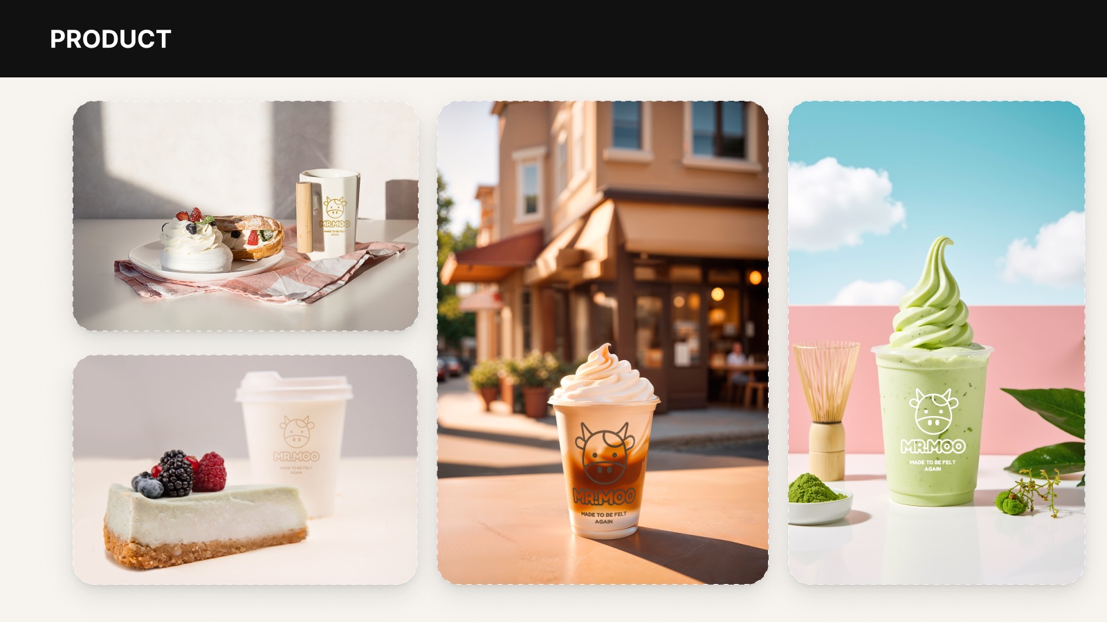
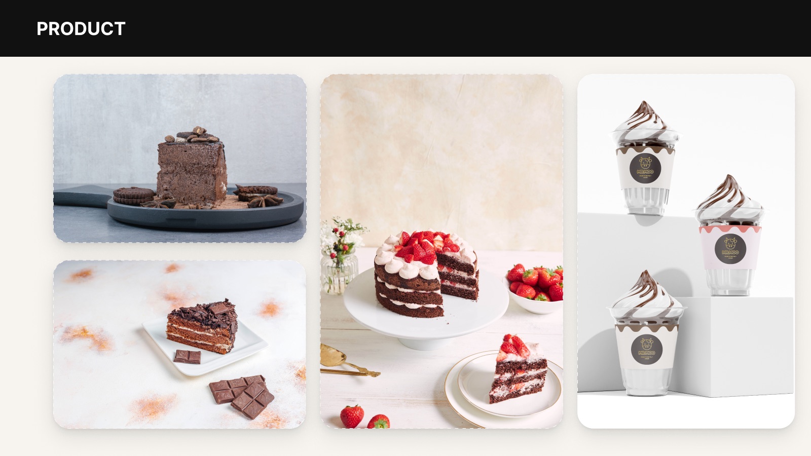
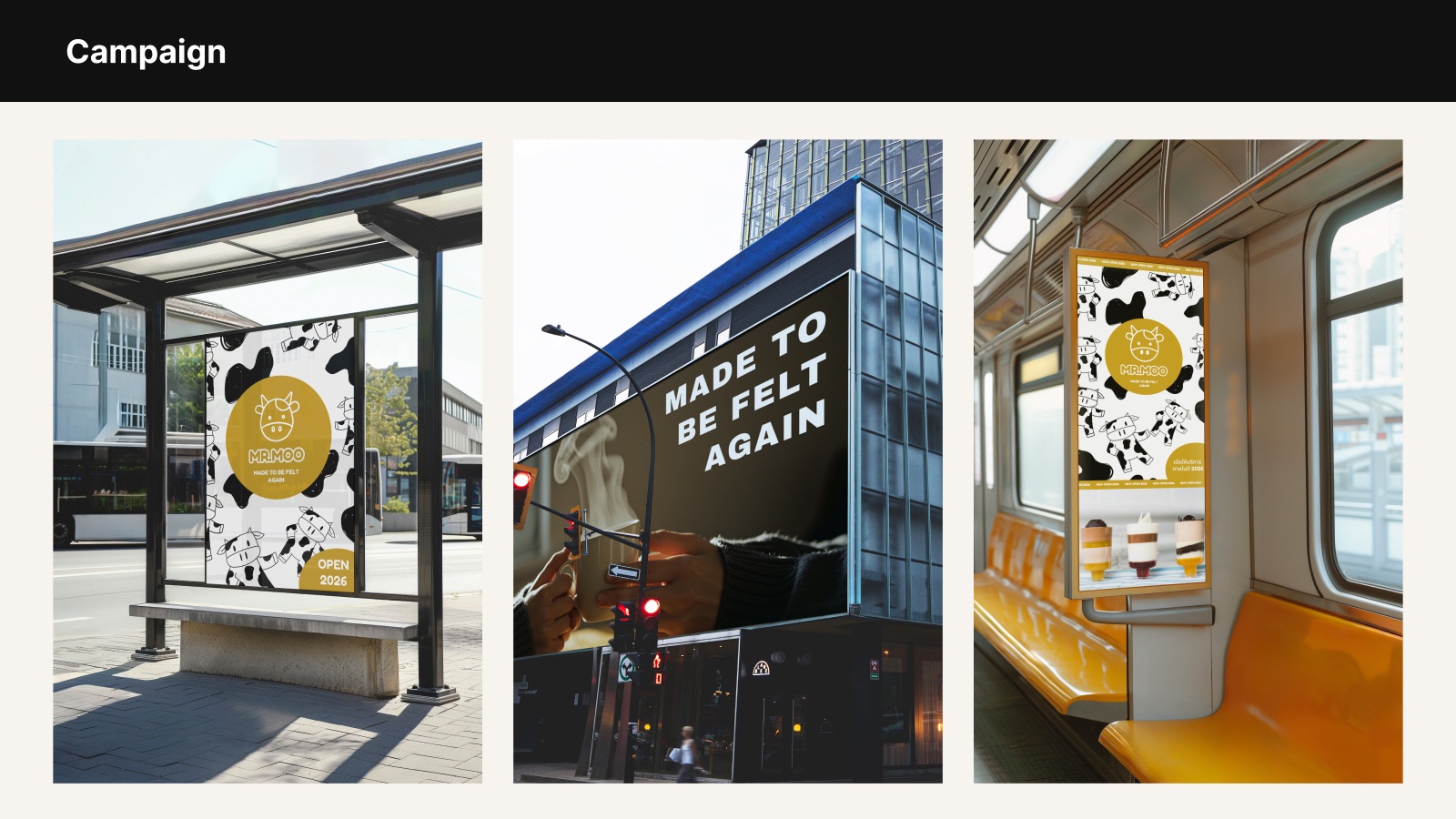
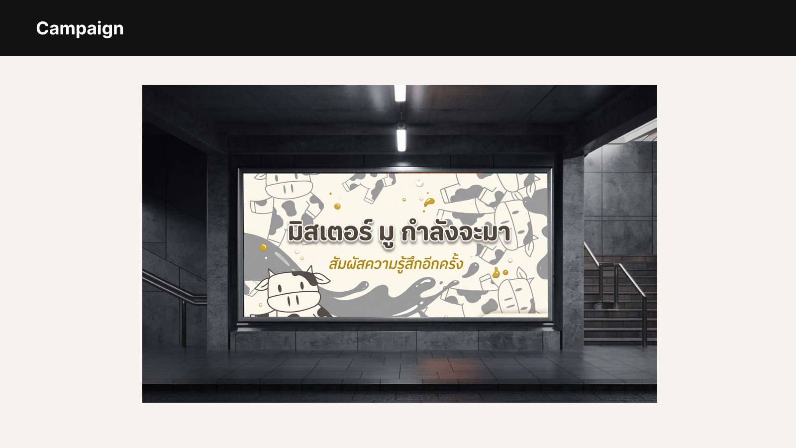
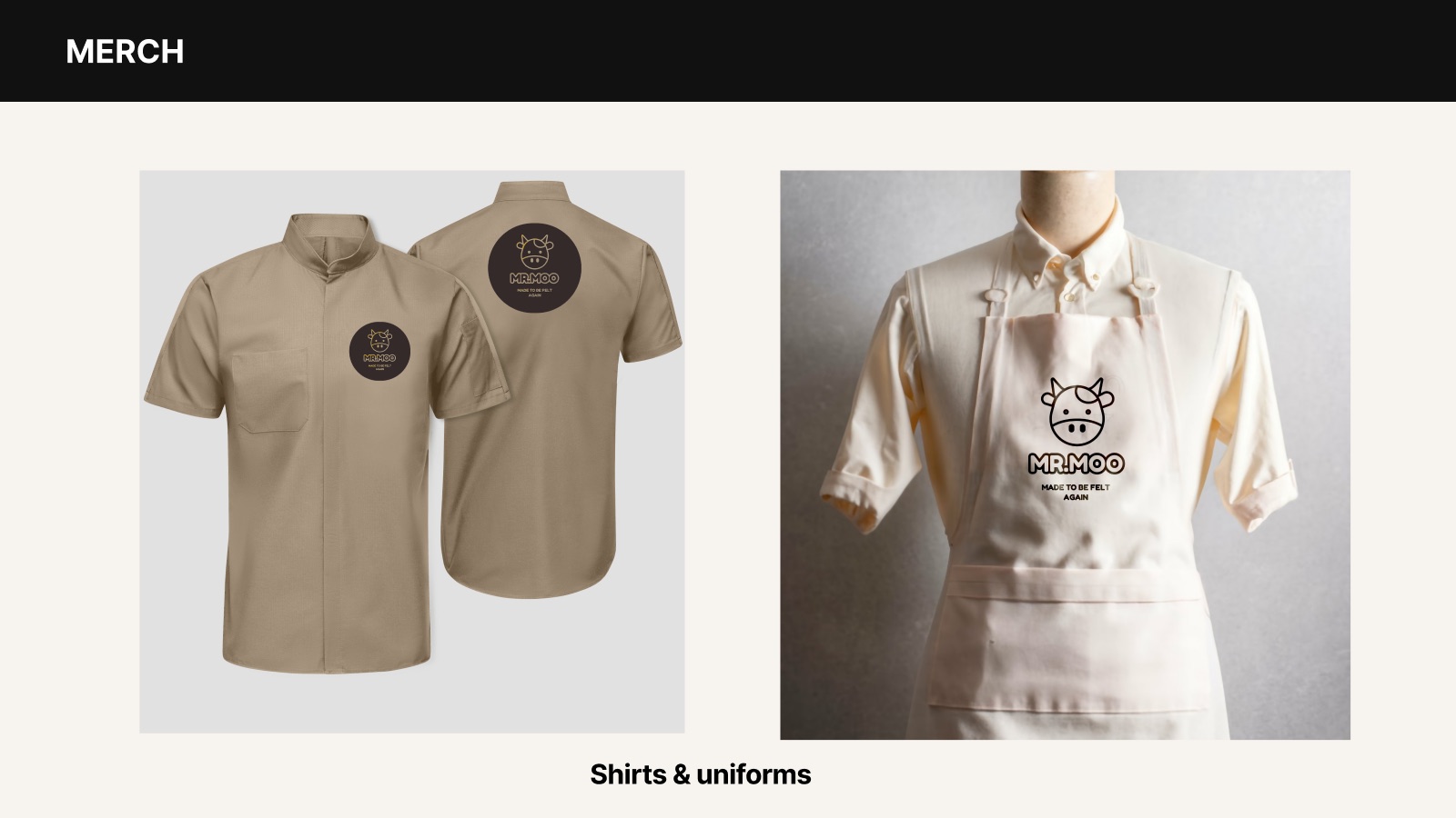
The identity across product, print, packaging, digital, advertising, and merchandise.
Product & packaging
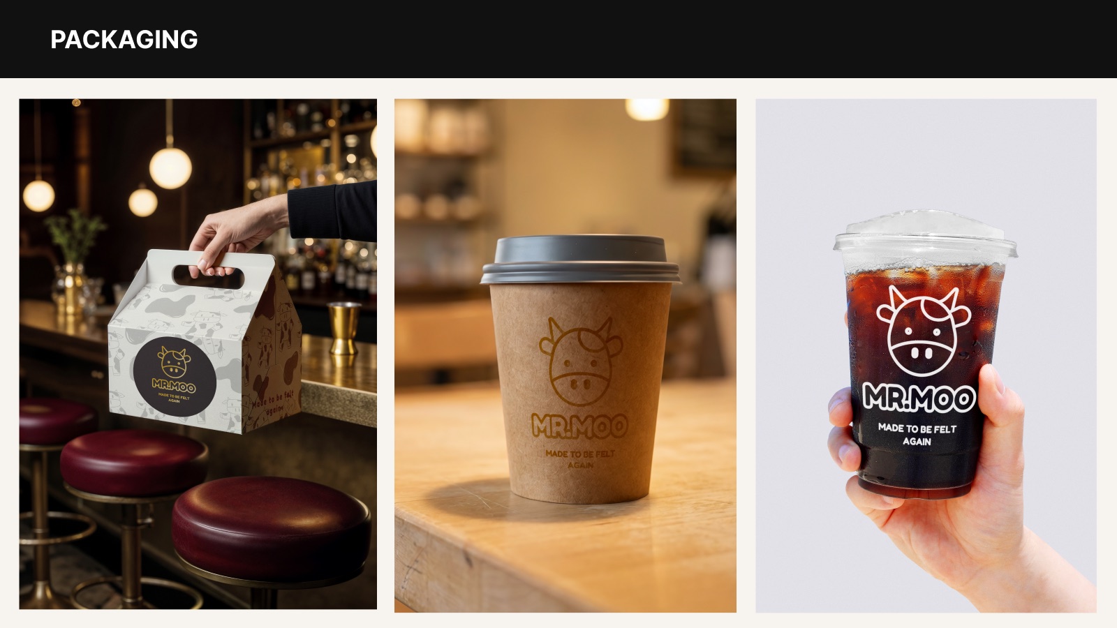
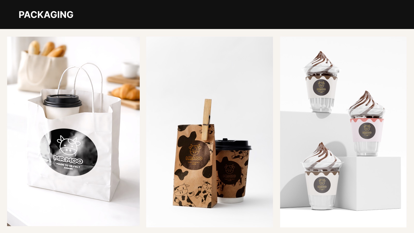
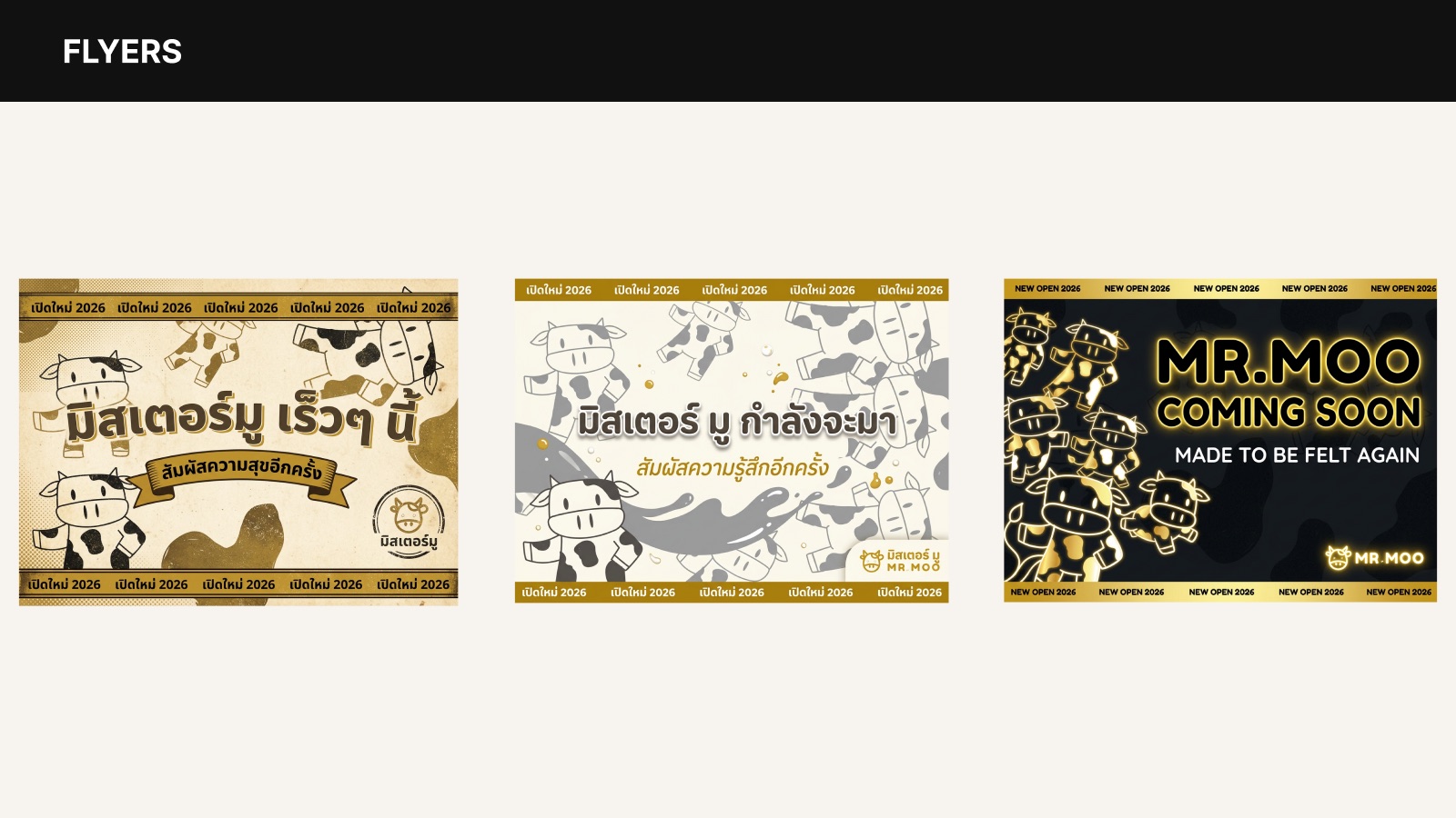
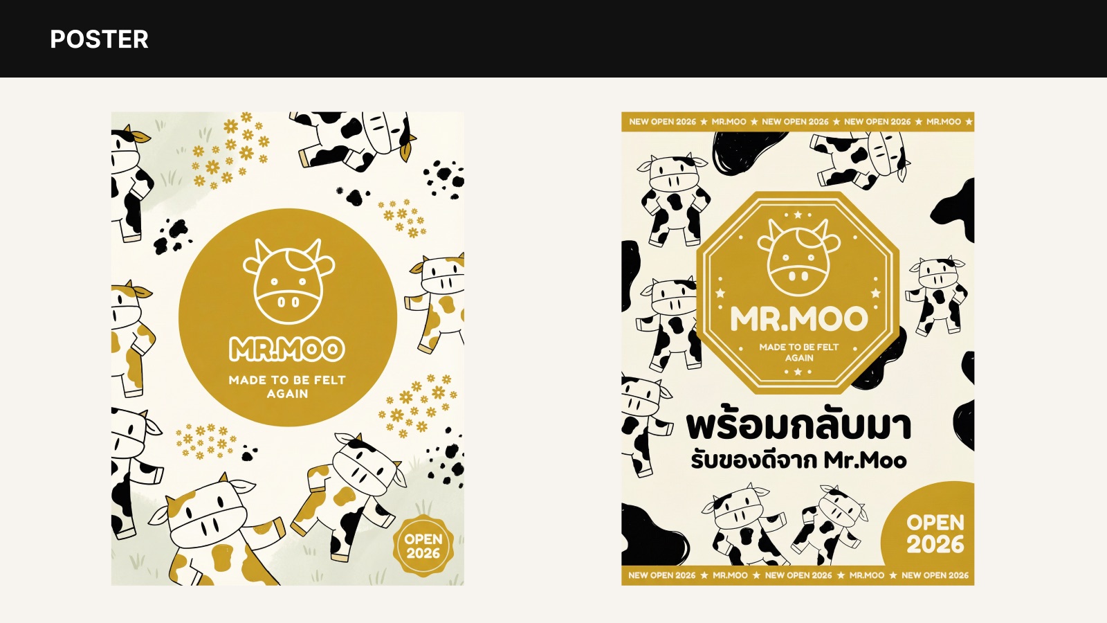
Digital
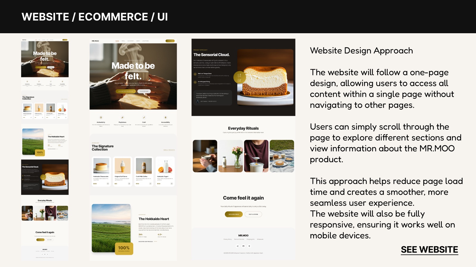
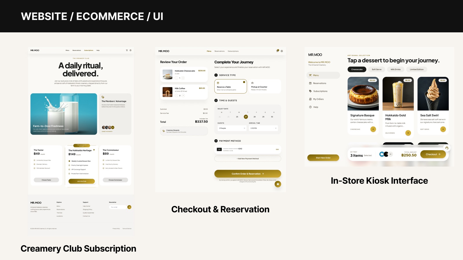
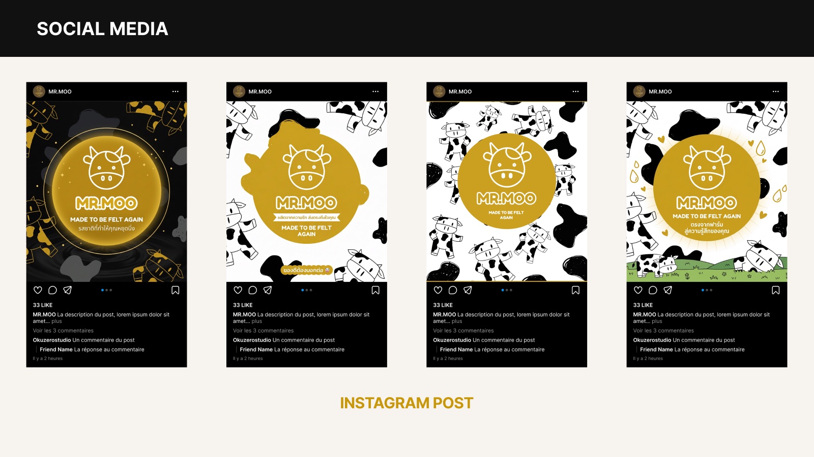
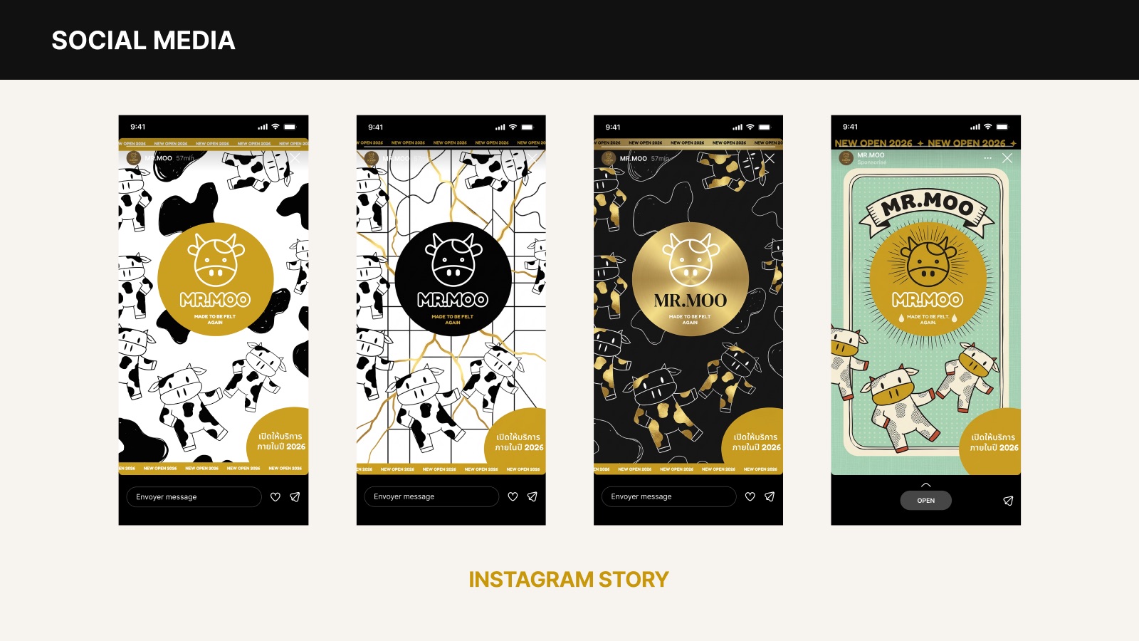
A one-page responsive website, in-store kiosk, Creamery Club subscription, checkout, and social templates. View website prototype →
Marketing & advertising
Apparel & merchandise
Closing
The feeling was never gone. It was waiting — made to be felt again.
This is a self-initiated concept project for portfolio purposes. It is not affiliated with, commissioned by, or endorsed by Farm Design or Boon Rawd Brewery. Brand names belong to their respective owners.