Overview
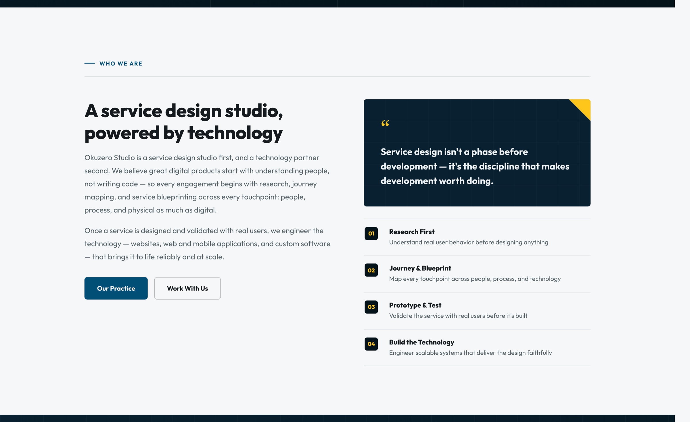
Okuzero Studio researches, blueprints, and prototypes services before building the technology behind them. The website needed to say that clearly — and show the studio is a design partner first, not just a software house.
I designed and built the full one-page site from the company profile and CI assets: information architecture, copy structure, visual system, responsive layout, bilingual EN/TH switching, and a working contact form.
Challenge
"Service design" is unfamiliar to many clients. Most expect a dev agency to start with code.
- Explain an abstract process in a way decision-makers understand quickly.
- Keep technology visible — clients still need to know the studio can build.
- Guide visitors to one clear next step: a discovery workshop or a conversation.
- Work equally well in English and Thai, on desktop and mobile.
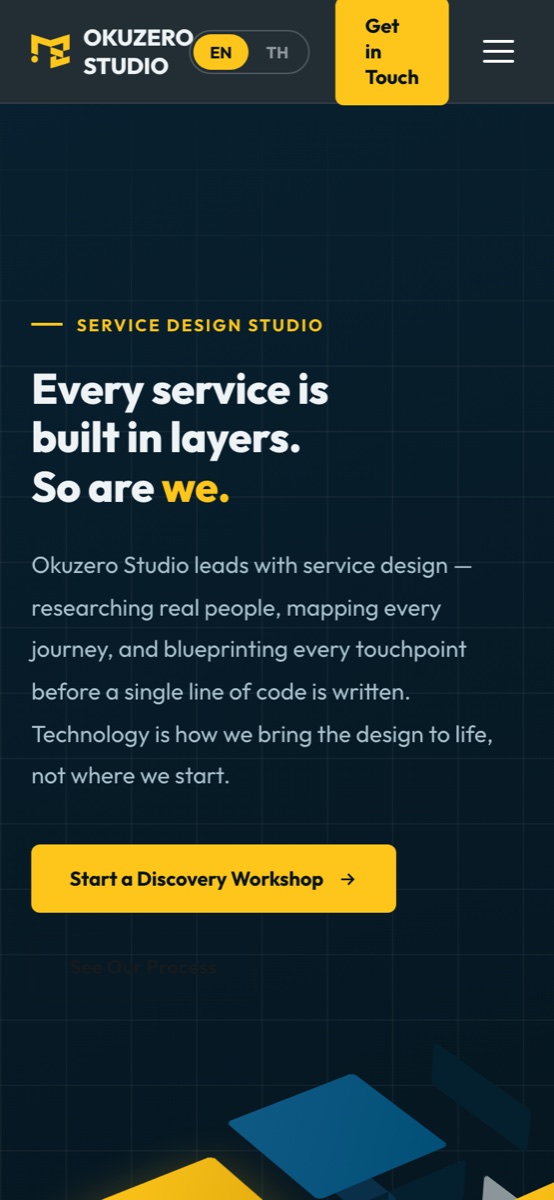
"Every service is built in layers. So are we."
Layers as the idea
Stacked isometric tiles in the hero turn "layers" into a visual metaphor for research, design, and technology.
Brand-true system
Okuzero yellow #FFC500 and deep navy, set in Outfit, with a subtle grid and yellow corner accents on cards.
Design first, tech second
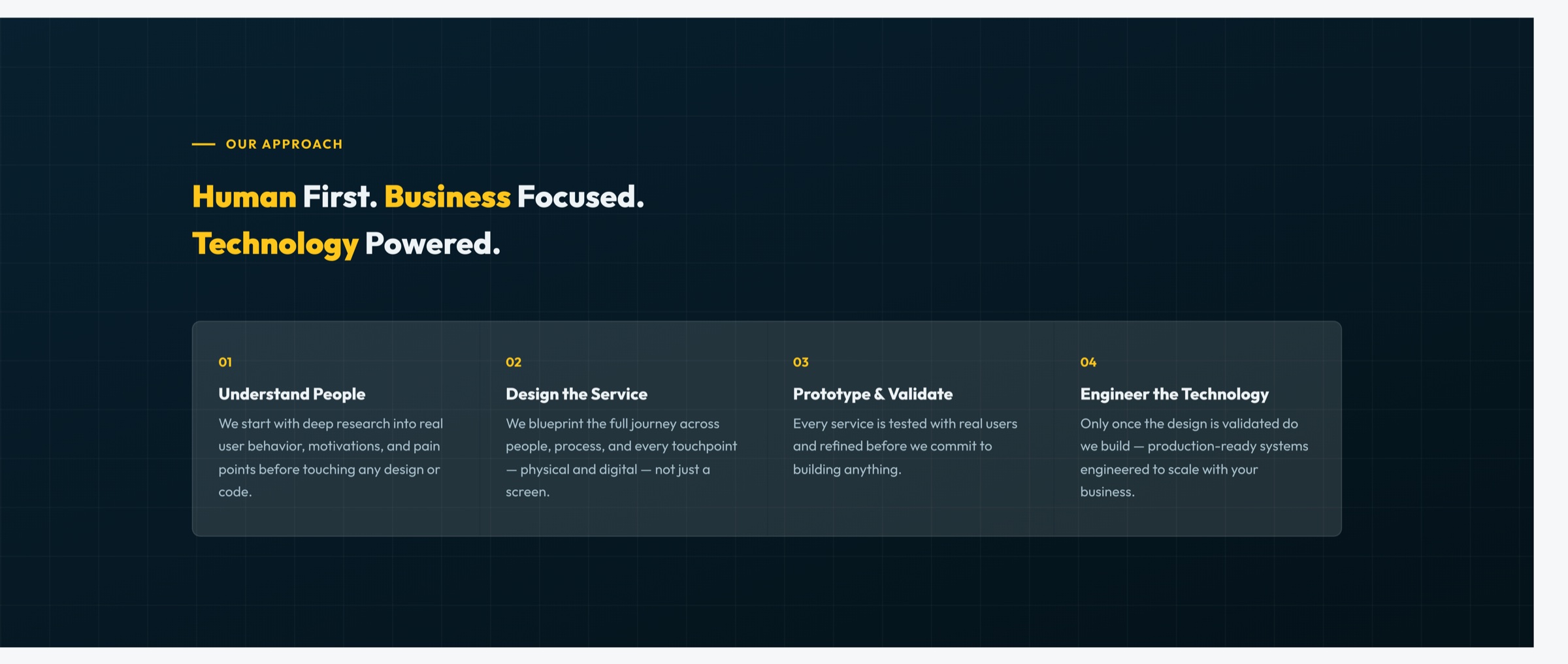
The page order mirrors the studio's method — understand, design, validate — before technology appears.
Structure
One scrolling story, from promise to proof to contact.
- 01Hero
Promise, key stats, and the main call to action.
- 02About
Who the studio is and what it believes.
- 03Framework
Four phases of service design.
- 04Services
Core practice plus four supporting services.
- 05Process
A six-step delivery framework.
- 06Engagement
Three ways to work together.
- 07Work & Tech
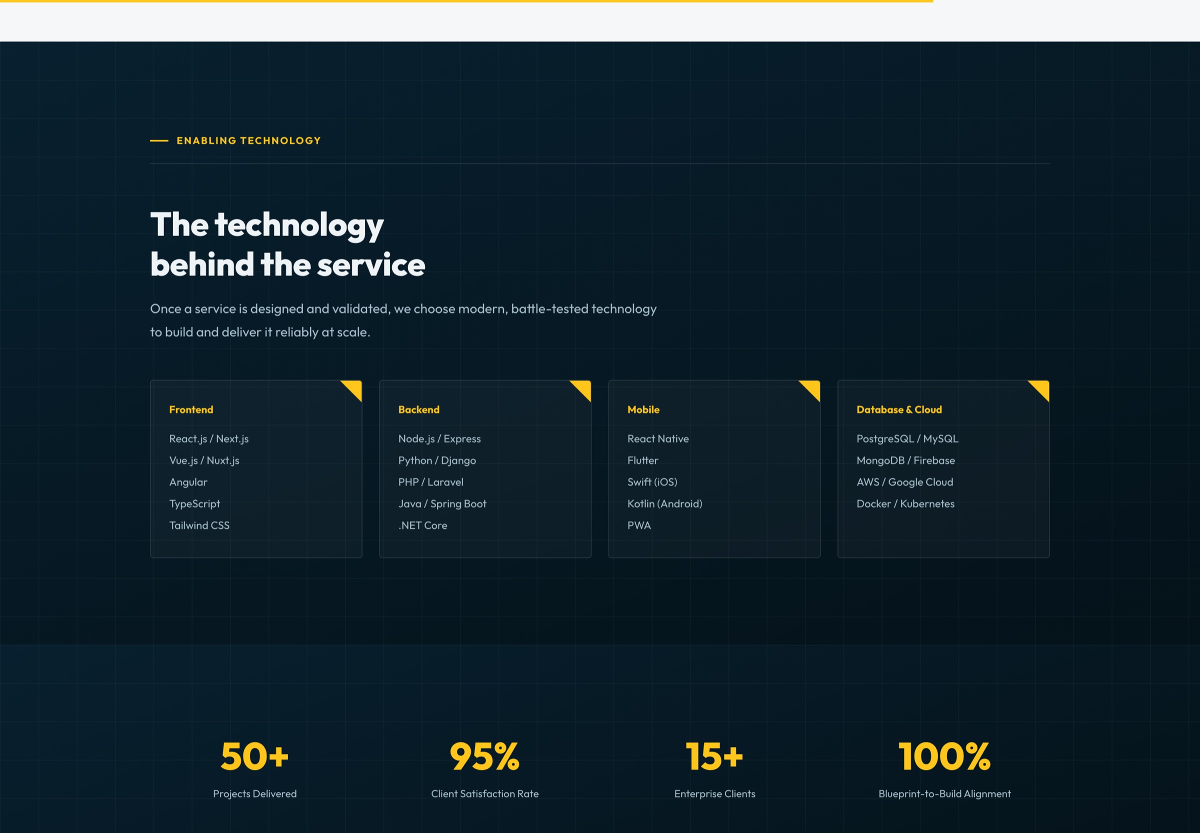
Brand touchpoints and the tech stack.
- 08Proof & Contact
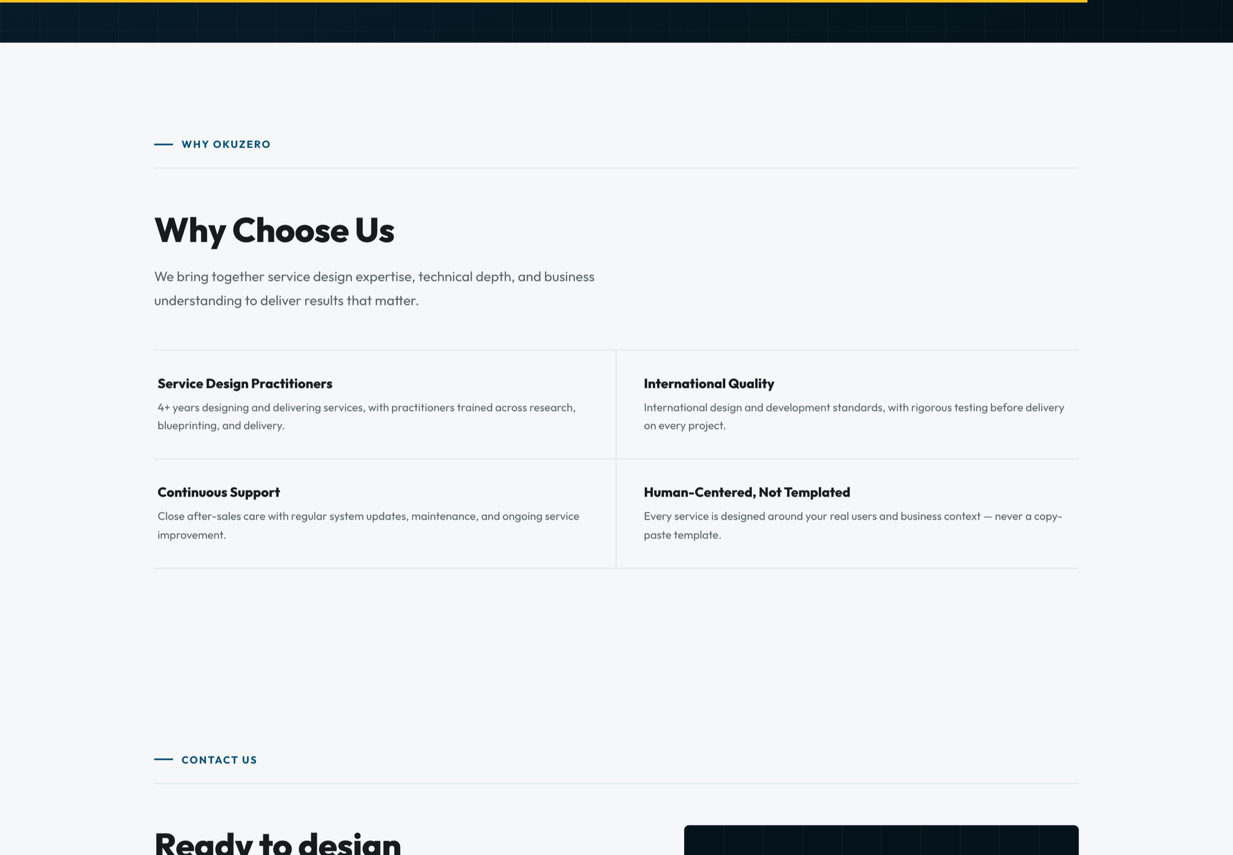
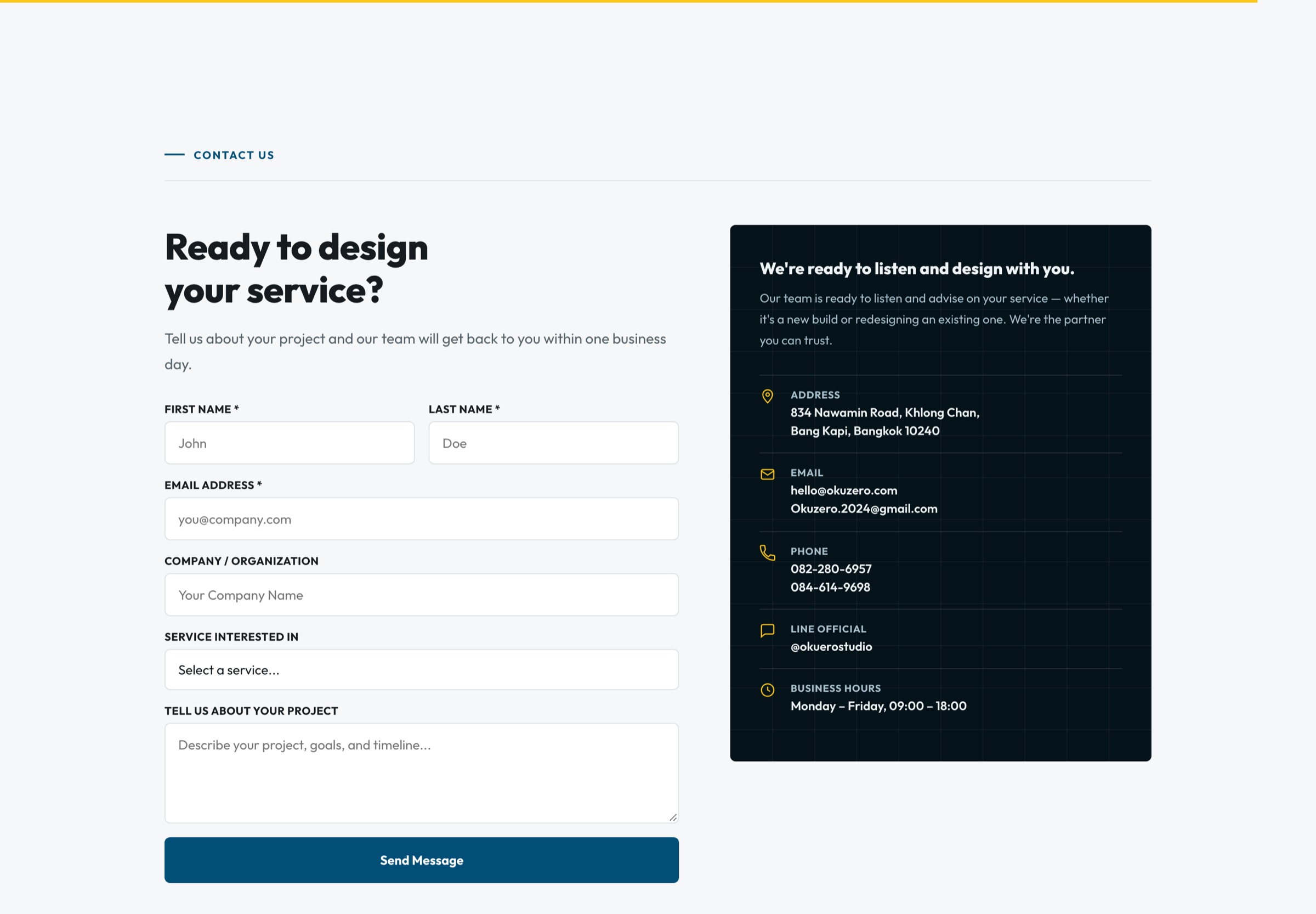
Stats, why us, and a contact form.
Key Sections
Each section answers one question a visitor has on the way to getting in touch.
Hero — the promise
A short, confident headline with "we." highlighted in yellow, the isometric layers illustration, and four proof numbers (50+ projects, 95% satisfaction, 20+ methods, 4+ years) right under the call to action.
Hero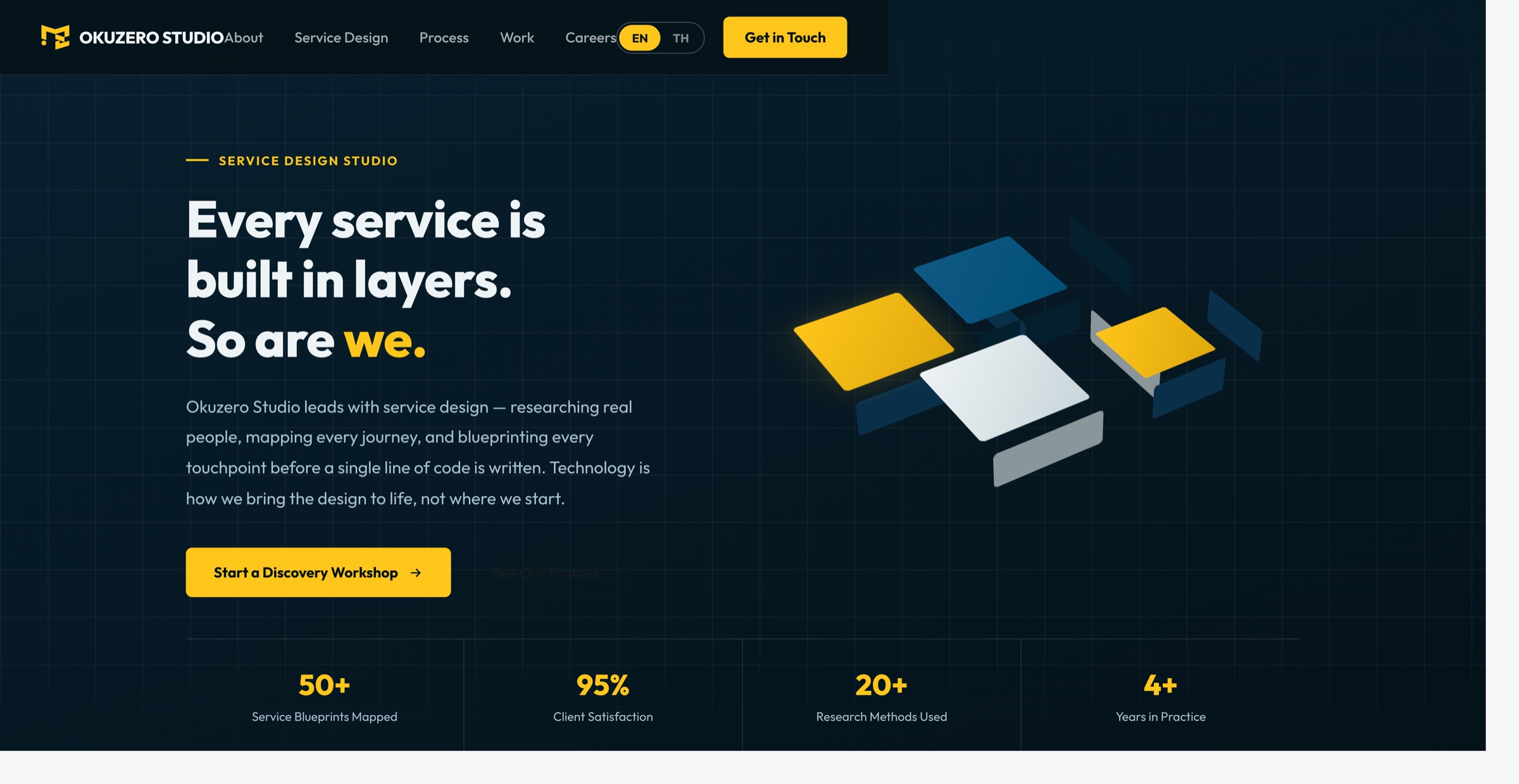
Framework & services
The Service Design Framework explains four phases — Research, Design & Prototype, Implementation Support, End-to-End Partnership — as dark cards. Services then place Service Design & Strategy at the center, with UX/UI, development, custom software, and workshops around it.
Framework and services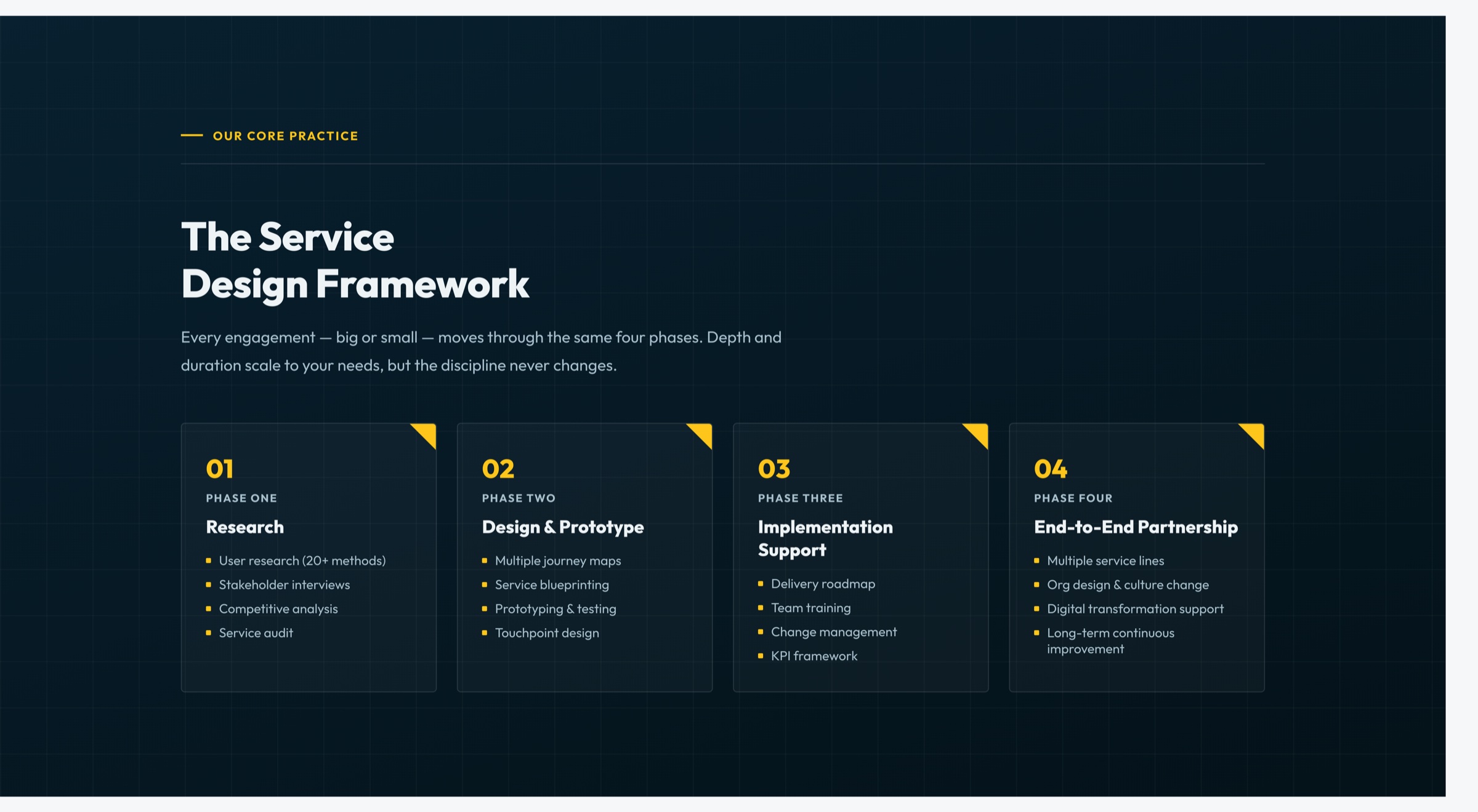
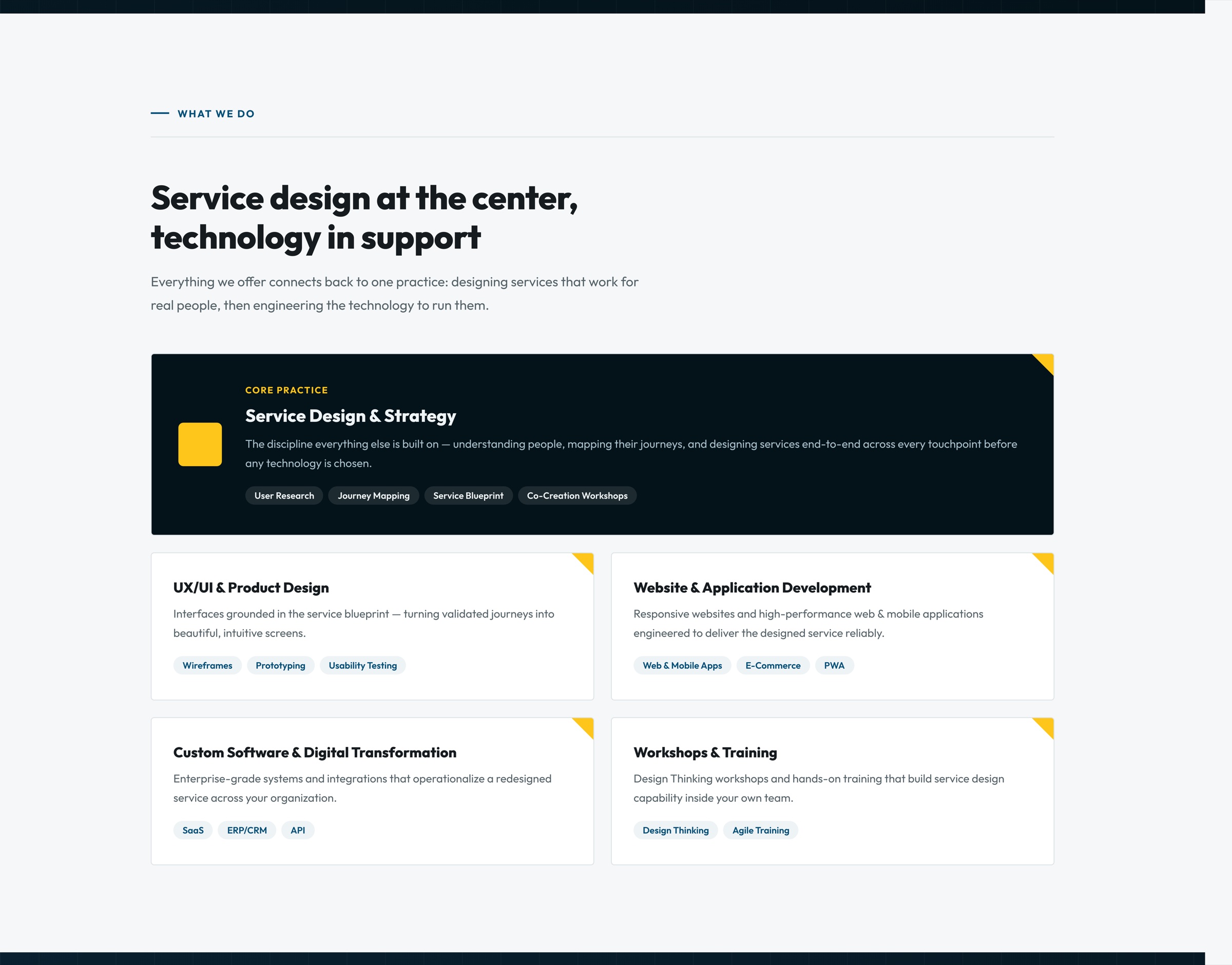
Process & engagement
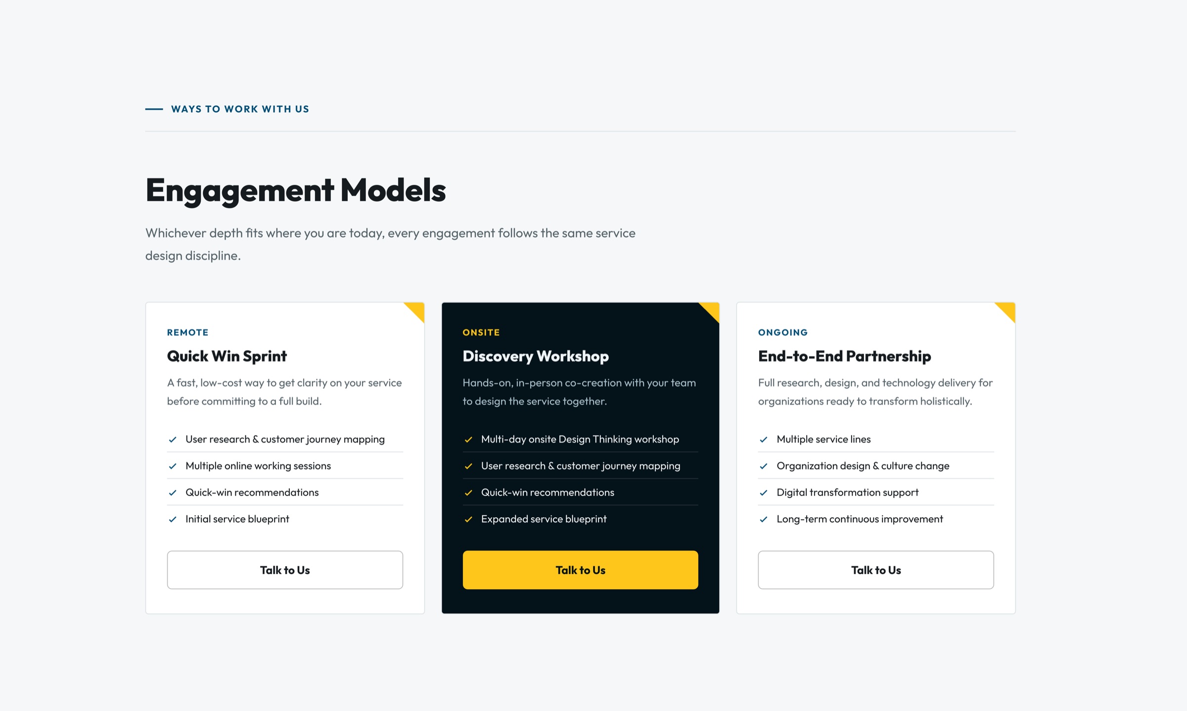
A numbered six-step process — from discovery to long-term improvement — makes the method feel concrete. Three engagement models (Quick Win Sprint, Discovery Workshop, End-to-End Partnership) give clients an easy entry point, with the recommended option highlighted.
Process and engagement models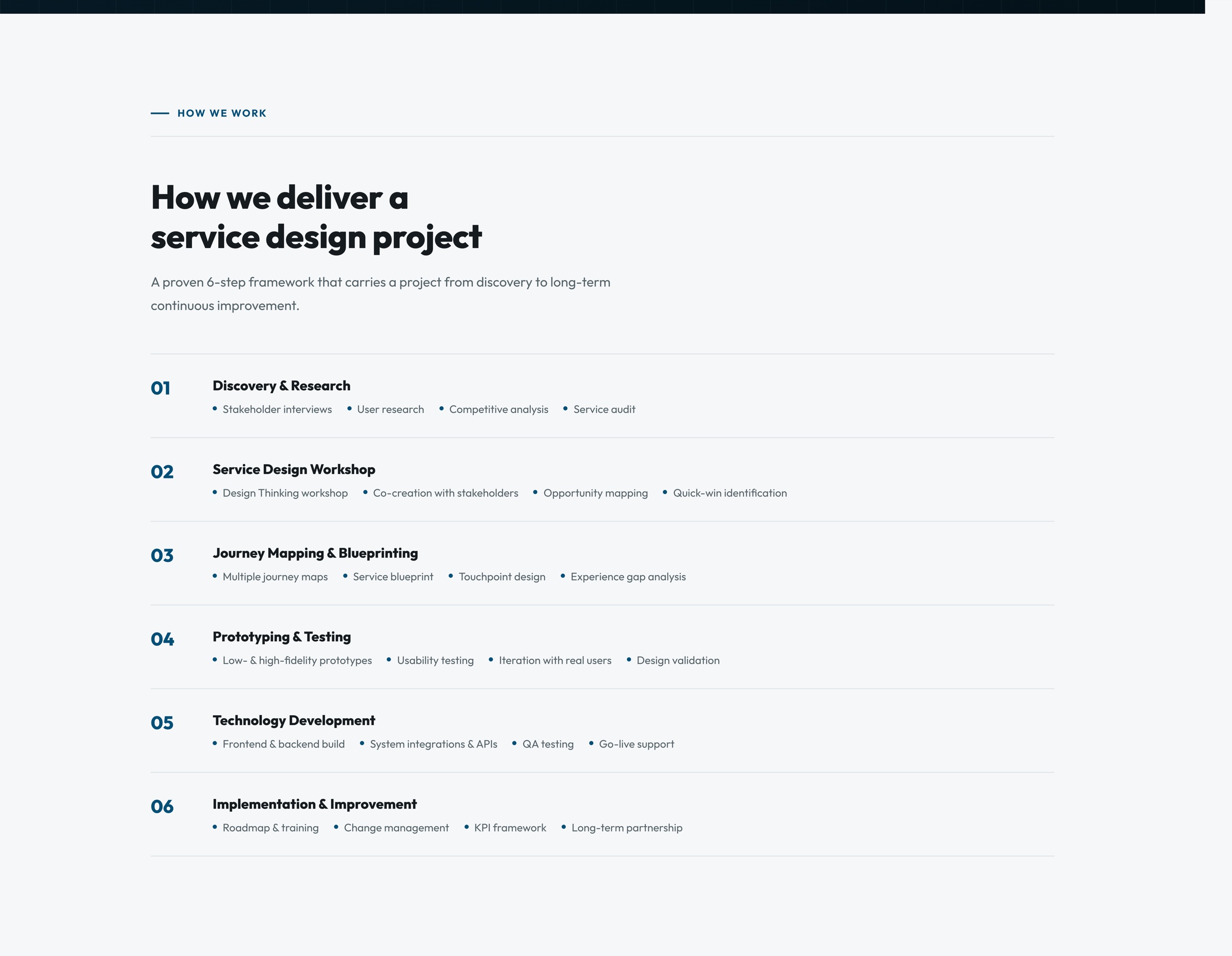
Brand in every touchpoint
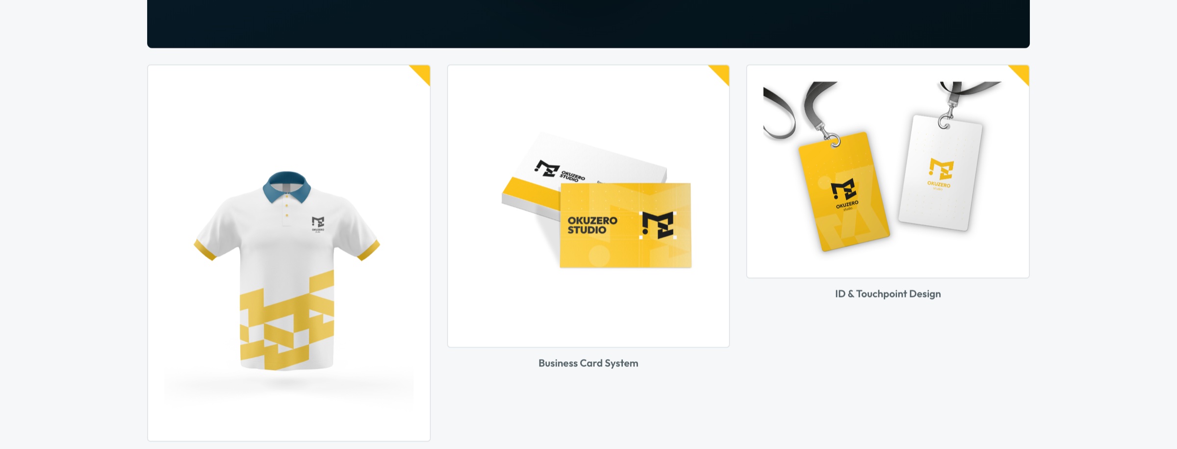
The Work section shows the identity carried into the website, apparel, business cards, and ID badges — proving the same design discipline applies from screen to physical objects.
Brand & identity systems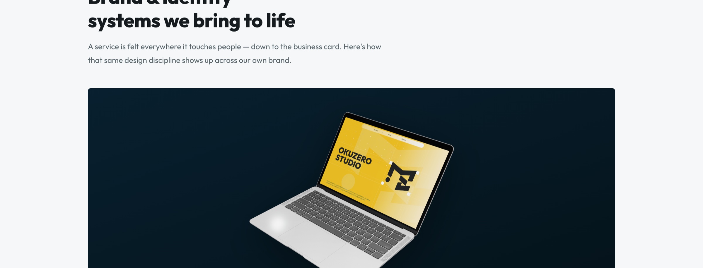
Mobile & Bilingual
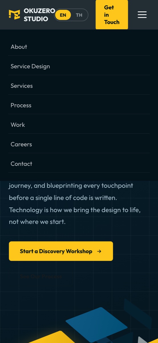
Built responsive from the start, with an EN/TH switch always in reach.
On mobile, navigation collapses into a hamburger menu while "Get in Touch" stays visible. The language toggle sits beside the logo so Thai and English readers get the same experience.
Outcome
A live company website that positions Okuzero as a service design studio — and gives every visitor a clear way to start.
- The service-design-first message is carried through structure, copy, and visuals.
- Two clear calls to action — Discovery Workshop and Get in Touch — repeated through the page.
- Fully responsive, bilingual, and live at okuzero.com.
LIVE WEBSITE
See it live.
Scroll through the full site, switch between English and Thai, and try it on your phone.
OPEN OKUZERO.COM ↗