Overview
ERC Dashboard is a centralized monitoring platform for Thailand's electricity and natural gas supply — bringing fragmented data from seven-plus systems into one operational view for regulators, analysts, and operators.
Problem
Thailand's energy information was scattered across disconnected platforms. No one had a complete picture — and every decision required hours of manual data gathering first.
Analysts spent 4–6 hours daily compiling data before analysis could begin. Operators had no live alerting, discovering grid anomalies only after they escalated. Regulatory officers had no visibility into renewable energy contribution — a core compliance metric tied to Thailand's 2036 energy target.
- No unified view for electricity and gas monitoring.
- Manual reporting introduced delays and human error.
- Renewable and traditional sources impossible to compare at a glance.
- No real-time alerts for load changes, faults, or shortages.
Research
Three weeks of discovery across all user groups — interviews, surveys, journey mapping, competitive benchmarking, and prototype testing — before a single screen was designed.
One data source. Three different needs.
Journey mapping revealed that all three user groups had a different "first question" when opening any energy tool. Operators ask: Is anything wrong right now? Analysts ask: What changed since yesterday? Officers ask: Are we on track?
These three questions require three completely different information hierarchies — which meant a one-size-fits-all layout would fail all of them.
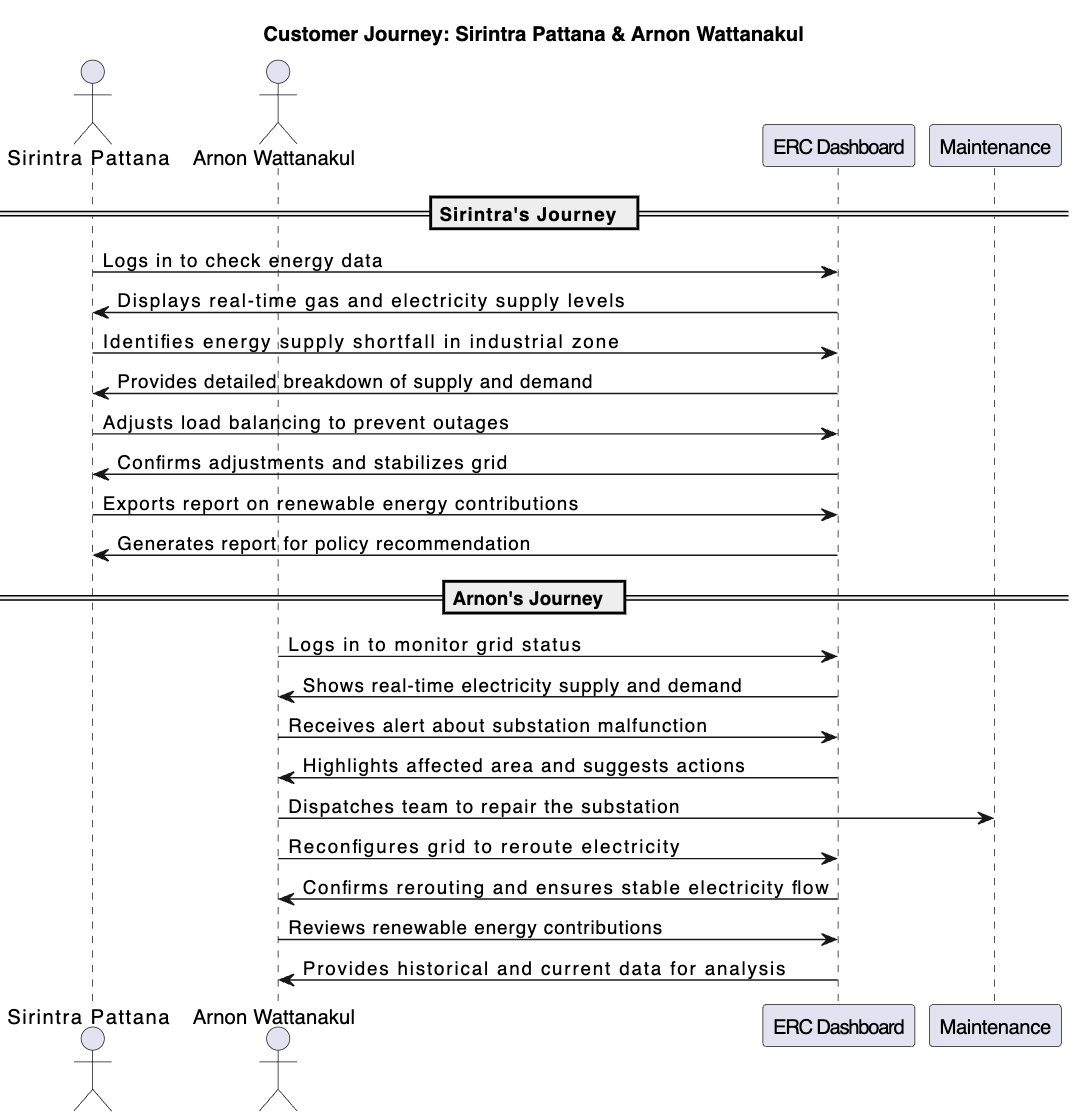 Journey map — tracing where the current workflow broke down for each user type
Users
Three distinct roles. Each needs the same data prioritized and presented in a completely different way.
Sirintra Pattana
Energy Regulatory Analyst · Bangkok · 34 years old- Trend comparison across time periods
- Renewable energy contribution tracking
- One-click formatted report export
- Historical data with context
- Spends 4–5 hours daily just collecting data
- Switches between 5+ disconnected systems
- Reports are outdated before they're sent
- No visibility into renewable progress
"I spend more time collecting data than I do actually analyzing it."
Arnon Wattanakul
Electricity Operations Officer · Chiang Mai · 43 years old- Live load status and grid stability view
- Immediate alerts for faults and shortages
- Fast path from alert to response action
- Regional status at a glance
- Learns about grid problems via phone calls
- No unified view for electricity monitoring
- Response time is too slow — problems escalate
- Data arrives fragmented, not actionable
"By the time I find out something's wrong, it's already escalated."
Design for decisions,
not decoration.
Clarity over density
Show status first. Let users drill into charts and tables on demand. Cognitive load is the biggest barrier for non-technical users — surface summaries, not raw data.
Role-based priority
Operators see live alerts at the top of every view. Analysts see trends and export actions. Officers see compliance. Same data, three different hierarchies.
Action after insight
Every data point leads somewhere — investigate, rebalance, export, alert, or report. A dashboard that only informs but can't enable action is just a prettier spreadsheet.
Wireframes
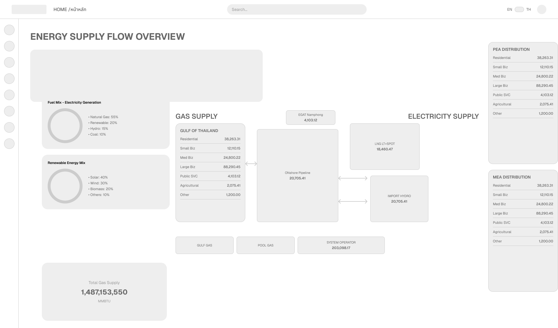
Before any color or component touched the screen, every view was sketched as a low-fidelity wireframe — mapping information hierarchy, navigation flow, and layout structure for each user type.
Structure before style
Wireframes forced every layout decision to be justified by user need — not visual preference. If data wasn't essential for the user's primary task, it didn't belong above the fold.
Eight screens were wireframed covering the full scope: the overview dashboard, electricity and gas monitoring, national and regional maps, navigation structure, and the PDP planning views.
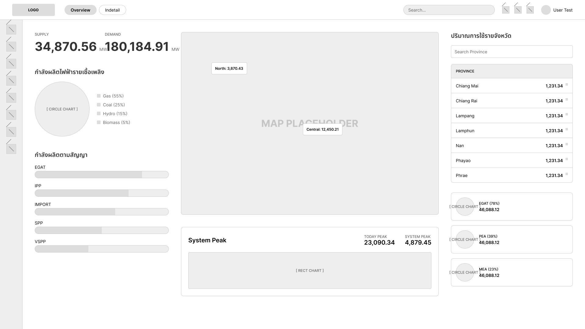 Overview screen — wireframe
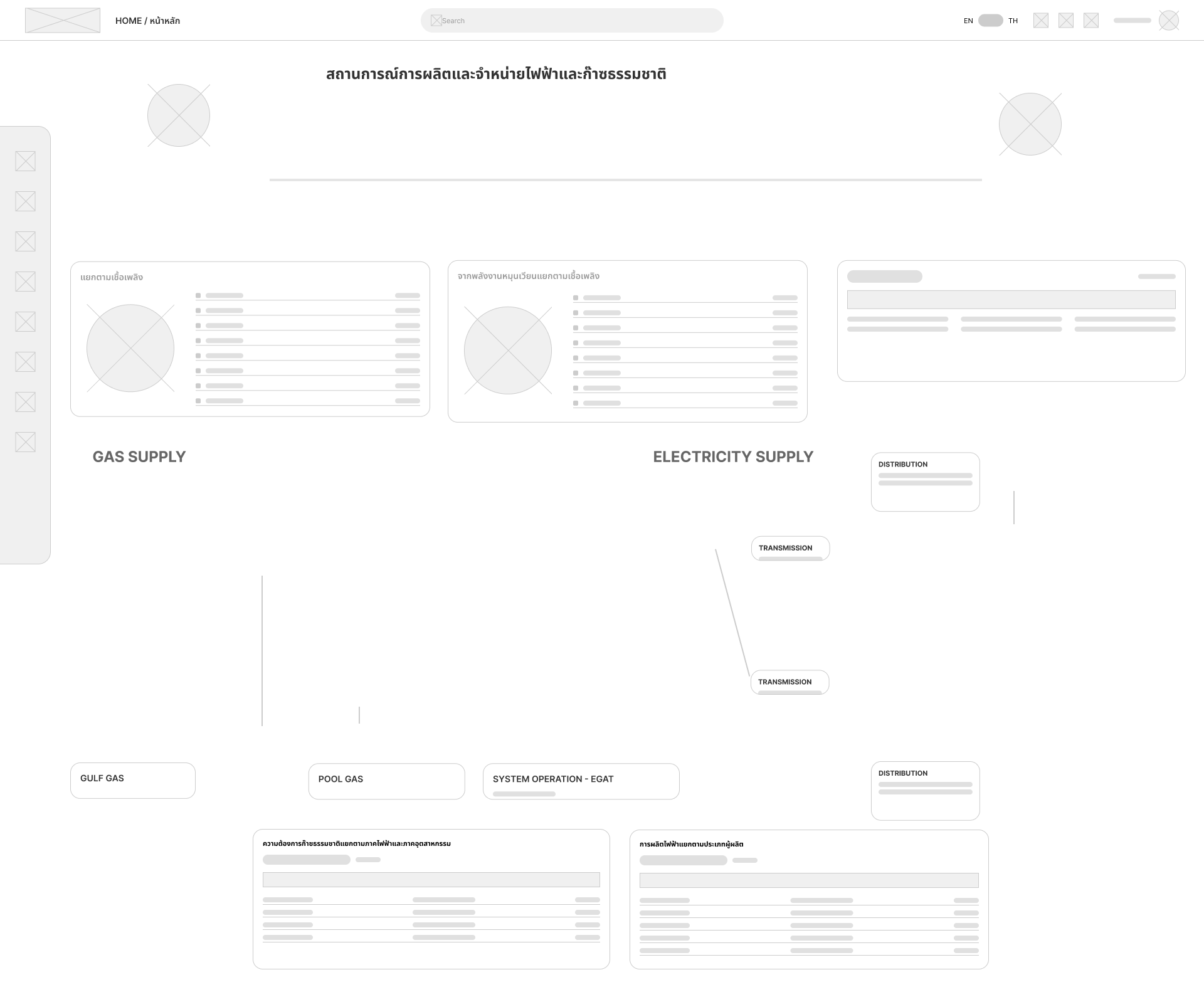 Dashboard layout
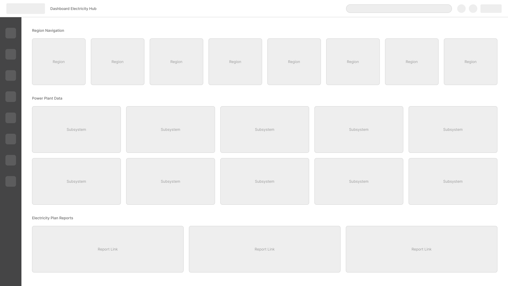 Navigation menu
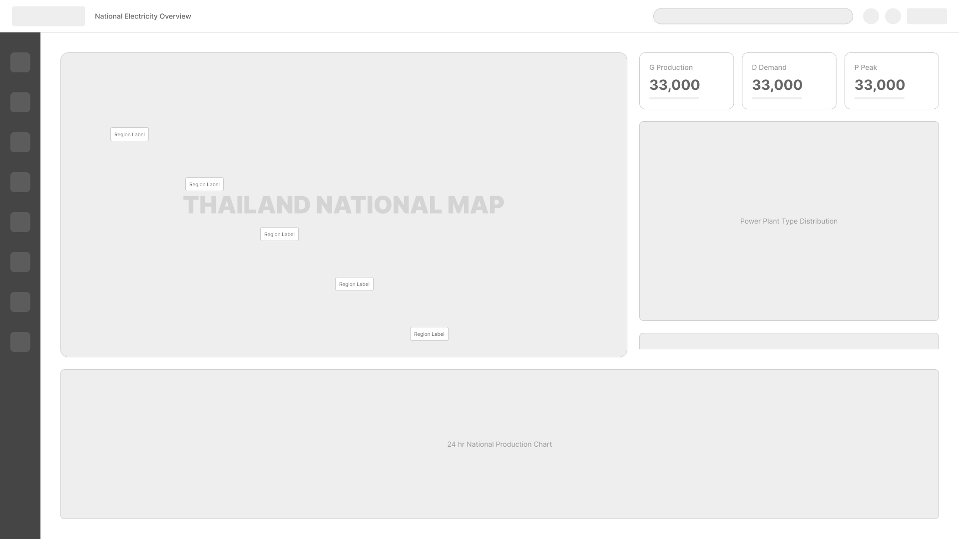 National energy map
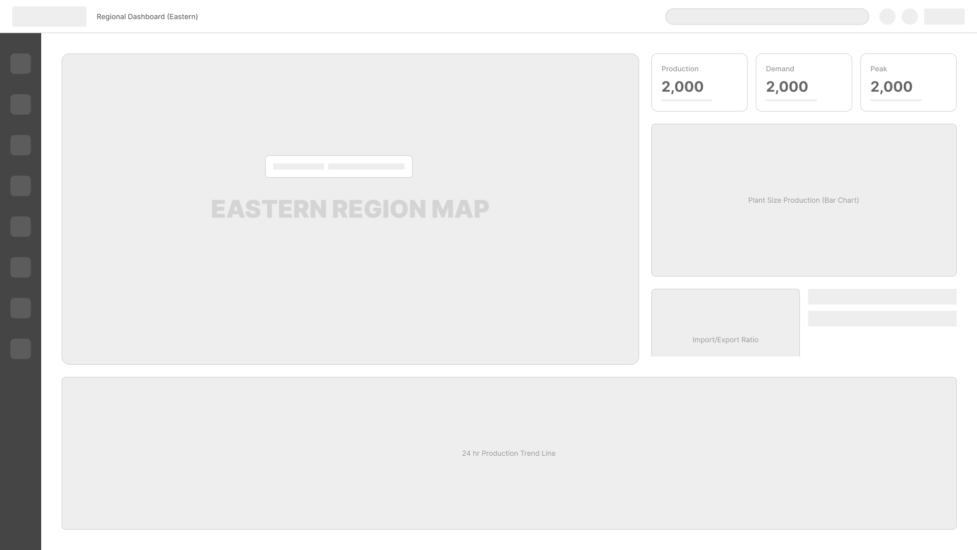 Regional breakdown
 Detail panel
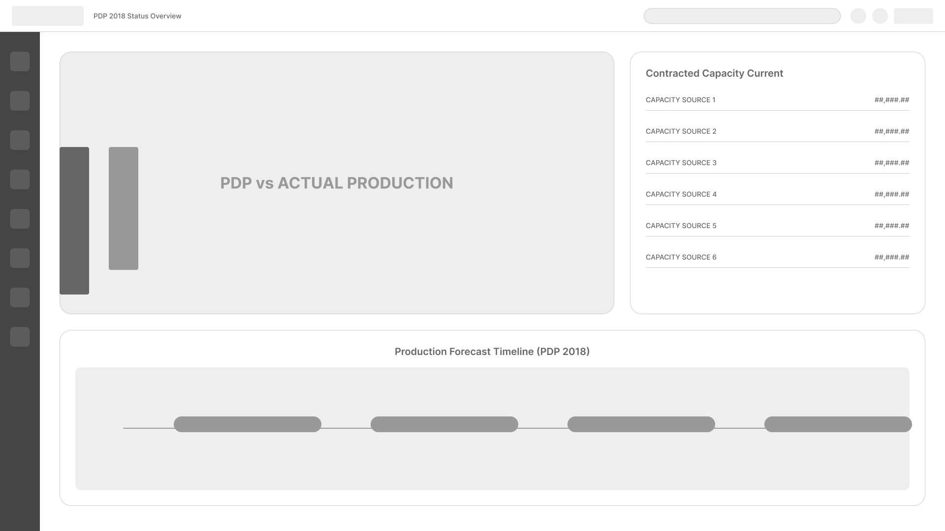 PDP 2018 plan
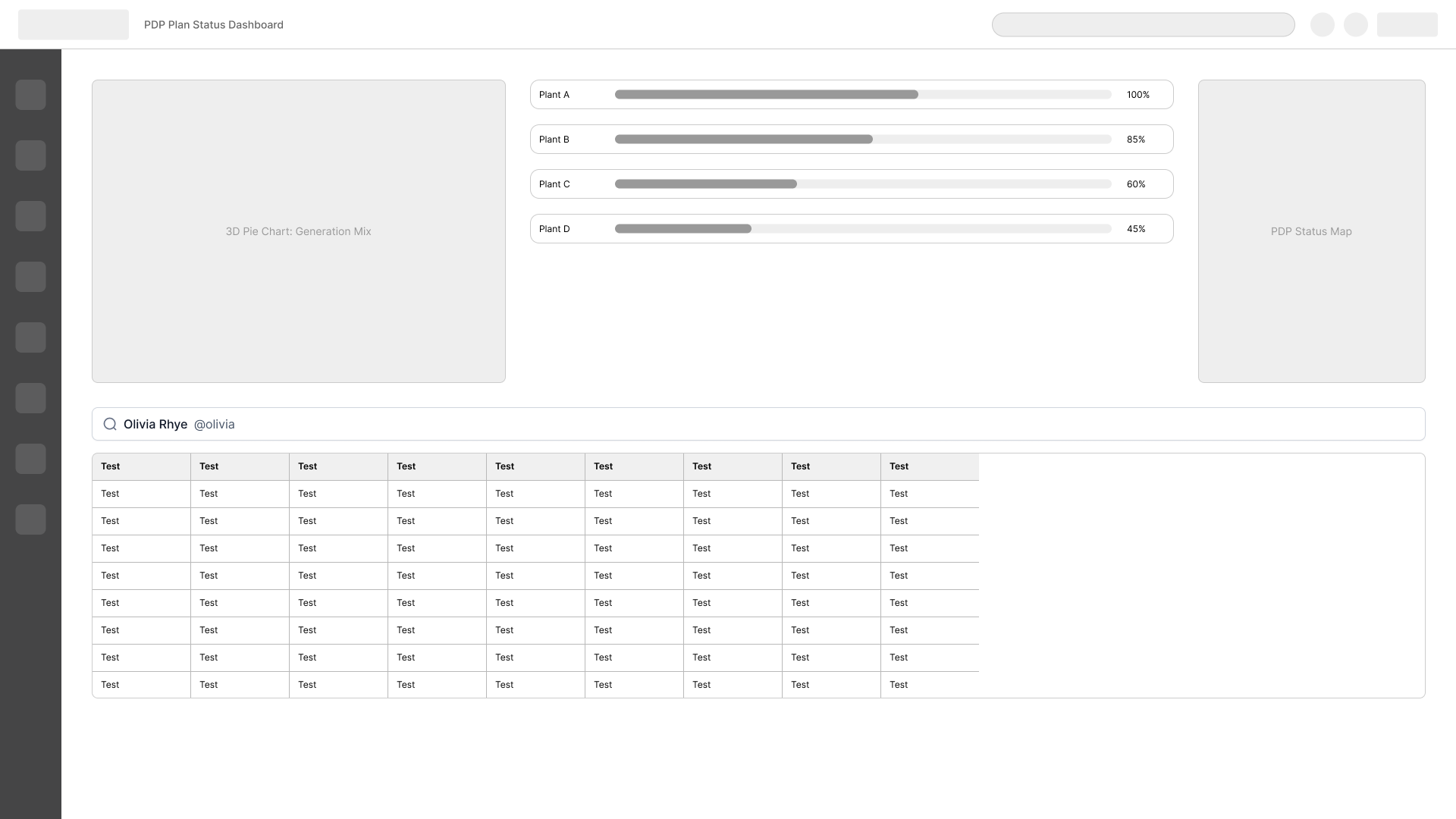 PDP planning view
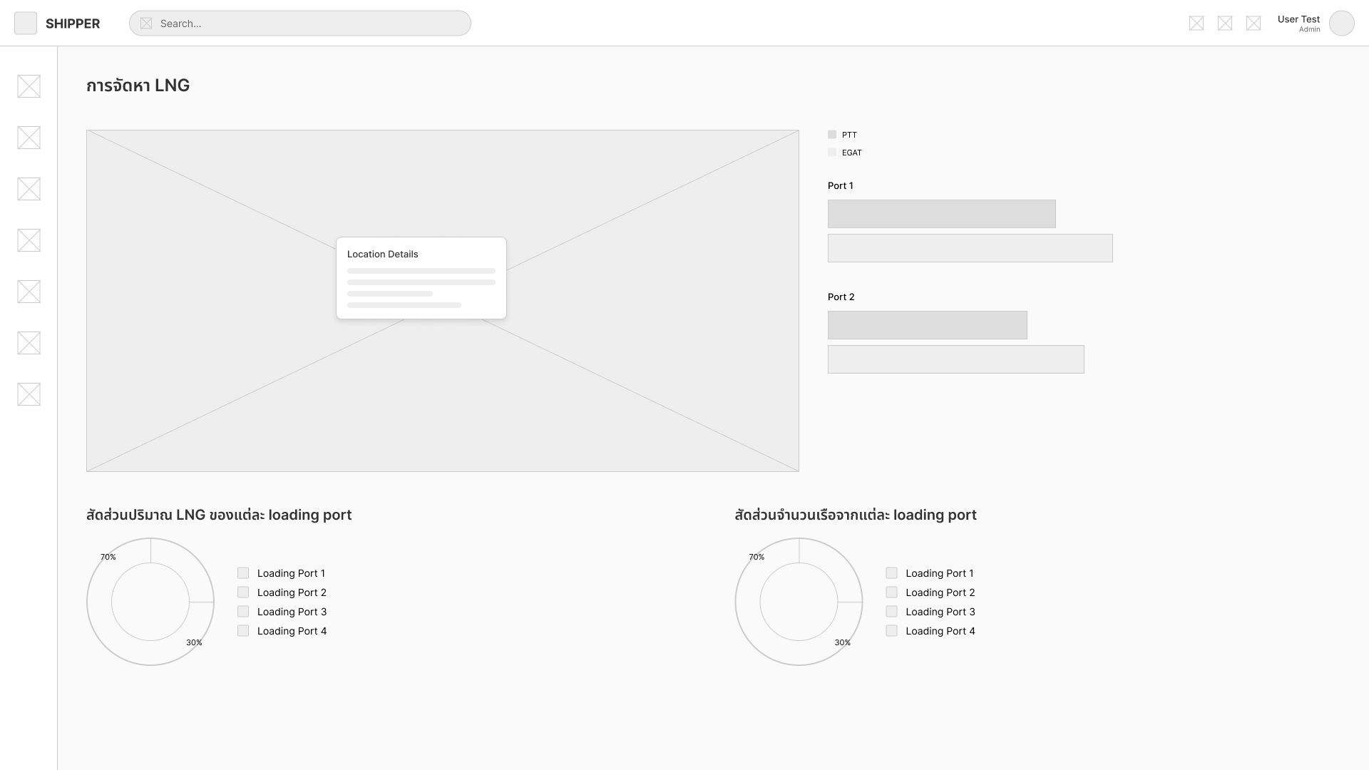 Shipper view
Interface screens
Five primary views — each built around the specific decisions a particular user group needs to make.
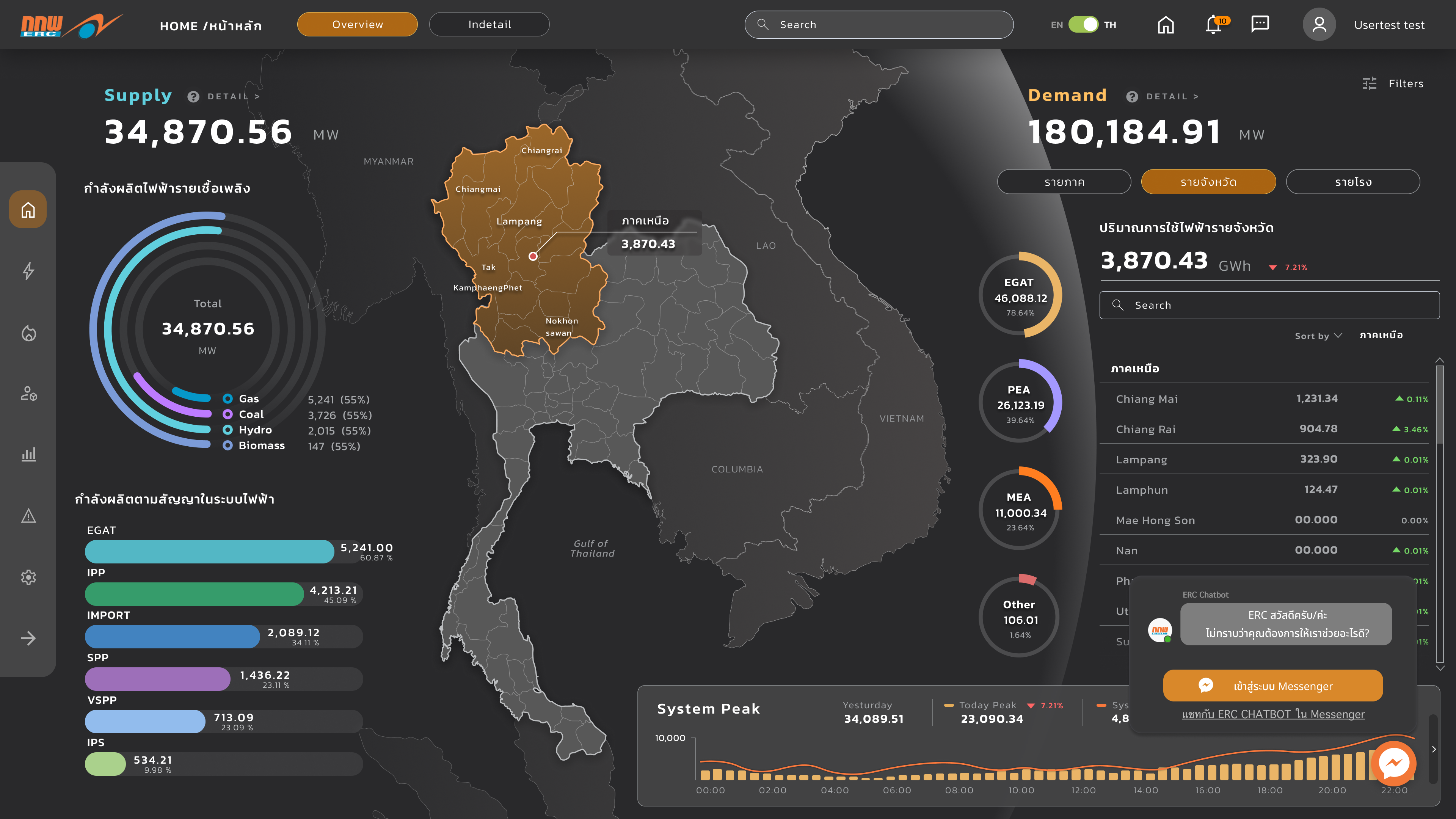
Homescreen
Unified electricity and gas status with a persistent alert bar — operators see critical events first, before any charts or tables.
The alert bar stays fixed as users scroll between views — critical events are never buried, regardless of how deep an operator navigates into the data.
Screen 01 — Homescreen dashboard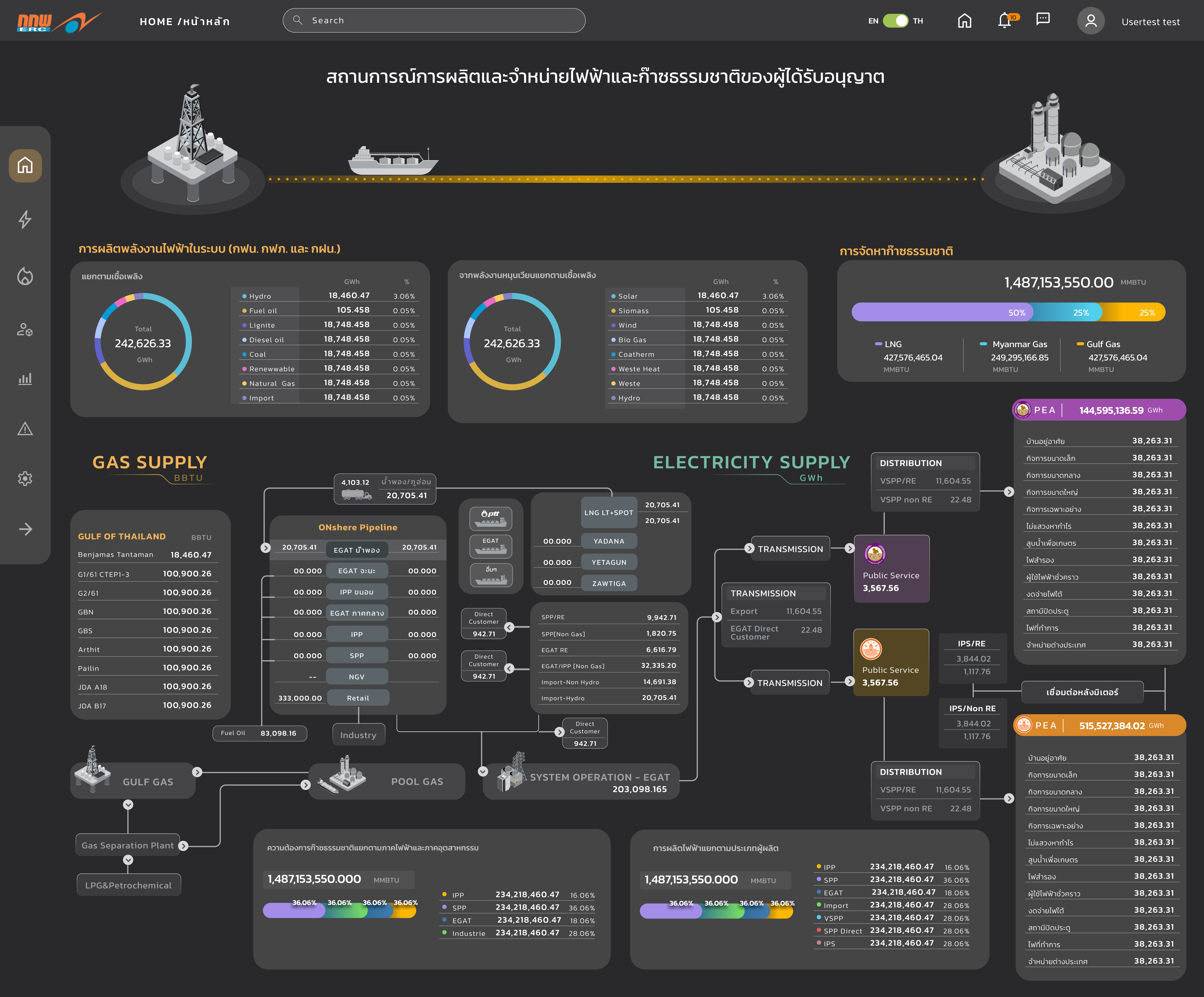
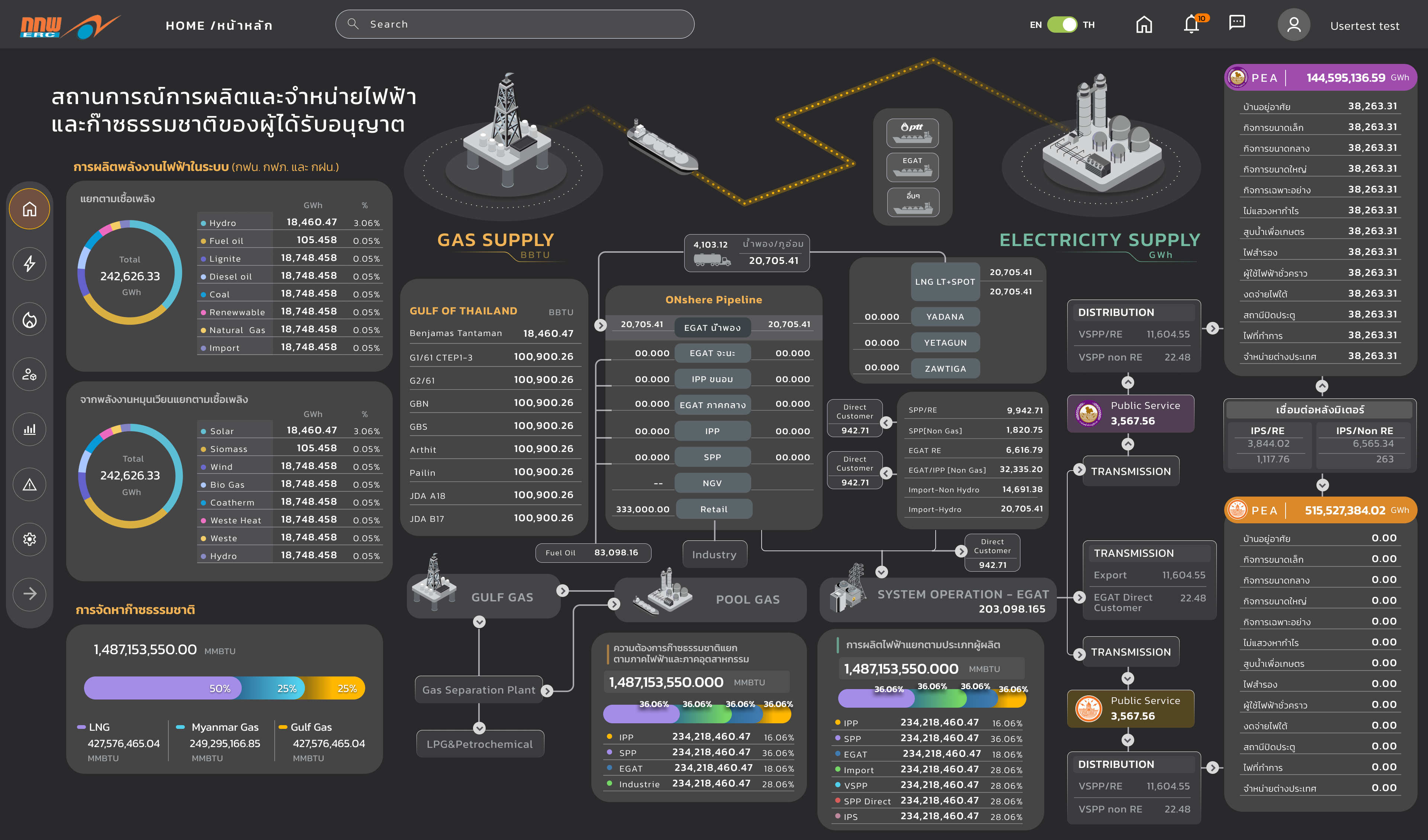
Electricity operations
Live monitoring with source breakdown across hydro, coal, gas, wind, and solar — metrics in GWh. Alert states surface at the top so operators see critical events first.
Color-coded by energy source, the breakdown lets operators assess fuel mix at a glance — reducing the cognitive load of interpreting raw numbers under pressure.
Screen 02 — Live source breakdown and grid monitoring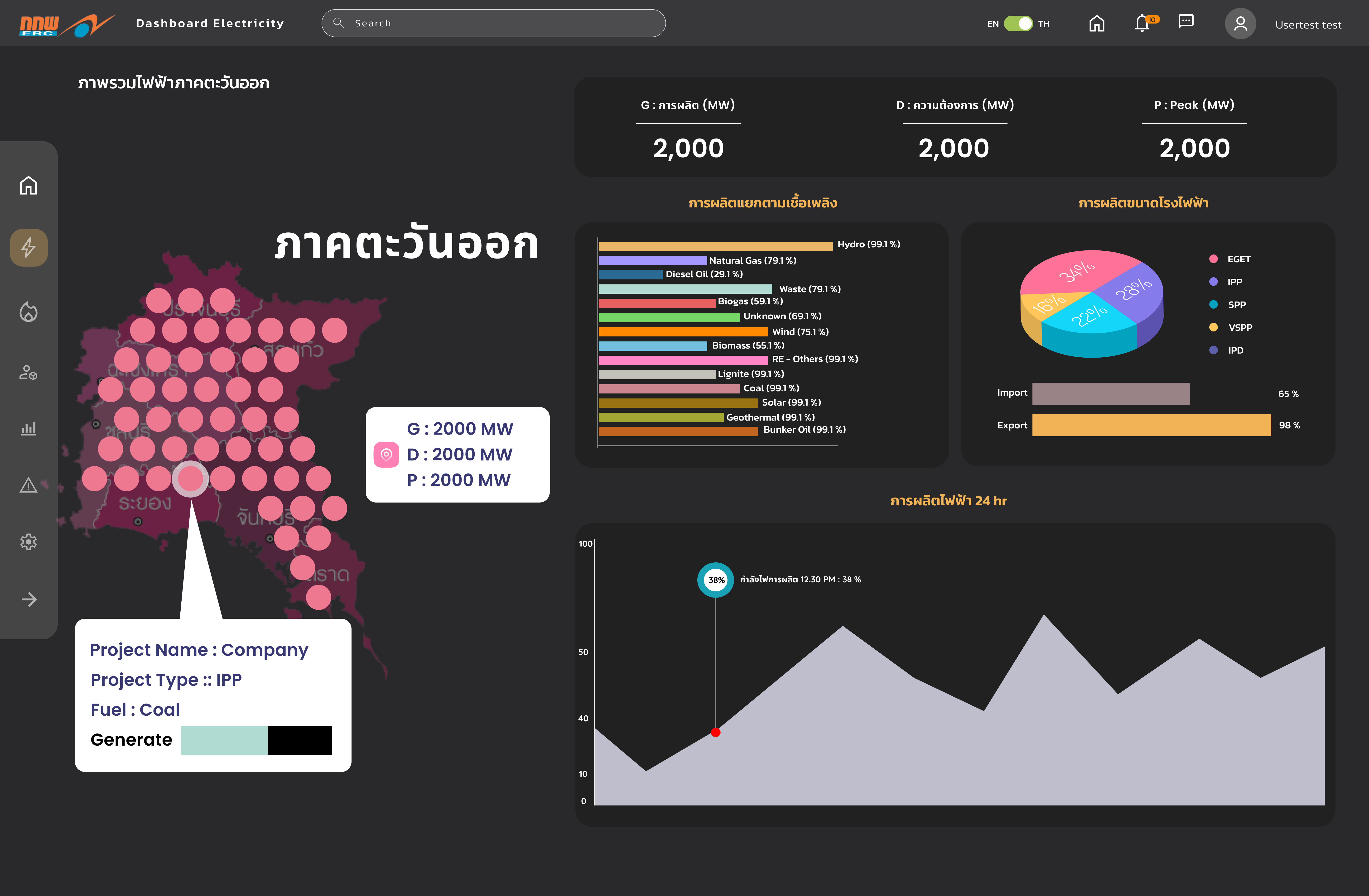
National level
Regional energy distribution and compliance progress — used by regulatory officers tracking Thailand's 2036 renewable energy target in real time.
Province-level comparison lets officers identify where renewable contribution is lagging — before targets are missed, not after.
Screen 03 — National-level electricity dashboard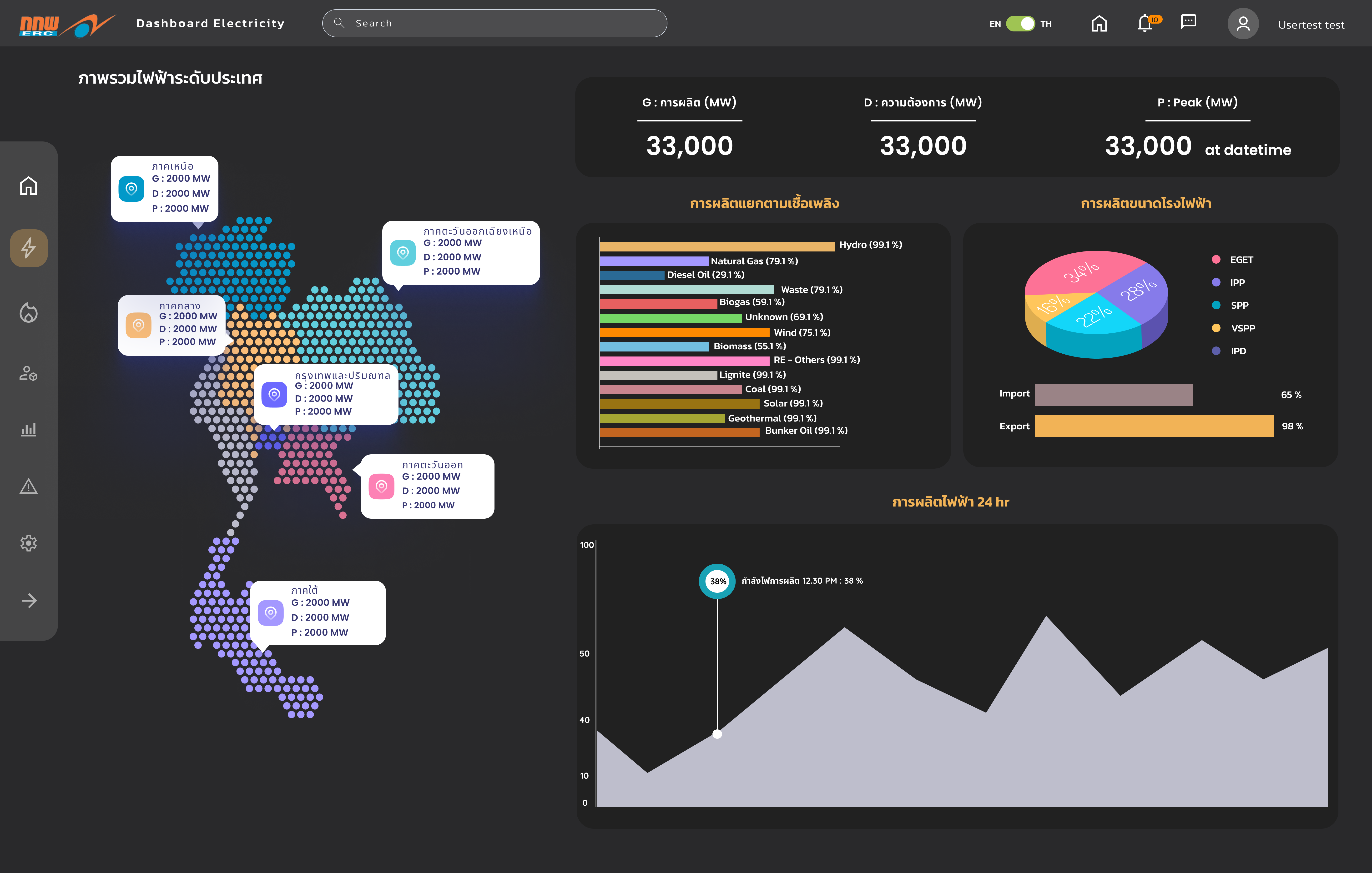
Natural gas
Live supply monitoring across LNG imports and domestic gas in BBTU — consolidated view of intake, storage, and throughput for operators and supply planners.
Source-level breakdown distinguishes piped gas from LNG, letting planners track which input streams are meeting daily demand targets.
Screen 04 — Natural gas view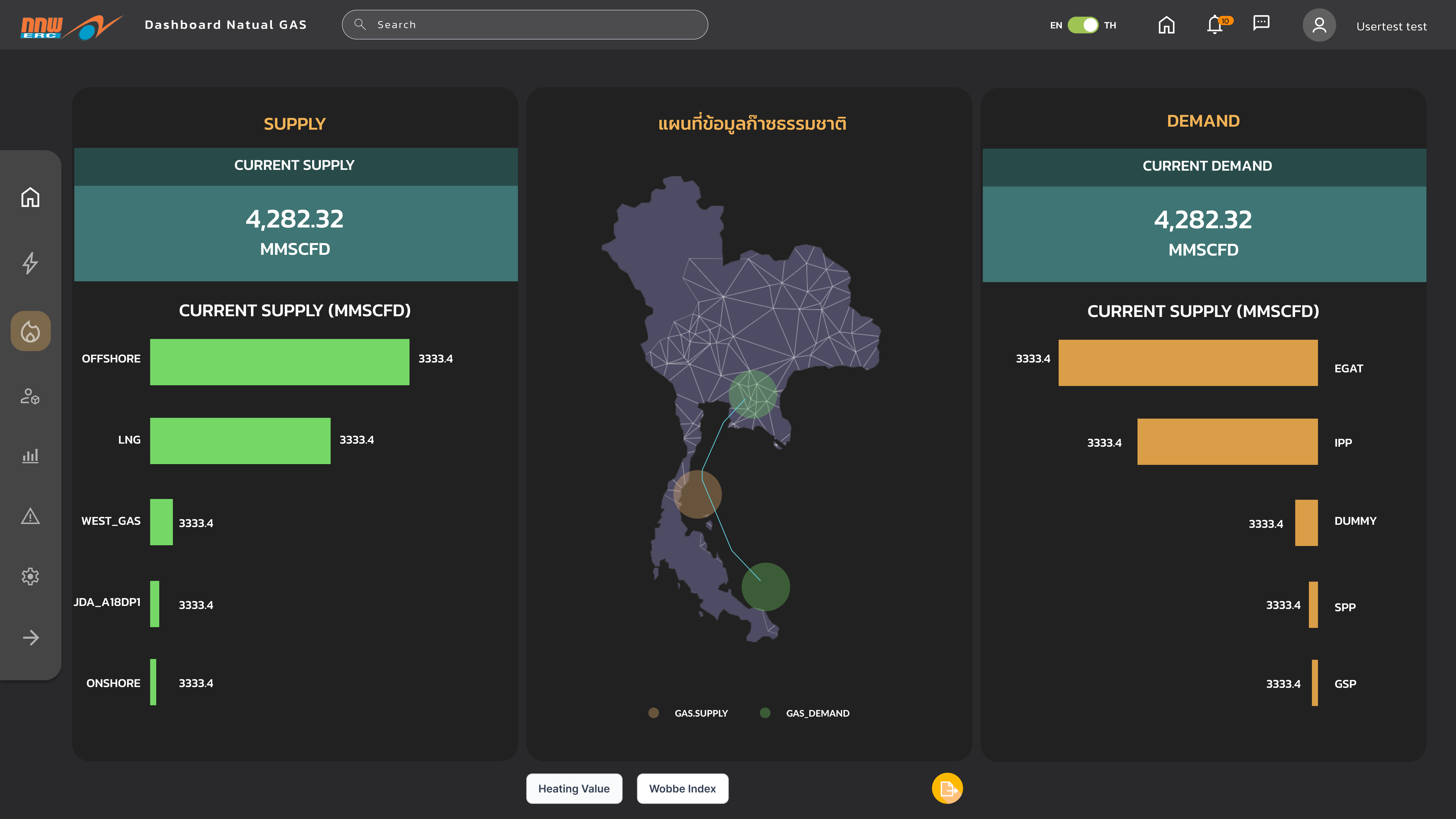
Shipper
Gas allocation and delivery confirmation for downstream distribution operators — tracking which shippers are receiving what volume and when.
Allocation is shown as both raw volume and fill-rate percentage — making shortfall conditions visible before they become delivery failures.
Screen 05 — Shipper view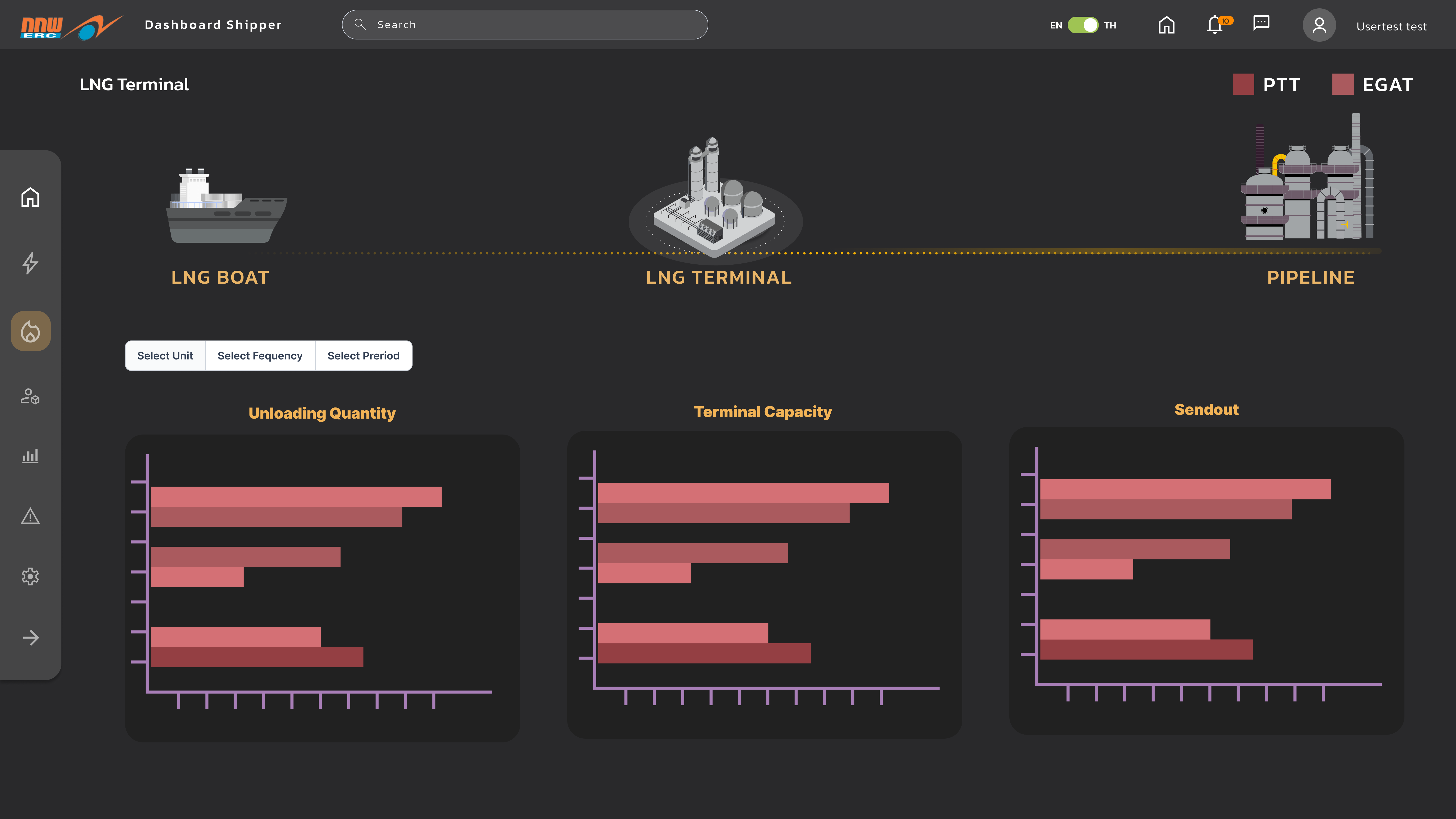
Outcome
The ERC Dashboard replaced a fragmented multi-system workflow with one platform covering real-time monitoring, renewable tracking, alert management, and one-click reporting.
The platform created a shared operational language across departments. When a team member raised a concern about grid stability or renewable contribution, everyone was looking at the same data — eliminating a whole category of miscommunication the previous workflow made inevitable.
- Compliance reports that previously required 4–6 hours of manual work now generate in seconds.
- Operators detect and respond to grid anomalies proactively instead of reactively.
- Thailand's 2036 renewable energy target is now visible and trackable in real time across every relevant view.
- All three user groups work from a single source of truth for both electricity and gas data.